
To get effective analyzing and communicating results, you may sift through lots of data for your jobs. When you manage multiple sources of data, it can get overwhelming and may make you frustrating. You'd better know what should be tracked and what matters. Also, figure out how you can visualize and analyze the data to take out key insights and actionable information. More importantly, if you want to make reports on these results and data efficiently, the article will show you the top 10 types of charts and their tips to use.
In this article
Types of Charts - Overview
Generally, the most popular types of charts are column charts, bar charts, pie charts, doughnut charts, line charts, area charts, scatter charts, spider (radar) charts, gauges, and comparison charts. Here is a quick view of all of these types of charts. The biggest challenge is how to select the most effective type of chart for your task.
If you want to choose the most suitable chart type, generally, you should consider the total number of variables, data points, and the period of your data. Each type of chart has specific advantages. For example, scatter diagrams are useful for indicating relations between different factors or topics, while line types are suitable for showing trends.
Types of Charts - Column Charts
Column charts are effective for the comparison of at least one set of data points. The vertical axis, also known as the Y-axis, is often shown in numeric values. The X-axis on the horizontal line indicates a period.
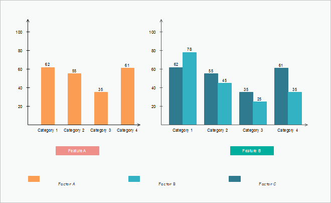
Typically, data points in column charts have these kinds: Flowers, Shrubs, Clustered, stacked, and Trees. You can find trends over time by using these types in different colors. A clustered column chart is especially useful in showing and analyzing multiple data sets. For stacked column charts, you can quickly check a specific percentage of the overall data.
Types of Charts - Bar Charts
Bar charts are for comparing concepts and percentages among factors or sets of data. Users can set different distinct choices for your respondents, for example, annually or quarterly sales. You can see bar charts are similar to what column charts lying on its X-axis.
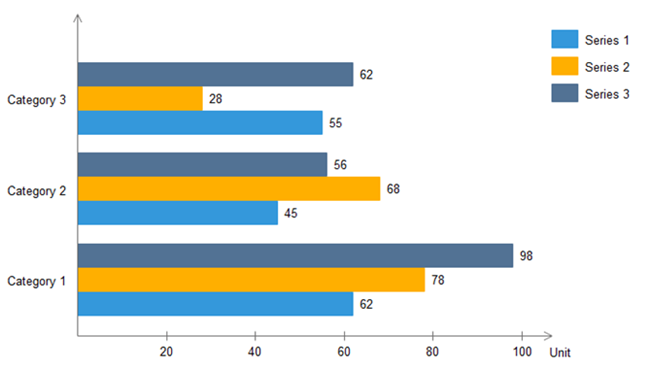
If you are not sure about when to insert a bar chart for your work, you should think about the specific kind of your original data and your personal preference. Usually, compared to other types of charts, bar charts are better for showing and comparing vast sets of data or numbers.
Types of Charts - Pie Charts
Pie charts are useful for illustrating and showing sample break down in an individual dimension. It is in the shape of a pie to show the relationship between your data's main and sub-categories. It is good to use when you are dealing with categorized groups of data, or if you want to show differences among data based on a single variable.
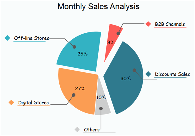
In reality, you can break down any sample data groups into different categories, for example, by gender or in various age groups. For business projects, you can use pie charts to represent the importance of one specific factor on the others. However, for analyzing several different data sets, you should go for column charts.
Types of Charts - Doughnut Charts
Doughnut charts are very similar to pie charts in terms of the area in the center cut out. Doughnut charts have several elements, including the division of segments, and the meaning of arc of an individual section. Doughnut charts are suitable for presenting the relationship between the proportions of different data groups. In this case, users can focus on the proportional areas of the slices. Doughnuts also cover more details than pie charts via their blank space.
In reality, you can break down any sample data groups into different categories, for example, by gender or in various age groups. For business projects, you can use pie charts to represent the importance of one specific factor on the others. However, for analyzing several different data sets, you should go for column charts.
Types of Charts - Line Charts
This type of chart is normally used for explaining trends over periods. The vertical axis always displays a numeric amount, while the X-axis indicates some other related factors. Line charts can be shown with markers in the shape of circles, squares, or other formats.
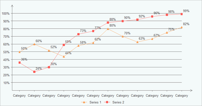
Line charts are not as colorful as other charts, but it is evident for users to see the trend within a specific period for a single set of data. Alternatively, you can compare trends for several different data groups. Managers or financial leaders may use such charts to measure and analyze long-term trends in sales, financial data, or marketing statistics.
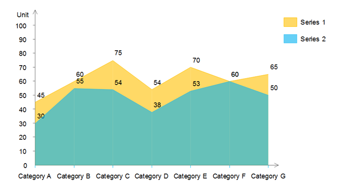
Types of Charts - Area Charts
Area charts are very similar to line charts, but the previous ones have solid plot lines. Area charts are ideal for displaying trends over a period for single or several categories, or the change between several data groups. Area charts have two main types: the stacked and the completed stacked area chart. Both of these types can show the nature of your selected data sets.
Types of Charts - Scatter Charts
Scatter charts are ideal for analyzing how different goals settle around the main topic and their various dimensions. For example, you can quickly compare types of products based on budgets and selling prices. Scatter charts have some different elements: markers, points, and straight lines. All of these factors can indicate and connect disparate data units. You can choose to draw a scatter chart only in markers or lines. Generally, markers are ideal for small data points, while lines are useful for large data points.
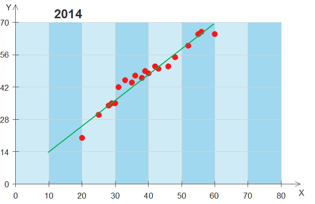
Scatter charts have similar points with line charts since they both use vertical and horizontal axes to show different data points, but scatter types can also show the degree of difference in one variable to the other, which is known as correlation. Correlations can be positive, negative, or equals to zero. Positive ones, for example, mean data increases simultaneously most of the time based on the given time.
Types of Charts - Spider and Radar Charts
Spider and radar charts are also known as web charts, star charts, or polar charts. If you have a large set of different data groups, using spider and radar charts are better than column ones. The radar chart is useful for showing multiple data groups in terms of 2D diagrams of at least three variables on axes.
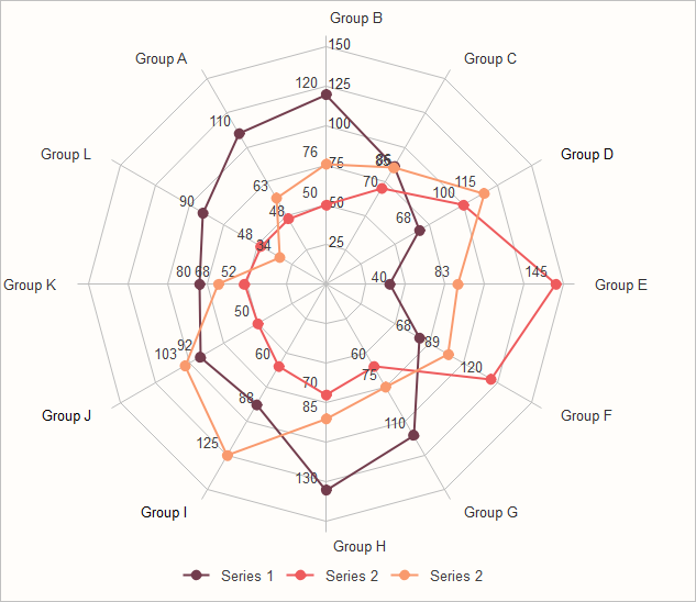
Human resource (HR) managers usually use the spider or radar charts for checking the skill pattern of different employee groups and their career performance. Besides, product managers in IT or trading organizations can use such charts to compare different products over a wide range of features, like showing a set of various smart electrics based on their quality, battery figures, appearance, and processors. Therefore consumers can easily and quickly choose the best option based on their preference.
Types of Charts - Gauge Charts
Factors in gauge charts regularly show as individual value. Such indicators are usually in red for the wrong message, or in green ones for correct ones. Gauge charts are ideal for showing KPIs (Key Performance Indicators), especially for business plans. Therefore they are usually used by managers or employers for ongoing assignments.
The main advantages of gauge charts are presenting improvement in a goal; showing a factor such as KPI; representing a value and meaning of individual measurement, revealing details that are easy to understand. However, one of the weak points of gauges is its limitation of showing more than one data point. In this case, a column chart is a better choice.
Types of Charts - Comparison Charts
Comparison charts, also known as cluster diagrams, are typically used to compare between at least two objects, units, or groups of data. The chart can provide a visual comparison of both qualitative and quantitative details. There are types of comparison charts, including comparisons between components, items, time series, correlations, and distributions frequency. The primary purpose of comparison charts is to show an outline of possibilities for different circumferences.
The uses of comparison diagrams covering research topics, the decision-making process for both business and science subjects. For larger organizations, decision-makers may need an all-around comparison with rich details to analyze the progress of different data groups and data from competitors over time.
Tips to Use Charts and Graphs
This article has discussed the top 10 common types of charts for daily life and work uses. Here you can see an outline of the most critical data visualization tips.
| Features | Description |
| Data Values | You should remove any excess details such as colors, text, or lines from your charts. Try to simplify a single chart, or you can separate it into two or more charts. The variables in your chart should be directly connected to the numerical units of your data groups. You should also consider inflation when switching between different currencies. |
| Structure | Make sure that your charts present clear and easy-to-read comparisons. Therefore, you should structure your datasets in clear order based on your selected values. |
| Indicators | Indicators are also crucial for highlighting your projects. Correctly insert labels on your lines, bar, or pies in your charts to avoid indirect lookups. |
| Colors and Axes | Try to simplify the color categories of your charts. Use the same color in a different intensity within the same classes. Make your charts have the same color pattern for the same axes or labels. If you cannot see colors in your printed charts clearly, you should change existing colors. |
More Free Chart Examples and Templates
The following free chart examples and templates include the main categories of charts for business and educational uses. Feel free to click on any of them to see more details.
 |
 |
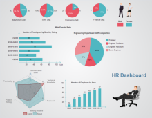 |
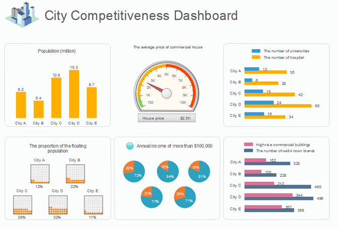
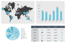
| Retail Dashboard | Monthly Sales Dashboard | HR Dashboard |
 |
 |
 |
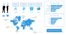
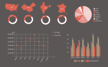
| Marketing Dashboard | Sales Status Dashboard | Infographic Ring Charts |
Chart Software Recommendation
You can use some free download Interactive Chart Software or click on the download buttons to create visually appealing charts for both business and educational usages. Simply drag and drop the built-in templates and symbols on your drawing board, fill in texts, and change themes using auto-create features.
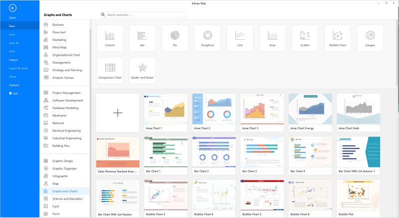
EdrawMax is the versatile diagram software that integrates 100% functionality and libraries of all other drawing products.