Line Graph
Know it All about Line Graph
A line graph, also known as a line plot or line chart, is a graph that displays quantitative values over a given time interval by connecting individual data points with lines. Line graphs have two axes: the x-axis (horizontal) and the y-axis (vertical), which are graphically denoted as x and y, respectively (x,y).
A line graph can be used in a variety of ways, but like every other form of a graph, it's crucial to know when/why to use it instead of some type of graph or data presentation process.
To help in visualization, line graphs use data point "markers" that are linked by straight lines. This form of a graph, which is used in a variety of fields, can be very useful in representing changes in values over time. Line graphs are the most popular visual representation of values over time in finance. They're often used to reflect shifts in stock prices, fluctuations in shares, business sales, and so on.
Moreover, line graphs are very useful in investing, particularly in the field of technical analysis, since they enable the user to visualize patterns, which can greatly aid them in their evaluation.
In statistics, there are three types of line graphs: simple line graphs, multiple line graphs, and compound line graphs. Depending on the form of data being analyzed, each of these graph forms has different applications.
1. Simple Line Graph
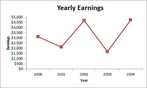
A single-line graph is referred to as a simple line graph. It depicts the relationship between two variables. One of these variables is independent, while the other is a dependent variable. Time is commonly the independent variable, although other variables may also be used.
In the example below, Earnings is the dependent variable while Year is the independent variable. This graph depicts an individual's annual earnings over five years.
2. Multiple Line Graph
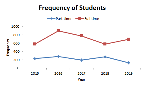
A multiple line graph is a line graph with two or more lines plotted on it. It's used to display the changes in two or more variables over the same period. The independent variable is typically plotted on the horizontal axis, whereas the two or more dependent variables are typically marked on the vertical axis.
If you want to compare the population of full-time and part-time students in a school for a few years, for example, you can use a multiple-line graph like the one below.
3. Compound Line Graph
This type of chart is used when data can be divided into different categories. It's an evolution of the basic line graph, which depicts the overall data proportion as well as the various layers that bring up the data.
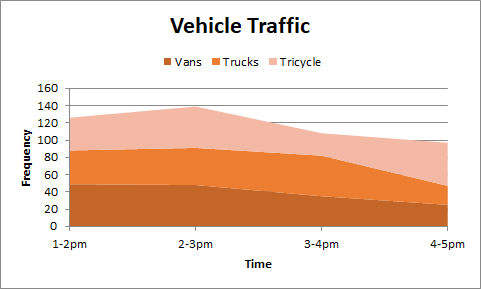
You must first create several line graphs, then shade each portion to denote the component of each data from the total while creating a compound line graph. The bottom lines represent a portion of the total, while the top line represents the total. The distance between any two consecutive lines on a compound line graph represents the size of each element, with the bottom line being surrounded by origin.
4. Constructing a Line Graph
Line graphs can be created manually or with software like Microsoft Excel, which significantly increases the speed and clarity of the final product. Other than that, you can use pre-built templates in EdrawMax and create one within minutes. This article will show you how to easily build a line graph in both of them.
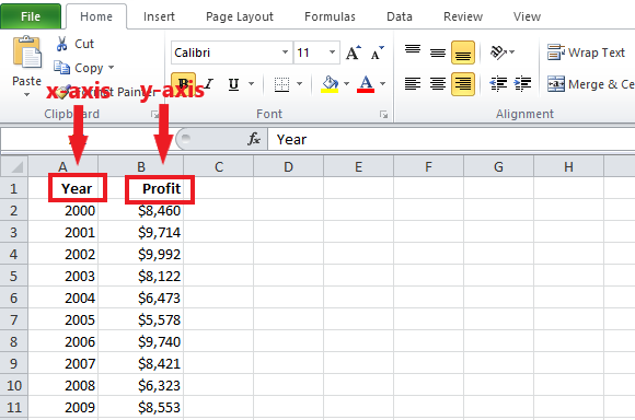
Excel is a useful tool for data visualization because it can turn the data into a line chart for you automatically. For this guide, we'll look at an illustration of a company's annual profit from 2000 to 2009. When making a line graph for your data, look at the sample data below and follow these basic steps.
Step 1: Firstly, start by entering data on your Excel worksheet. You’ll need to have both horizontal (x) and vertical (y) axes so make sure to indicate these axes by using two columns. The data for the horizontal axis should go in the left column, while the data for the vertical axis should go in the right column.
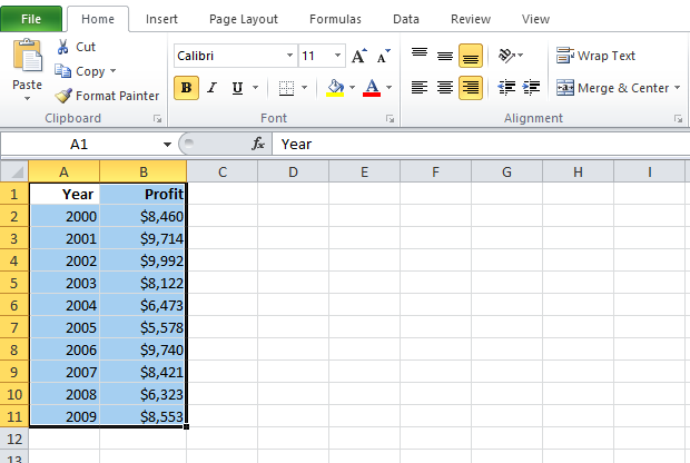
Step 2: After you've finished formatting the data axis, you'll need to build your line graph. To make a line graph, select the cells that contain your data.
Next, go to the Insert tab, then click on Line to create a line chart for your data.
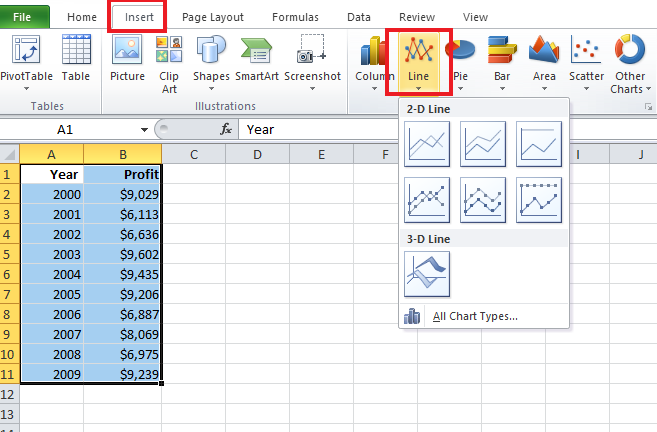
After clicking, you’ll successfully create it on Excel.
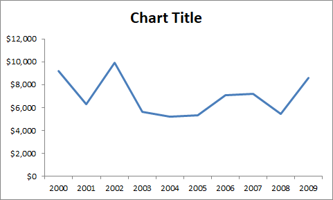
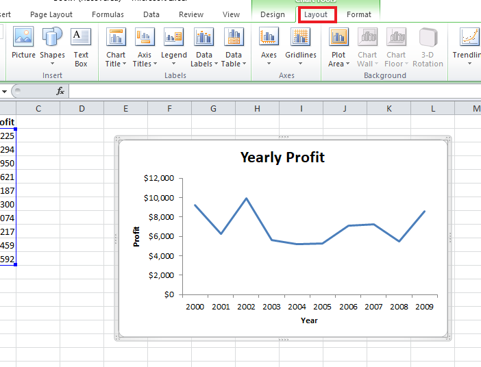
Step 3: You can further modify your line graph by changing themes, changing labels, changing the title, changing the axis, and so on. To do so, go to the Excel application menu, click on your graph, and then on Layout. Here, you can make changes as per your requirements.
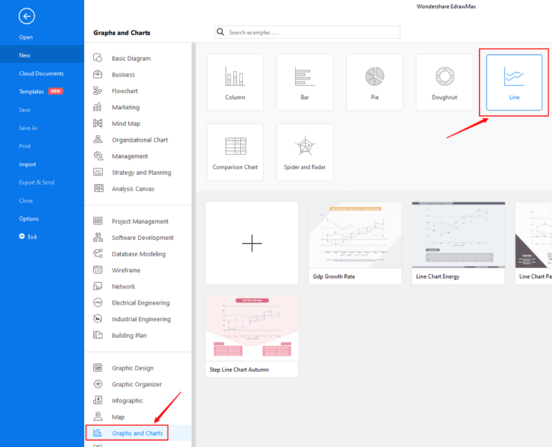
Step 1: Open EdrawMax from your computer, and navigate to [New] > [Graphs and Charts] > [Line].
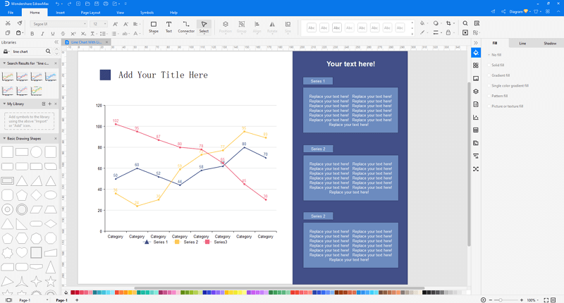
Step 2.1: Choose a pre-made template from the template gallery and open it. You will see the chart on the canvas with a lot of editing tools on the top menus and right panes.
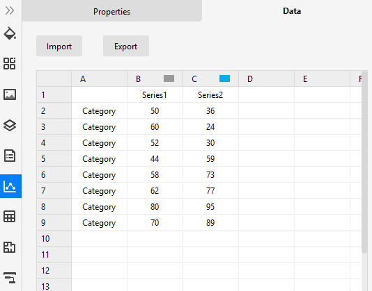
Step 2.2: After you open a blank line chart template or insert one on the canvas, you can import the data by uploading files (XLSX or CSV) or pasting the data on the windows.
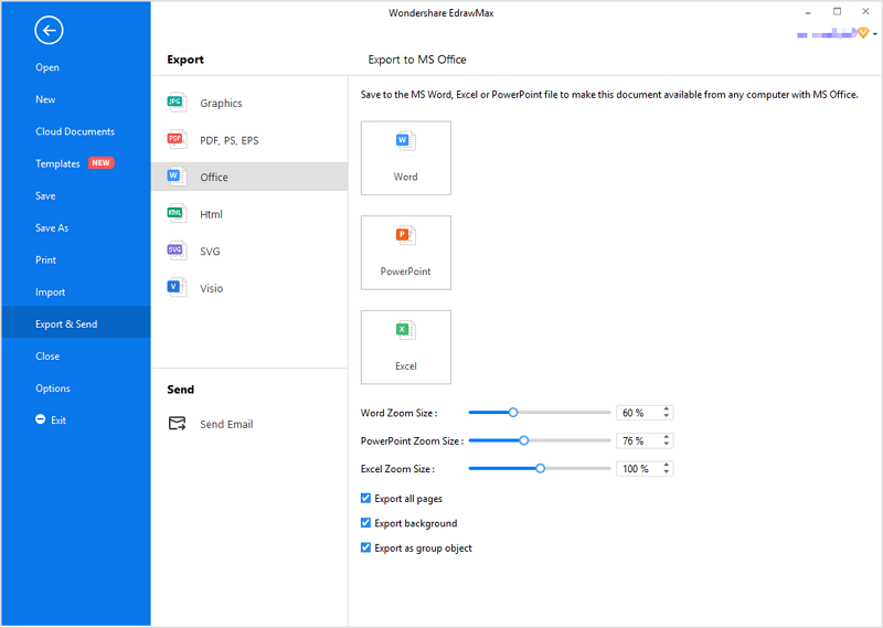
Step 3: You are able to save and export the chart to graphics(JPG, PNG), PDF, editable MS Office file format, SVG and Visio vsdx file format when you finish the design.
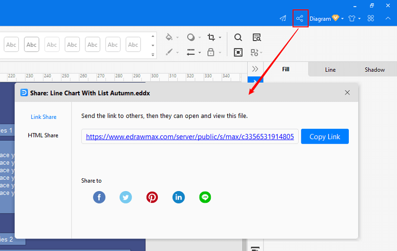
Step 4: You can also share your line chart with others via social media or sharing links. In addition, you can publish your chart into EdrawMax's online template gallery.

・ Simple alternative to Visio
・ 26k+ symbols
・ 10K+ free templates
・ 10+ AI diagram generators
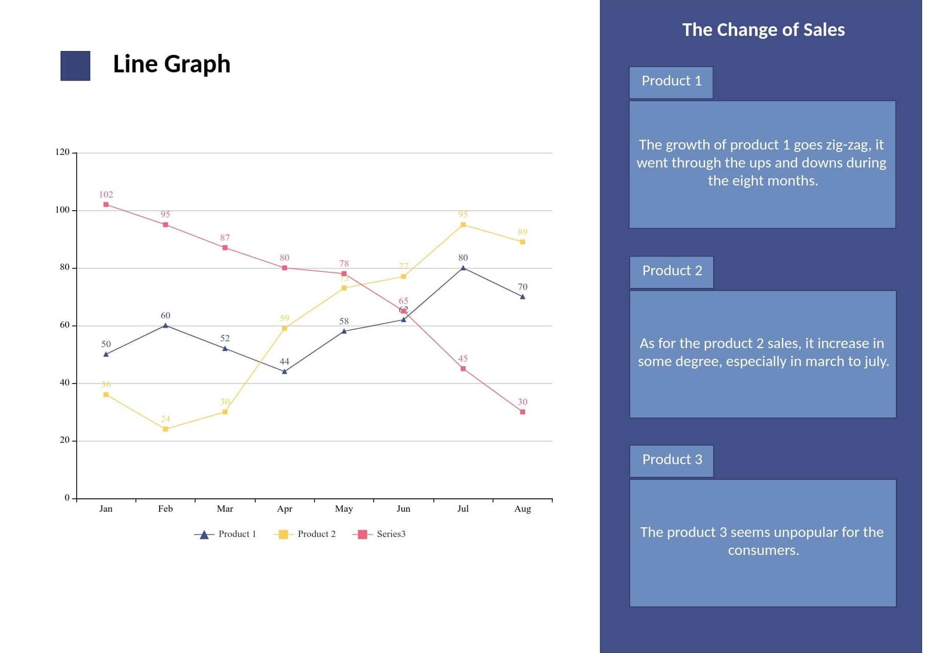
Below is an example template available at EdrawMax Online. This line chart clearly shows the fluctuations in sales of 3 different products between January and August. The increase/decrease is evident in a zigzag pattern.
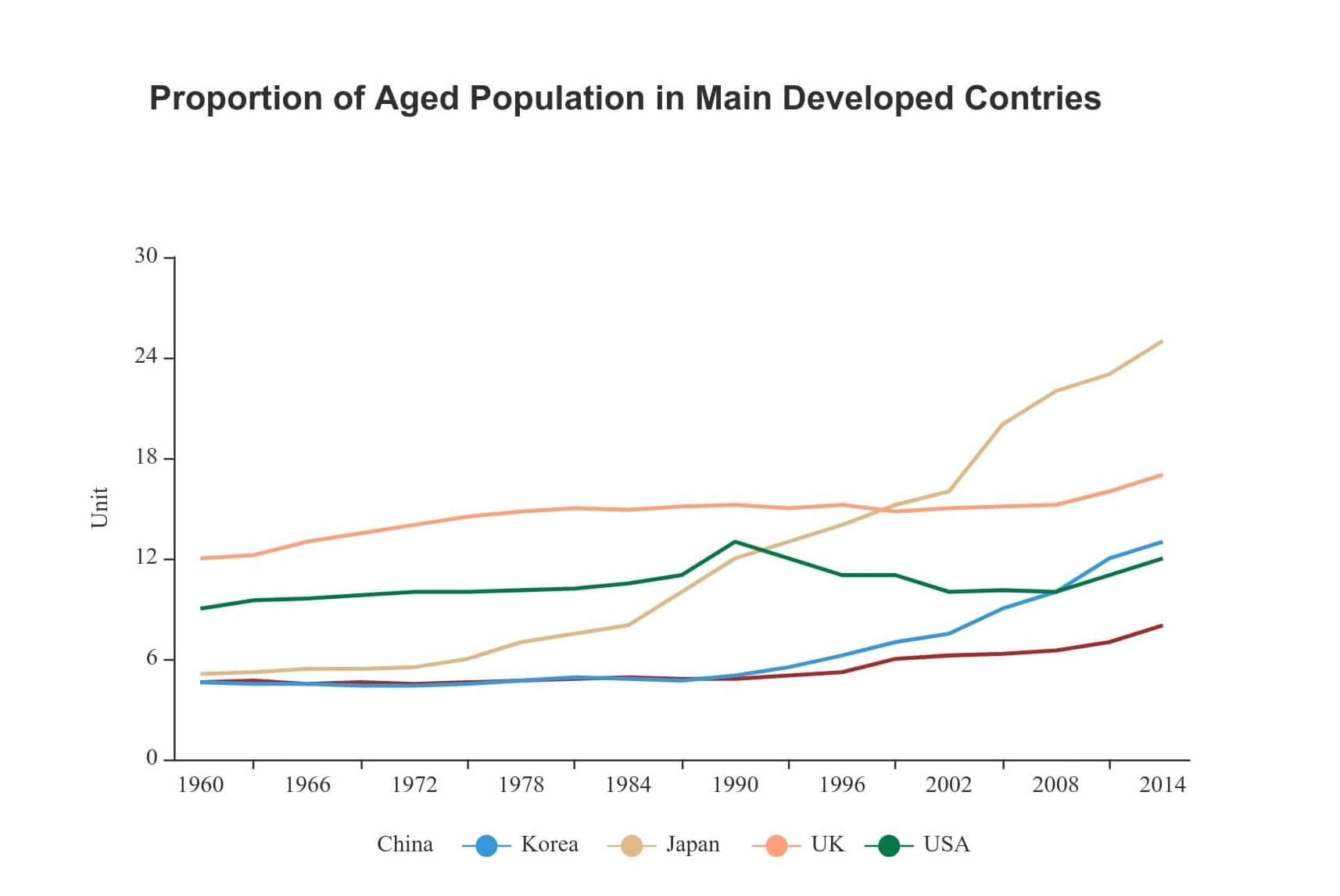
Here is another template of a line chart diagram showing the aged population in the developed countries such as China, South Korea, Japan, the UK, and the USA. This example of the Aged Population Line Chart depicts the age gap in several countries over time.
Lastly, line graphs are widely used in finance, business, sales, and other fields for several reasons. They make visualization of the data more effective and it is easier to understand as well. In the above guide, you can get tips on how to create a line graph on Excel as well as on EdrawMax.


