Scatter Plot
Know it All about Scatter Plot
A scatter plot is a map that is used to display and analyze the relationship between variables. The variables' values are represented by dots. Scatter plots use Cartesian coordinates to represent the values of the variables in a data set since the placement of the dots on the vertical and horizontal axes informs the value of the respective data point. A scatter plot is also known as a scattergram, scatter graph, or scatter chart.
In 1833, English scientist John Frederick W. Herschel used the modern scatter plot for the first time in research on the orbits of double stars. It is believed that individual data points were plotted on a Cartesian plane for the first time in this analysis.
The following are some of the benefits of using a scatter plot:
A few limitations that have been found with the use of scatter plots are below:
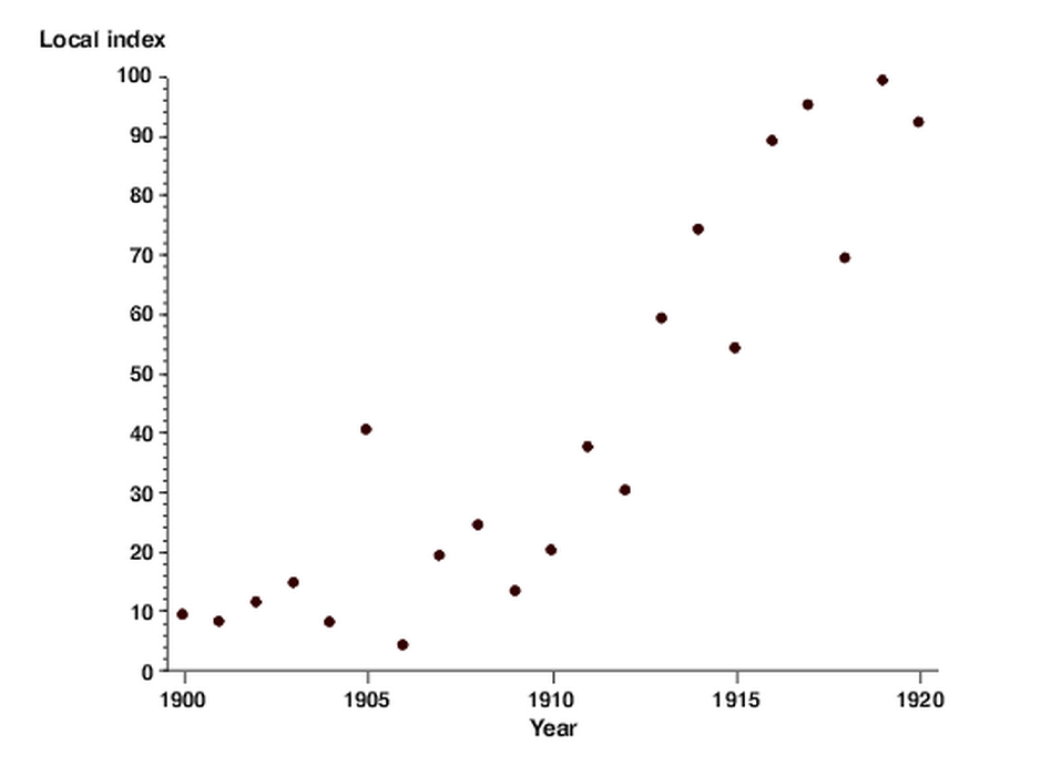
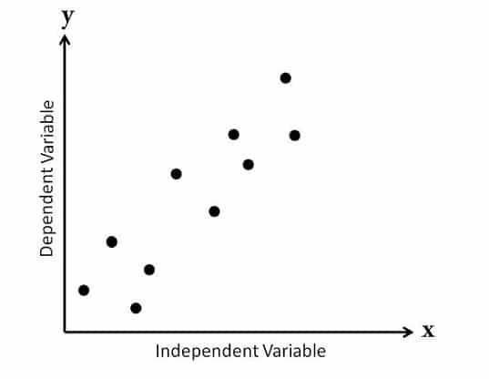
The primary purpose of a scatter plot is to observe and display relationships between two numeric variables. In a scatter plot, the dots show not just the values of individual data points but also associations when the data is viewed as a whole.
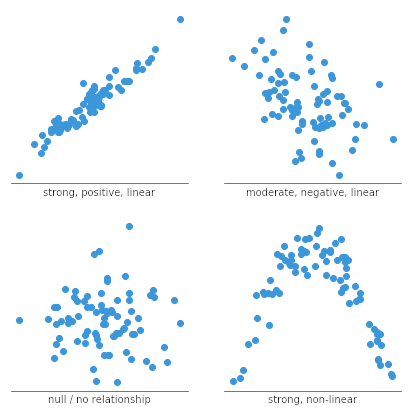
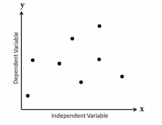
Scatter plots are often used to identify correlational associations. In these situations, we want to know what a successful vertical value estimate would be if we were given a specific horizontal value. The variable on the horizontal axis is sometimes referred to as an independent variable, whereas the variable on the vertical axis is referred to as a dependent variable. The observed relationships may be positive or negative, non-linear or linear, and strong or weak.
Line charts provide an excellent way to map independent and dependent variables that are both quantitative. When both variables are quantitative, the line segment that connects two points on the graph expresses a slope, which can be interpreted visually relative to the slope of other lines or expressed as a precise mathematical formula.
Scatter plots are similar to line graphs in that they start with mapping quantitative data points. The difference is that with a scatter plot, the decision is made that the individual points should not be connected directly together with a line but, instead express a trend. This trend can be seen directly through the distribution of points or with the addition of a regression line. A statistical tool used to mathematically express a trend in the data.
If the markers are close to making a straight line in the scatter chart, the two variables have a high correlation. If the markers are equally distributed in the scatter plot, the correlation is low, or even zero.
Scatter plots can be classified into many ways. Based on the correlation, scatter plots are of three main types. These are discussed below.
In this type of scatter plot, the data points are spread all over the graph randomly. Therefore, you cannot draw a straight line through them. As a result, it shows that there is no correlation between the variables. It is also known as 'Scatter Diagram with Zero Degree of Correlation.'
In this type of plot, you can spot that the data points exist a little closer as compared to the first type. Therefore, you can say there is some kind of a relationship between the variables here. It is also known as 'Scatter Diagram with a Little Degree of Correlation.'
Apart from the relationship between the variables, scatter plots can also be categorized based on the slope or trend of the data points. These are below:
The scatter plot is a useful graph, specifically when you need to figure out how two sets of data are linked. Let's look at how to make a scatter plot in Excel along with step-by-step instructions.
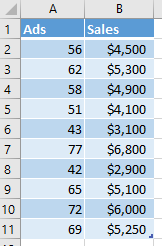
Step 1: The first step is to enter the datasets into the worksheet. Here we are looking at the relationship between the number of advertisements and the resulting sales. You can either enter the data manually or import it from external sources.
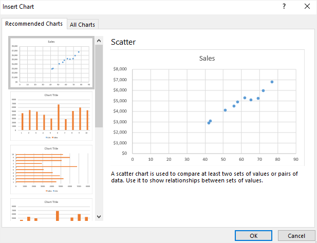
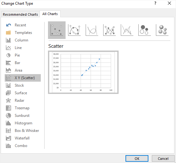
Step 2: Next. Select the complete data range on the worksheet, go to the 'Insert' tab, then Charts, and select the scatter plot icon. Besides, you can go to Recommended Charts option and select your desired format.
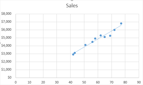
After selection, your scatter plot may look like this:
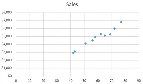
It shows that the data points for ads seem to connect with increasing sales.
Step 3: To make your plot clear and more readable, you can add a trendline. To do this, select the plot, go to the [Design] tab, and then to [Add chart element]. From here, check Trendline:
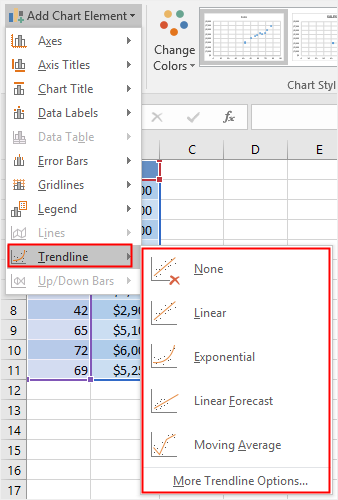
Choose the required Trendline option for your scatter plot. In this example, a linear trendline is used.
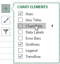
Step 4: In Excel, almost every aspect of a scatter plot can be customized. In this step, you can adjust or remove the chart title, add axis titles, change the chart types or colors, and so on.
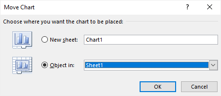
Step 5: After completion, you can move your chart into another place. Simply click the Design tab and select Move Chart; you'll see the following options:
To change the chart type, select it from the Design tab, and a new worksheet will appear. Here you can choose from options such as Scatter with Smooth Lines and Markers, Scatter with Smooth Lines and Scatter with Straight Lines.
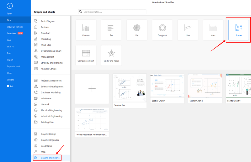
Other than Excel, you can create a scatter plot in EdrawMax with some quick steps as well. At EdrawMax, you’ll find amazing features along with pre-built templates for creating a scatter plot. Follow the easy steps below to create one.
<Step 1: Open EdrawMax from your computer, and navigate to [New] > [Graphs and Charts] > [Scatter].
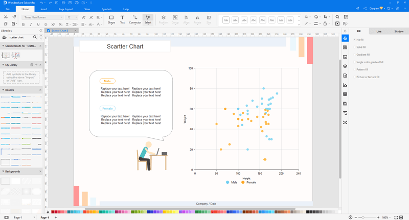
Step 2.1: Choose a pre-made template from the template gallery and open it. You will see the diagram on the canvas with a lot of editing tools on the top menus and right panes.
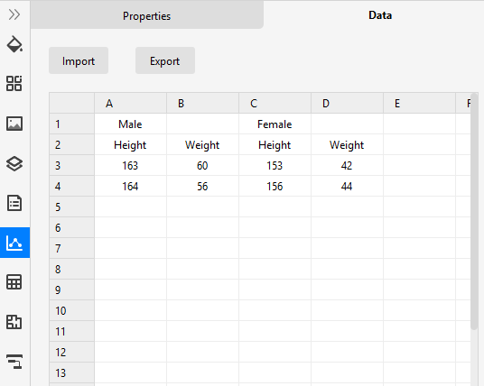
Step 2.2: After you open a blank scatter plot template or insert one on the canvas, you can import the data by uploading files (XLSX or CSV) or pasting the data on the windows.
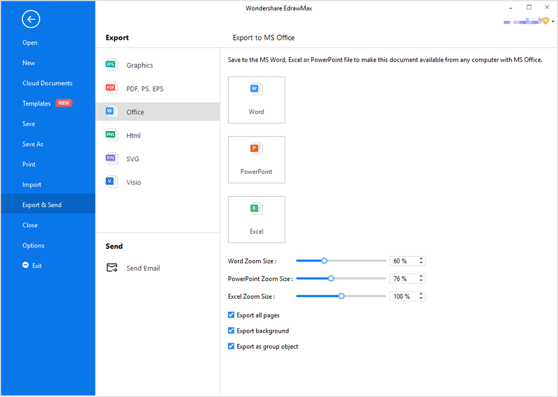
Step 3: You are able to save and export the chart to graphics(JPG, PNG), PDF, editable MS Office file format, SVG and Visio vsdx file format when you finish the design.
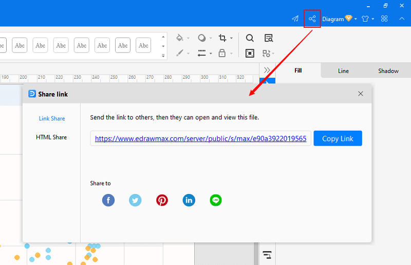
Step 4: You can also share your scatter plot with others via social media or sharing links. In addition, you can publish your chart into EdrawMax's online template gallery.

・ Simple alternative to Visio
・ 26k+ symbols
・ 10K+ free templates
・ 10+ AI diagram generators
Here is an example of a Scatter plot available at EdrawMax. It shows the annual correlation between the world’s population and CO2 emissions from the years 1960 to 2014. Besides, the graph also shows the distinction between males and females by different colored dots.

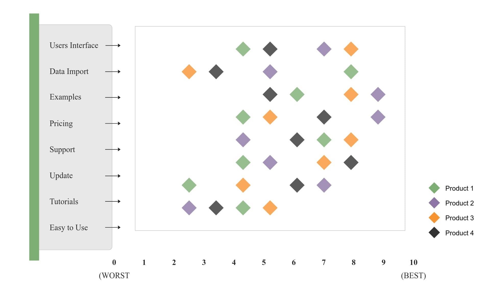
Below is another example of a scatter chart showing the relationship between two variables for a set of data. It is also available at EdrawMax. To find more, head over to their website.
Lastly, a scatter plot works best to find out the relation between two variables. The good part is that it is easy to construct as well as to understand. The article above consists of all the information that you may require about them. So, without further ado, create one on EdrawMax.


