Bar Graph
Know it All about Bar Graph
You have got data in different categories and plan on plotting it on a single platform, but can not seem to figure a way out? Do not worry that is where a Bar Graph comes in handy.
The Bar Graph also known as a Bar chart or Bar Diagram is a visual tool. A Bar Graph is generally used to compare data amongst two or more categories. The Bar Graph is mostly vertical but can also run horizontally.
The Bar Graph consists of two axes. Depending on the orientation of the Bar Graph the Axes are labeled respectively. One side of the axes have the values noted down while the other has the categories of the Data set. Between the axes, colored bars are drawn which represent the Data Series. The longer a bar is, the larger the value it is indicating. In some cases, a bar graph can also be plotted in a cluster to display more than one recorded value.
Bubble charts are useful graphs that are a popular choice for representing multivariate data. However, this chart has its shortcomings too. Let's see both of them briefly.
1) Vertical Bar Graph
This is the most common type of Bar Graphs. As you can observe the values are listed on the y-axis and the categories are listed on the x-axis. One disadvantage of the vertical bar graph is that detailed remarks about the categories can not be listed.
2) Horizontal Bar Graph
Another way to display a bar graph is horizontal, in this, the categories are shifted to the y-axis and values on the x-axis. This graph is mostly used to show growth trends in stock markets or popularity ratios in other departments. The free space on the y-axis allows a much more detailed description of the categories to be present.
3) Stacked Bar Graph
A stacked bar graph can be used to display a lot more information in respect to a simple bar graph as some information can be stacked. These can be plotted vertically or horizontally too.
4) Grouped Bar Graph
This is also a type of a ‘cluster Bar Graph’, which is commonly also called the cluster bar graph, that is used to display more than one value of a particular category. These are more descriptive than a simple Bar Graph.
As discussed, Bar Graphs are used to visualize comparative studies of data that is summarized Data. Since a Bar Graph is quite straightforward, they are the best choice to conduct a comparative analysis between summarized Data. There are four instances when a bar graph can be used.
1) Viewing each category of data spontaneously
While talking about statistics in meetings and presentations, the best way to present the summarized data is using Bar Graphs. The data can be viewed spontaneously and described in that manner too.
2) More than 5 Data Sets Present
Generally, other forms of Visual tools have a limit to the amount of data they can present. Bar Graphs come into play in places where such visual tools feel limited by that factor.
3) Comparative Study of Data
The grouped Bar Graph is best for the comparative study of Data that might be grouped.
4) Interrelated Data
Bar Graphs come in handy when data is interrelated, for those values, the best choice is a stacked bar graph.
Apart from these four instances, bar graphs are a quite handy visual tool that helps in plotting data graphs for much simpler values as well.
Microsoft Excel is the most used application when compiling data. It is used by businesses, teachers, and even NGOs to track things and create databases. Keeping that in mind, Excel also allows you to easily convert your already present data into the form of a Bar Graph. Following these simple steps will allow you to make your own bar graph.
Step 1: Make a table
The first step is to make a table with two values, one for the x-axis and the other for the y-axis.
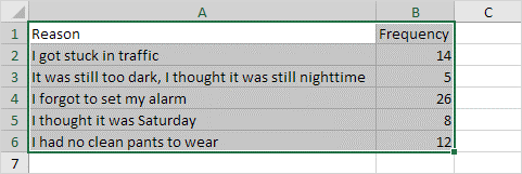
Step 2: Select the Table
The next step is to select the Table in which the values exist. In this case, it is from A1:B6.

Step 3: Tap the Column Symbol
On the top there should be a symbol present in the charts box, the symbol would be of Bar Graphs.
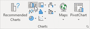
Step 4: Select preferred Bar Graph
A pop-up will drop down which will contain several types you can choose from. You can choose vertical or horizontal as you please. Since the values have more detail, we will select the Horizontal Bar Graph.
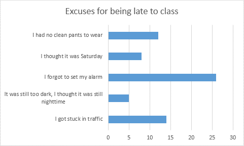
Step 5: Enjoy the Result
The result should look like this.
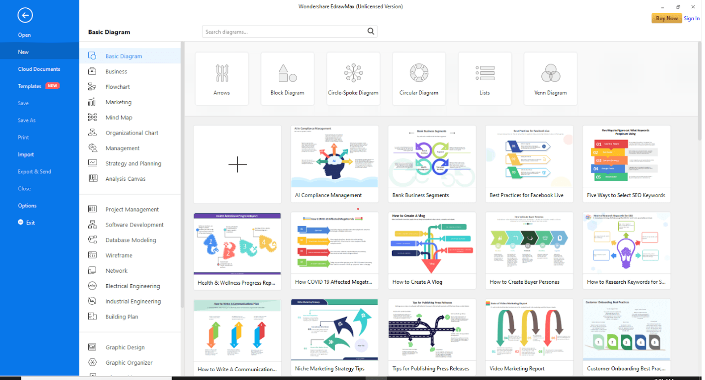
EdrawMax is one of the most useful software for data representation. It has inbuilt templates that help you create your desired visualization tool quickly. The following steps will help you make a Bar Graph in EdrawMax.
Step 1: Install EdrawMax
Go to the official website of EdrawMax and download the software.

You have both the free and paid version available. For basic tasks, the free version is sufficient.
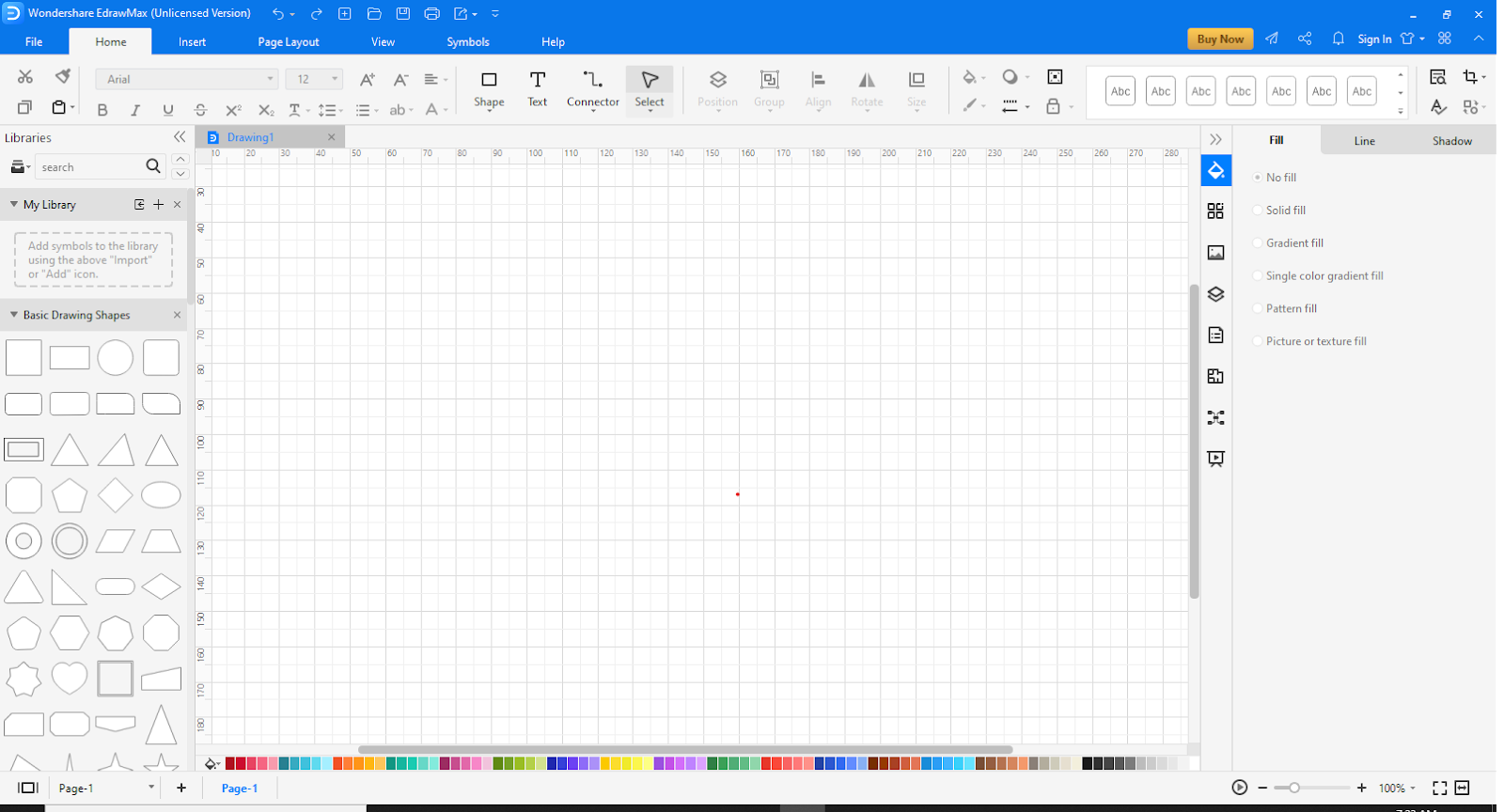
Step 2: Launch the App
Once the software has been installed, open EdrawMax. The interface will look like this.
At the top right corner, there is an option of signing in. This will enable cloud storage. However, you can use EdrawMax without signing in as well.
Step 3: Open a New Canvas
Click on the “+” sign to open an empty workspace.
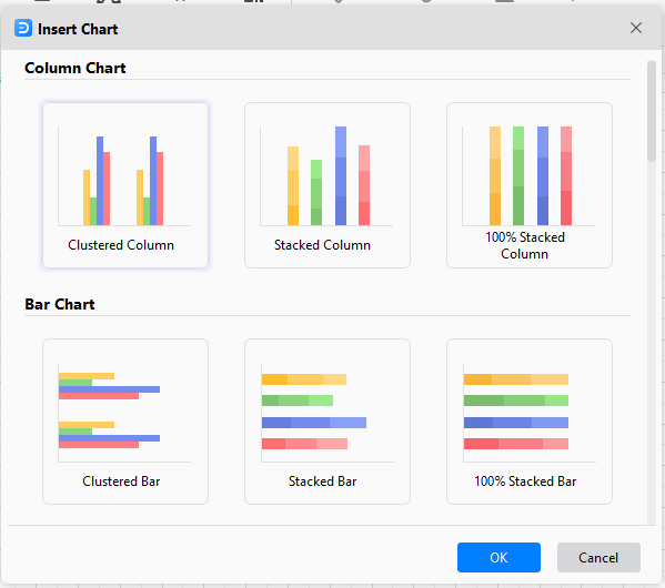
Step 4: Go to Insert
At the top, go to the Insert tab.

Click on “Chart” to view the templates. A pop-up will appear.
Step 5: Choose template
Scroll down to find the “Bar Chart.” Select it and click “OK.”
Step 5: Customize Bar Graph
As you can see, the right side allows you to edit the graph on the canvas, while you can also use the color palate below to edit the Bars in the Bar Graph.
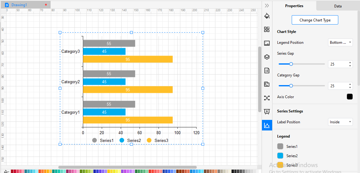
Once you have edited the Graph, save your file.

・ Simple alternative to Visio
・ 26k+ symbols
・ 10K+ free templates
・ 10+ AI diagram generators
Example 1:
This is a Bar Graph that shows the values of recorded average temperatures for 12 months.
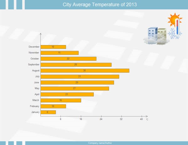
This is an example of a horizontal bar graph. The Months are present on the y-axis, while the temperature recorded is present on the x-axis. As you can see that the bars represent the maximum average temperature that was hit every month throughout the year. It is quite easy to compare the temperatures and deduce the overall hottest and coldest month of the year.
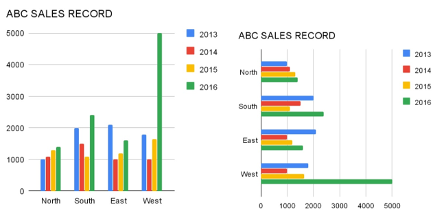
Example 2:
This is a grouped bar graph that shows the revenue generated by 4 individuals in each quarter during 2020.
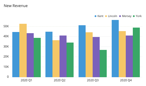
This grouped bar graph has the generated revenue values on the y-axis and the respective quarter for the year 2020 on the x-axis. As you can see that the revenue generated by Kent, Lincoln, Mersey, and York has been grouped and then plotted on the bar graph. This helps in analyzing the different data collected side by side. This grouped bar graph has allowed us to see who has been consistent throughout is each quarter which would be Mersey as he has generated almost the same revenue. Lincoln was much more active in the first one, while Kent has been continuously improving his revenue generated. York's data suggests that he had been slacking till the last quarter. Now, this data is quite useful for the employer in making crucial decisions for the company.
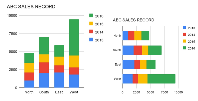
Example 3:
This is an example of a stacked graph bar.
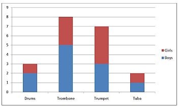
In this graph, the number of kids in total is kept on the y-axis while the types of instruments they prefer are present on the x-axis. The bars are seemingly divided into two, one representing the number of boys and the other the number of girls, as the data is stacked, hence the name of the graph.
The Bar Graph is a very important visual tool utilized by every stratum of society that wants to present their data professionally. There might be instances where this might be confused with a column chart, but the biggest difference is the apparent existence of wider bars on the graph. It is perfect for comparing data that is quantitative, so use this tool wisely. It can easily be made on either excel or EdrawMax. Just be sure of what you need and get to work!


