Radar Chart
Know it All about Radar Chart
A radar chart is a way of displaying multivariate data through graphs. This is a two-dimensional chart with one or more groups of values plotted over the common variables. Each variable has a different axis that is then arranged around a central point with equal spacings. The data is then plotted and connected to form a polygon. Multiple observations can also be plotted for displaying multiple polygons on a single chart. Due to the shape of these charts, they are also popularly known as spider web charts, star plots, polar charts, and web charts.
The history of radar charts is very vague, and there is confusion about who invented and used them first. The most popular opinion is that Georg von Mayr (1841 - 1925), a German scientist was the first person to ever create and use a radar chart for representing data. He used this graph in 1877.
In 25,000 BC, the oldest known maps were found that showed parts of the land and the sky. It wasn’t until 649 and 684 A.D. that the earliest version of graphics was found in the form of Dunhuang star atlas.
After this invention, the charts then started getting popular among scientists and became a popular way of representing data.
It would be fair to say there is no such thing in this universe that doesn’t come with disadvantages. So is the case with radar charts; while they are really useful for graphical representation, they have some limitations. Let’s have a look at them.
Businesses often use radar charts for their multiple advantages. Since these charts are a great way of comparing data, companies often use this method to judge the metrics of a specific employee or a product. The competitive analysis allows them to find uniqueness and drawbacks between things. Let’s see some of the areas they use radar charts for analysis.
Comparing Employees
Radar charts are a great tool to compare the performance of employees in a company. The performance can be plotted on a single graph and compared with a team of workers or a specific employee. The best part is that more than one value can be plotted so his performance, punctuality, teamwork, technical knowledge, etc., can be judged with just one graph!
Analyzing Product Efficacy
This is another major area where radar charts are really effective. Businesses often plot these types of graphs to measure the success of a specific product against the whole product range. This helps them analyze how popular it is among the masses and is the manufacturing profitable or not.
Radar Charts are of three types: Simple Radar Chart, Filled Radar Chart, and Radar Chart with markers. All three are an extension of each other that helps us in understanding them better.
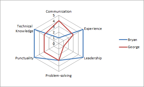
Simple Radar Chart
This is the most primary type of radar chart that is then modified to form the other two types. It expresses all the data with respect to the origin and displays the value of each entity in a dataset by joining the points on the graph.
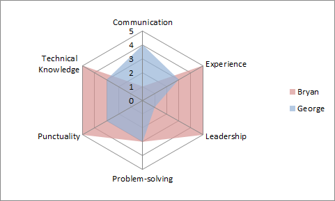
Filled Radar Chart
Filled Radar charts are an extension of the simple one and are so-called because they are filled with colors. This type of chart fills colors in the empty spaces between the lines and the center of the web. These charts develop a visual hierarchy and are the most appealing ones.
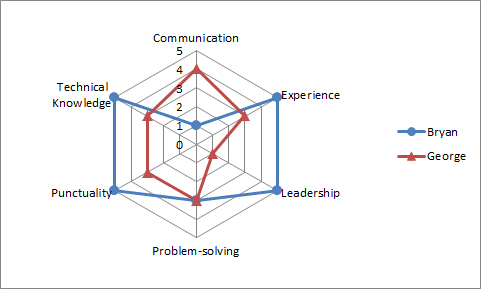
Radar Charts with Markers
This type of chart is very similar to the simple radar chart. The only difference between the two is that this radar chart has markers on the data points. The values are first plotted with markers and later joined together with lines.
Unlike many other graphs, these star plots only possess just a handful of basic components that are easy to understand and keep in mind.
Centre Point: This is the main point of origin from where the axis starts.
Axes: A radar chart needs to have at least two axes to represent the data two-dimensionally. One of the axes will be radial, while the other is circular.
Grids: This aids in dividing the entire graph into sections so the information can be plotted and understood more easily.
Data: After drawing the graph, the data points are plotted to make a sequence of equiangular spokes. Even though the chart is circular, the data is two-dimensional, and every entry is plotted with a distinctive color.
1. Download and open the EdrawMax software on your device.
2. Go to the New tab and select Graphs and Charts.
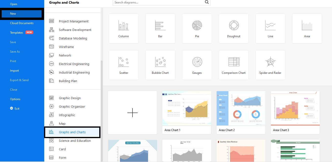
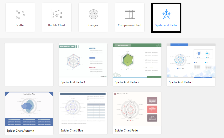
3. Select the Spider and Radar Chart tab. A list of templates will appear on the screen. Select a template or click on the plus-shaped (+) icon to start creating from scratch.
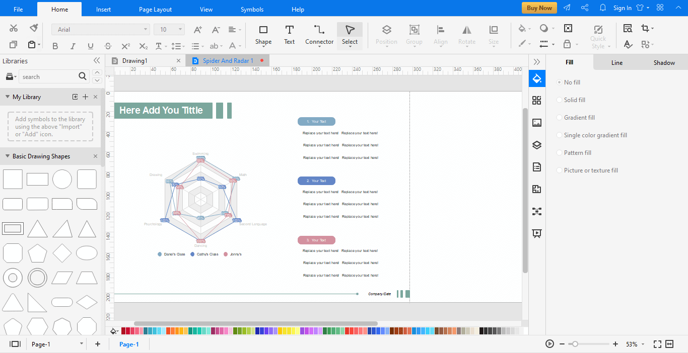
4. Edit your radar chart with the range of tools in the editor window. Add data and change the type of chart by clicking the Chart Type tab.
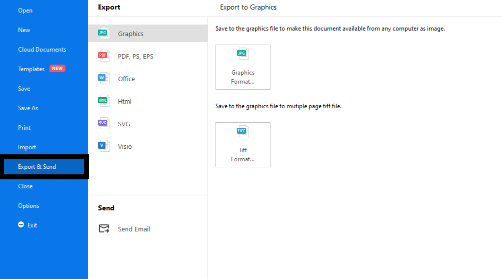
5. After you are done, click on the File followed by Export and Send. Select the type of file to save the work in your desired format.
・ Simple alternative to Visio
・ 26k+ symbols
・ 10K+ free templates
・ 10+ AI diagram generators
Creating Radar Charts is not a piece of cake, so here are some tips to help you get through the process.
Let’s have a look at some minimalist and creative spider graph templates from EdrawMax.
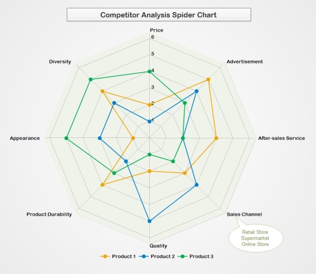
Competitor Analysis Spider Chart
This is a template that can be used to assess the performance of several products at once. Different color codings represent the different products, and the graph has multiple variables listed for comparison. This competitive analysis radar chart helps you analyze the reason for the success and failure of a specific product.
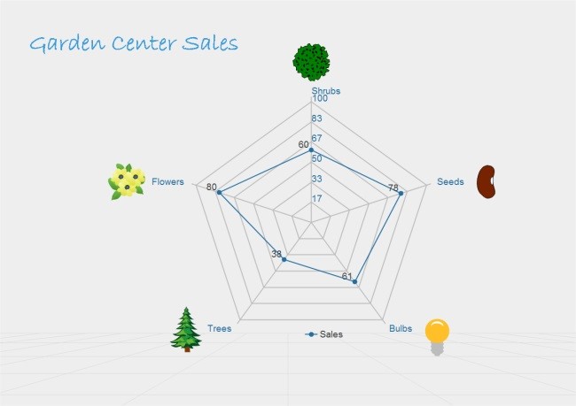
Garden Centre Sales Chart
This is a simple and minimalist radar chart that helps you guage the sales of different plants. Such radar charts are really useful for nurseries and garden suppliers who want to guage their weekly sales and keep a check on their supplies. It helps analyze what has been in demand in the past week and was the best-selling item.
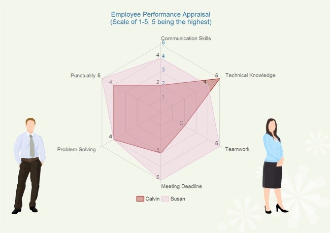
Employee Performance and Appraisal Chart
This chart is an effective way of comparing the performance of two or more employees. Different variables like punctuality, teamwork, cooperation, communication skills, management, technical knowledge, etc., can be added for the comparison. You can allocate points for each of these attributes and then compare an employee with an entire team or another employee.
I’m sure that after a thorough read through this guide, you are well aware of the radar charts, their types, and their distinctive uses. Helping in competitive analysis, these charts are a very handy tool. So, be creative and make your own radar charts with Edraw. Use the extensive range of tools to create a spider plot from scratch or customize a template according to your preference.


