What is a Pareto Chart?
Know it All about Pareto Charts
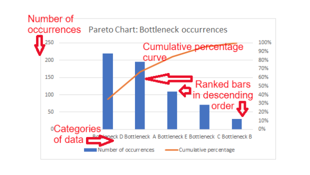
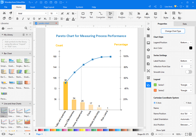
A type of chart with both bars and a line graph shows that discrete values are illuminated by dropping order by bars, plus the cumulative total is represented by the line. Such a type of chart is known as the Pareto Chart.
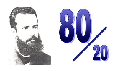
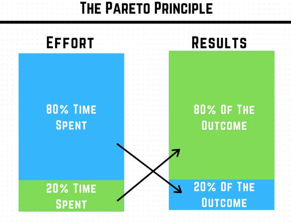
The Pareto principle is the main idea behind this chart. A Pareto principle says that roughly 80% of consequences come from 20% of the causes for many outcomes. This principle comes from the Vilfredo Pareto and the chart is based on the Pareto Principle, which’s why the name the Pareto Chart.
In other words, for the definition, we can say that Pareto Chart tells us the frequency of defects along with the cumulative of their impact. This Pareto chart helps us to seek the defects to prioritize and then, based on those priorities. We find which part is to be improved first or is important and necessary to improve.
The Pareto Chart’s history goes back to 1896 or 97 when an Italian economist Vilfredo Pareto devised a formula representing the uneven distribution of wealth in his book Cours d'économie politique.
Vilfredo Pareto noticed the few people have the majority of the wealth, i.e., 20%. He then derived the logarithmic mathematical imitation from illuminating this un-balanced distribution of wealth among the people. The other person, named M.O Lorenz, made a graph to visualize Pareto’s work.
After this, Dr. Joseph Juran illuminated that what the economist Pareto had derived was the universal principle applied in many different situations, not only just in economic and finance types of work.
According to its definition, the Pareto Principle is also known as the 80/20 Rule that 80% of consequences arrive from 20% of the causes.
The Pareto Chart consists of the bar graph and line graph in a partner. The parts of the Pareto Chart are described below.
The Pareto Chart is used when:
Look how to use a Pareto Chart in Six Sigma.
The Pareto Chart has many advantages, some of them are described below,
Some of the disadvantages are listed below,
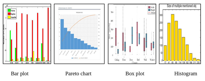
The bar chart and histogram are different from the Pareto chart because the Histogram and Bar Chart are alone calculated. Still, the values in Pareto Chart are calculated with the combination of the bar chart and the histogram.
The bar chart is also different from the histogram as the bar does not need to touch another bar but touch each other in the histogram. Learn more about the differences between histogram and bar chart.
In the Pareto Chart, the bars are always in descending order (from tallest to shortest), but in the histogram and in the bar chart, the bars can be made in any order.
Plus, the Pareto Chart also uses the line graph, which means the line graph rises from left to right, which is quite different from the bar chart or histogram.
Source: https://www.researchgate.net/

・ Simple alternative to Visio
・ 26k+ symbols
・ 10K+ free templates
・ 10+ AI diagram generators
The Pareto Chart can easily be made in Microsoft Excel. Here are the tutorials.
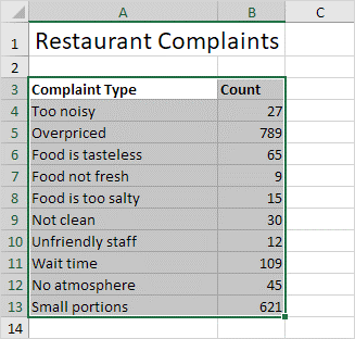
Step 1: Select the range from A3:B13.
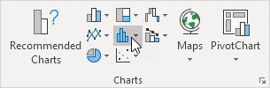
Step 2: Go to [Insert] Tab, which is in the charts group, and there click the histogram symbol.
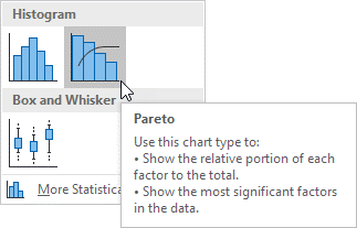
Step 3: Click Pareto.
Step 4: See the result and check the diagram
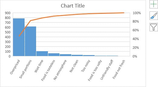
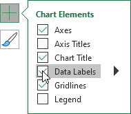
Step 5: Click the + on the right side of the chart. From there click the check box next to the data labels.
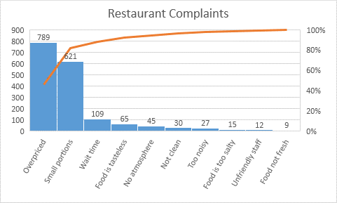
Your final result will be like this.
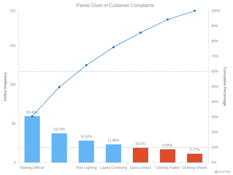
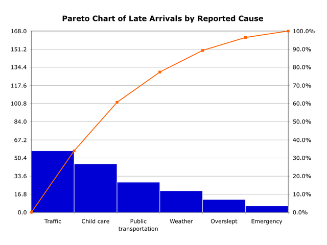
This the example of the Customer Complaints Pareto Chart. As we can see the major cause of all problems is the Parking Difficulty and should be mitigated first. The problems according to their severity are designed on the chart. The problems are represented in the bar graph format while the cumulative impact is embedded in the line graph.
According to this Pareto Chart, parking difficulty, sales representative's rudeness, plus poor lighting affect the business more. So, now the company will mitigate them first.
So, now we can easily understand that the Pareto Chart is an important tool to find the major problems. In essence, the Pareto Chart is simply the chart to illustrate the Pareto's Principle, which is simply 80% of consequences come from 20% of the causes, for many outcomes.
There are hundreds of tools available over the internet to make a Pareto Chart for your purpose, but there is also one tool named EdrawMax, which makes your Pareto Chart more efficient and is highly recommended.
・ Simple alternative to Visio
・ 26k+ symbols
・ 10K+ free templates
・ 10+ AI diagram generators


