How to Make a Gantt Chart in Tableau?
Learn it All about Gantt Chart
In this article, we will know about how to make a Gantt chart in tableau. We will discuss the overview of the tableau, how to make a Gantt chart in tableau, and we will also discuss the best software to make a Gantt chart on.
But before jumping into the tableau, we should know the overview of the Gantt chart to understand what is happening in the Gantt chart tutorial. A Gantt chart is a project management tool that helps the project or product managers manage and track the project's progress using a chart.
A Gantt chart contains multiple columns, and on the first column, the tasks are listed. In the next column, the progress of the tasks is listed, which tells how much task is completed against the time duration, and the milestones are also marked using a diamond shape.
Tableau is the well-known software developed in Mountain View, California, in 2003, for data science and data visualization purposes. Tableau plots the latitude and longitude coordinates and connects spatial files using its mapping functionality.
Christian Chabot, Pat Hanrahan, and Chris Stolte were the researchers at Standford University who had their specialization in data visualization founded Tableau.
Tableau is the software that was specially developed for data visualization and analysis purposes. But now, the boundaries have been extended as a new field has emerged in the market called data science. So, Tableau is used by statisticians or data analytics, but now, the data scientists also use Tableau a lot.
Many of these people use Tableau because it is a very efficient tool that quickly turns insights into visualization, and it is straightforward and user-friendly. The software handles a bulk of data efficiently and quickly gives you the output in visualizations, calculations, datasets, etc. It also includes functionalities of MS Excel and others.
As we all know, the Gantt chart is the famous project management tool that lets the project managers track the project and check if it was going to the path that was desired in the first place. The Gantt chart is a tool that is entirely related to the data, and somehow it also shows you the visualizations.
So, it is good to use software that is precisely developed for data visualization purposes. You can make the Gantt chart efficiently with the help of Tableau as this software is related to data, and so it contains all the necessary tools to visualize the data as we want.
In this section, we will see how to make a Gantt Chart using the award-winning software Tableau. We will use all the features to make our Gantt Chart visualize the data efficiently and do all the stuff related to Gantt Chart to make it look complete and perfect. Follow the below steps thoroughly.
1, Connect to the Sample and then Superstore data source.
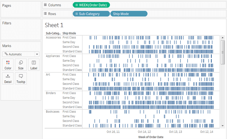
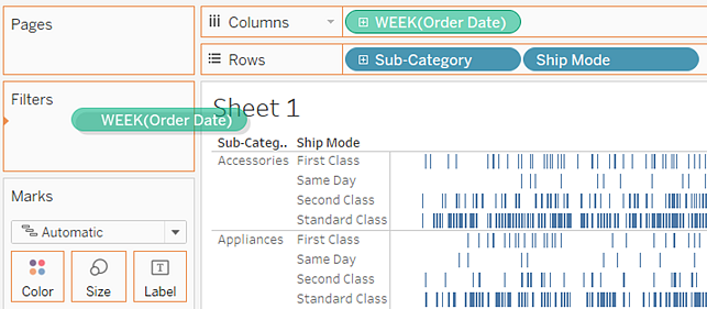
2, In the Columns, drag the Order Date dimensions.
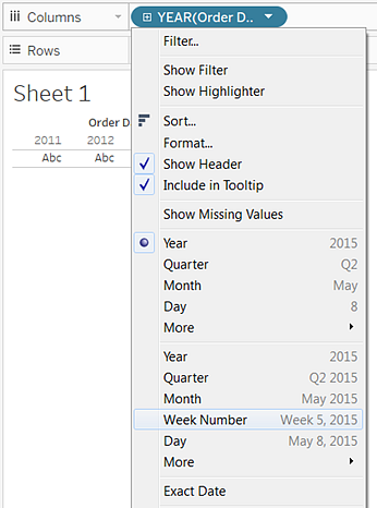
3, Click on the Year (Order Date) drop-down arrow from the Columns shelf and click on the Week Number.
4, To the Rows shelf, drag the Sub-Category and Ship Mode dimensions. To the right of the Sub-Category, drop the Ship Mode. The two-level nested hierarchy will build along the left axis.
To area the marks by seeing the length of the interval, we will do the below steps.
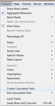
5, Click the Analysis, then Create and then Calculated Field from the toolbar menu, or you can also click on the Create and then Calculated Field by right or control-click on any field of the Data pane.
6, Name your calculated field OrderUntilShip, in the Calculation dialog box.
7, If there is any content by default in the Formula box, you can clear it.
8, Put the following formula in the Formula box and then click OK. The formula will capture the contrast between the Order Date and Ship Date.
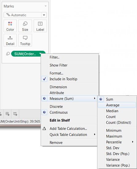
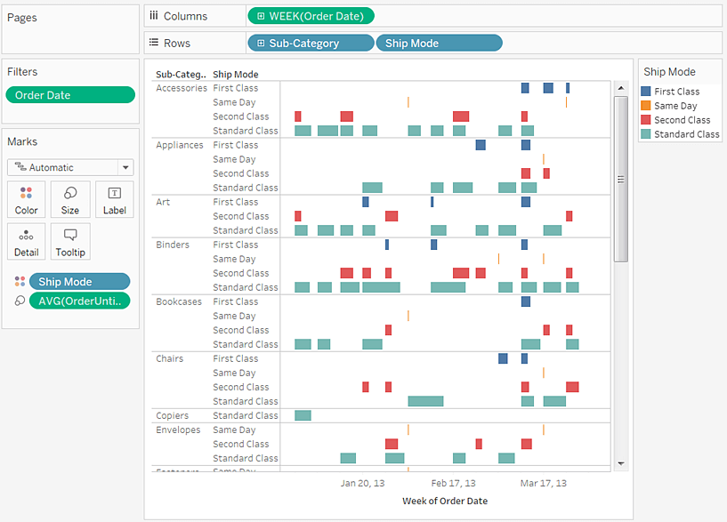
9, To Size on the Marks card, drag the OrderUntilShip measure.
10, On the Marks card, Right-click or Control-click the SUM(OrderUntilShip), then click Measure(SUM), and then Average.
11, To the Filter shelf, drag the Week(OrderDate) field from the Columns shelf by holding down the Ctrl key (option key on mac). In this way, you will add the same data to the new position without deleting the old one.
12, Click on the Ranges of Dates from the Filter Field dialog box and then click on Next.
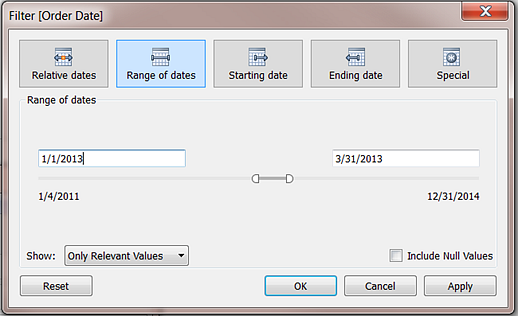
13, Make a date as the three-month time interval like 2/8/2012 to 5/4/2012, and then click OK.
14, To color on the Marks card, drag the Ship Mode dimension to Color.
15, Your final work would look something like this.
・ Simple alternative to Visio
・ 26k+ symbols
・ 10K+ free templates
・ 10+ AI diagram generators
Install EdrawMax on your computer or visit EdrawMax Online. Navigate to [File] > [Project Management] > [Gantt Charts].
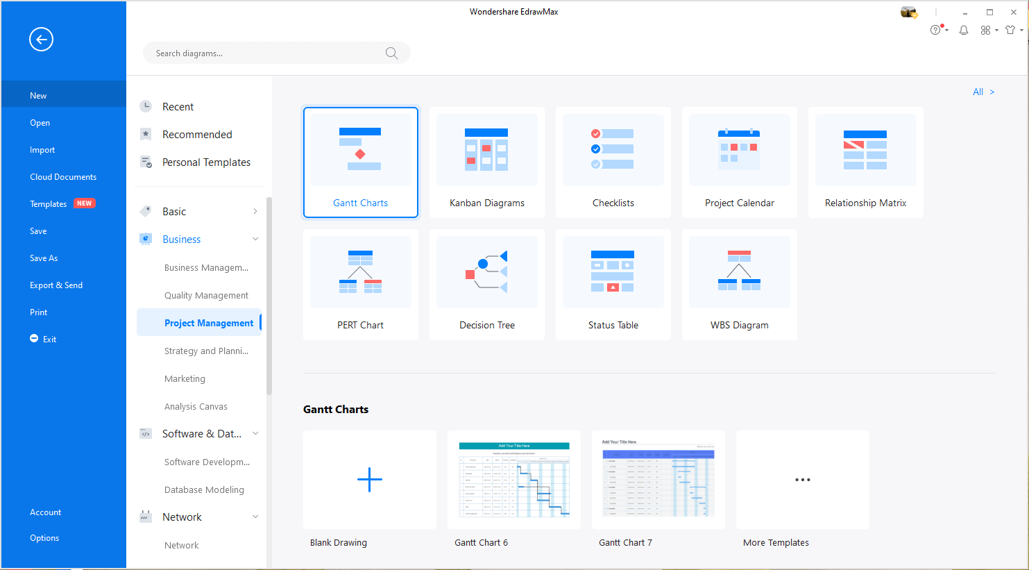
Double-click the icon of Gantt Chart. Or, you can choose to open a Gantt chart template to save your time of building the chart from scratch.
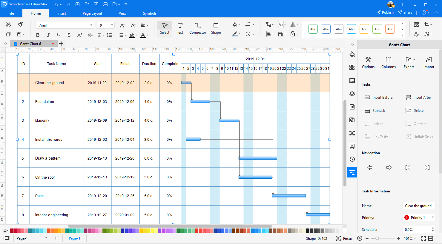
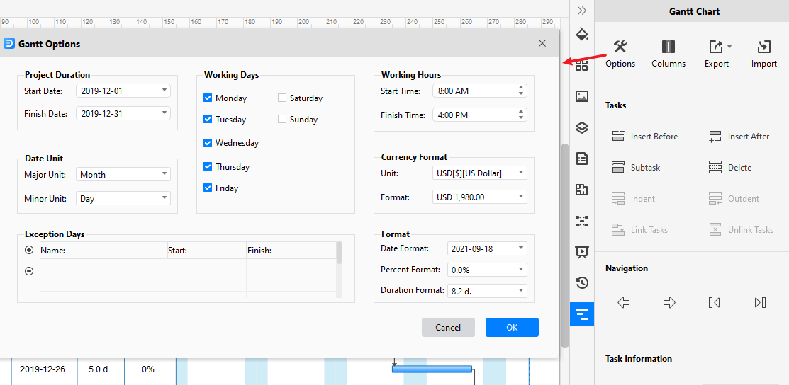
Select any task of the Gantt chart, you'll see the [Gantt Chart] pane on the right side of the canvas. Click on [Options], then a dialogue box pops up. You can set Gantt chart data in this dialogue box, including date format, start and finish date.
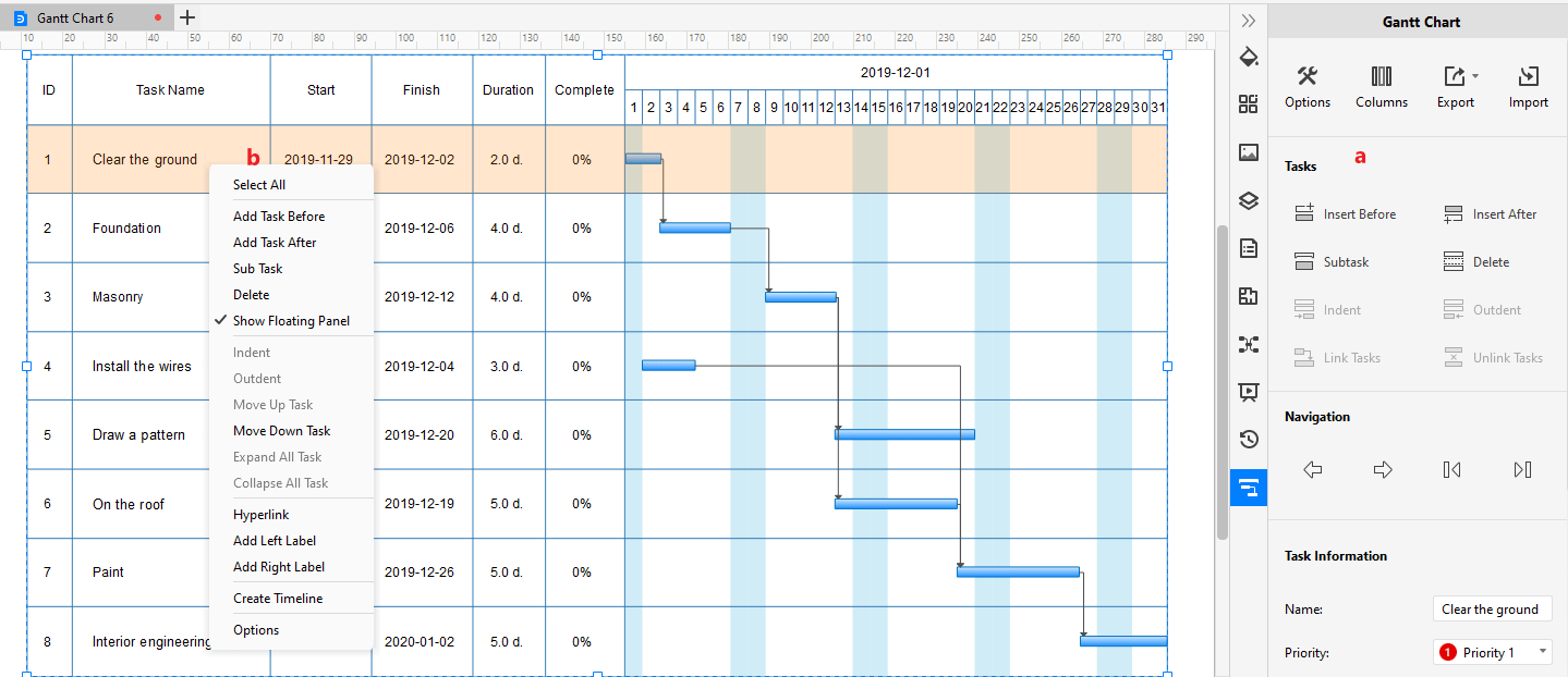
Right-click on the task or just select the task, you will see many options for editing the Gantt chart on the menu and the pane. You can add/delete tasks, nagivate the whole chart and add task information for individual tasks.
After creating the Gantt chart, you can save and export the Gantt chart in a number of file types, including PDF, PNG, JPEG, PDF, DOCX, XLSX, PPTX, and VSDX for Visio. Thus, even non-Edraw users can read and edit your Gantt charts.
In fact, EdrawMax also supports our users to import the project data that is stored in Excel files and generate their own Gantt charts in minutes. You can watch the video below and learn more details!
Creating a Gantt Chart before the project takes off and maintaining it during the whole project lifecycle is imperative. It gives the project manager a dashboard to track and see the work on the project.
It tells the project managers how much work has been done on the project, and if something undesirable is happening during the project, the project managers can take all the measures to make it expected with the help of the Gantt Chart.
You can use the experts' recommended software called EdrawMax to make your Gantt Chart. EdrawMax is a well-known diagram-making software that every professional person should motivate themselves to use it.
EdrawMax contains all the critical features and tools that will suffice you in making the diagram efficient and perfect. According to the developers, the software contains over five thousand plus diagram making symbols to make your diagram as you want it to look.
EdrawMax also provides hundreds of pre-generated templates that you can use to save your time. The software also allows you to import your project to customize it further!