How to Visualize Your Data with Bubble Chart Template
Edraw Content Team
The bubble chart is usually a variant of the scatter chart. Some people may confuse bubble chart with scatter plot. This article will help you find the differences between the two charts and visualize data with bubble chart template with ease.
In bubble charts, data points are usually displayed as the shape of bubbles on an excel sheet chart; there is an additional dimension added, which is the size of bubbles. Hence, there can be three dimensions to a bubble chart since it can incorporate x, y, and z values, while scatter charts include only x and y values.
When to Use Bubble Charts
Analyze Return on Investment
The instance of return on investment compared to the year of investment; when these two parameters are depicted with a bubble chart, it can also include a third variable that is investment size. Hence, instead of a mere dot, it becomes a bubble where the size of the bubble denotes investment size. Position of the bubble on the chart of x and y-axes are determined by the other two variables.
Manage a Football Club
Show the relation between promotional expenses and football as well as revenue growth. These three related variables can be plotted effectively with a bubble chart. The X-axis would highlight daily footfall while Y-axis would show promotional expenses. The area than inside the plot will show how corresponding figures for these two parameters; the bubble sizes would then show revenue that has been generated as well. This lends an effective picture to the sales and marketing team as to how effective their promos have been.
Analyze Online PPC Campaigns
Comparing CPC and clicks to conversions in online PPC campaigns. These are related and important parameters for web marketers. In order to know whether ones excess spending leads to more CPC and clicks, a bubble chart would prove useful. The volume of conversions would be shown in the bubble sizes.
In general, bubble charts help in visualization of growth or fall as the bubble sizes denote. Bringing in three parameters also makes a chart more meaningful and comprehensive.
Scatter Plot VS Bubble Chart
Scatter plots and bubble charts are analytical tools that are used in different business, marketing or any data analyses scenarios. They help compare data across different variables; however, there are certain commonalities as well as differences between these two chart forms.
One of the similarities is that both charts have circular forms that are used on a chart or an excel sheet instead of lines or columns.
There are two main differences between scatter plots and bubble graphs. In scatter plotting, the circles or dots do not have any width or size aspect; they can be mere dots or circles but they represent two variables. On the other hand, bubble graphs are essentially three-dimensional graphs. The bubbles and their sizes and volumes are not ad hoc but they represent the third parameter.
Hence, if a scatter plot represents sales amount and profit, a bubble chart can include a third parameter that could be a sales order quantity as represented by the bubble sizes.
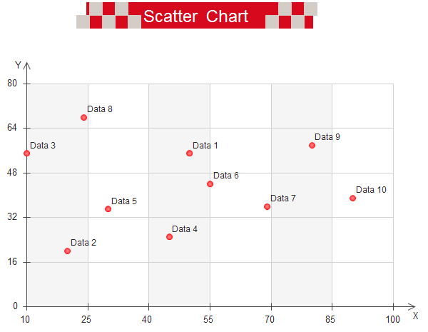
Scatter Plot
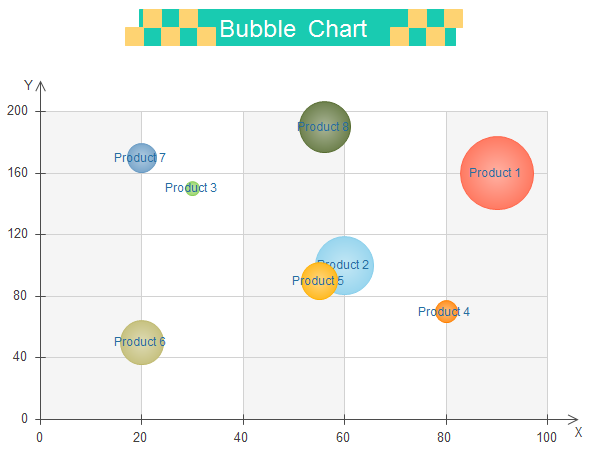
Bubble Chart
Learn from Bubble Chart Templates to Visualize Data
There are different tools that have a ready-made bubble chart templates and help visualize data in different ways. For instance, if you open a bubble chart template such as in EdrawMax, you would be asked to fill in data for the x, y axes and circles as per the data you want to display. Once the basic information is keyed in, there is a properties bar or editor tool that helps to adjust the colors or fonts as per your preference.
There are add-on tools in Edraw that can be installed and helps to create and insert a bubble chart on an excel sheet. Most tools that offer ready-made bubble chart templates having different visualization options. You could even choose a three-dimensional chart to show how the third variable is mapped.
Chart showcasing years of a brand, revenue over the years and sales volume. As can be seen, the number of years that a brand has been in a market is plotted on the X-axis while revenue is mapped on the Y-axis. Sales volume, on the other hand, is showcased by the size of the bubbles. As can be seen, the volume has remained similar between 10, 15 and 20 years in the market while it rose appreciably after 35 years in the market.
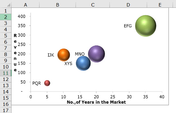
Image Source: www.wallstreetmojo.com
Sales data bubble chart showing planned and actual sales as well as sales percentage.
Here the X-axis shows planned sales figures while actual sales are plotted on the Y-axis. Sales percentage achieved between the planned and actual sales figures is showcased by the bubble sizes and written alongside the bubbles.
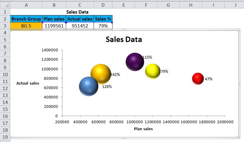
Image Source: www.wallstreetmojo.com
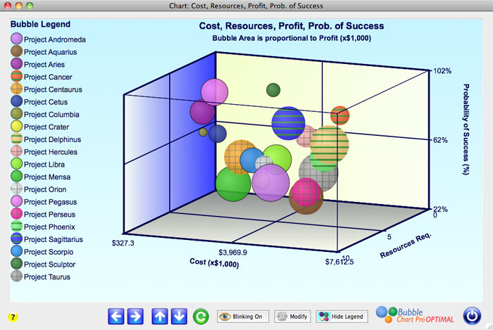
Three-dimensional bubble chart between resources required, probability of success and costs and profits.
Here several variables are plotted that include costs, resources required, probability of success while the bubble areas showcase profits.
EdrawMax
All-in-One Diagram Software
- Superior file compatibility: Import and export drawings to various file formats, such as Visio
- Cross-platform supported (Windows, Mac, Linux, Web)


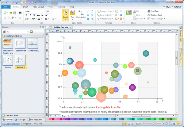
How to Create a Wonderful Bubble Chart?
EdrawMax can help in creating a bubble chart with simple steps that are easy to follow. The bubble chart that is formed helps one to comprehend a set of three variables and how they relate to each other. With Edraw, data can be sorted easily and charts completed. There are different kinds of operations that the templates here provide for users to create different effects.
Download bubble chart maker for FREE.
Step 1: Choose the Template as Per Data
Look at the data that need to be represented; accordingly, there are different formats or templates that one can look at. There are easy tools to set the maximum and minimum limits for the axes as well as set bubble numbers.
Step 2: Set the Template
There are several template options that you can choose from. There are readymade examples provided that makes the choice easier for Edraw users. They can double click on the example they find suitable and open it. They can modify it by keying in the numbers for both the axes.
Step 3: Set Point Numbers
The templates have 8 bubbles by default. There is a floating button on the chart that can be used to configure the point numbers. One can also delete or add on bubbles every time by adding or deleting a point. To set a certain set of bubbles, one can click on Set Point Number, enter the number and then choose OK.
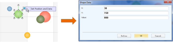
Step 4: Add Data
Data labels are illustrated in the floating menu of the chart; double click on the same to find text boxes that allow one to type in names. In order to add data for each bubble and for editing the X and Y axes the following steps can be taken:
- Double click on bubble area outside the label text box.
- The floating button of bubble shows on the right corner on top.
- Move the cursor to the floating button and enter data in the dialog box.
Step illustrated below.
Step 5: Fill Pattern and Colors
Choose a bubble and fill in a pattern of your choice or a color; choose picture option to add a background to the chart; picture added gets adjusted to bubble size. There are several patterns and colors offered that one can use for beautifying the graph.
Step 6: Save and Export
This is the final step. It helps you save the project file; you can revise it later or export it in HTML or print it in different formats such as png, svg, and pdf. The application also allows you to export to MS PowerPoint, Excel and Word with a single click.
Summary
The above sections demonstrate how a bubble chart is easily made with EdrawMax and associated tools that make complex data representation easy and attractive.

Edraw Content Team

