How to Create a Stunning Map Infographic?
Edraw Content Team
When it comes to representing data, the map infographic is the best way to go around it. It helps to add meaningful pictures to data and provide illustrations to bring forth the meaning of data that is being showcased. With several useful software tools available, it is possible to find different ways to illustrate data and create a professional look and feel to data-rich presentations or timelines.
What is Map Infographic?
Map illustrations have come a long way from the boring lines and shapes that simply indicated the part of the globe and data shown with colors, lines, and text. Edraw is one of the tools that one can use to create illustrated infographic maps. As the term states, these are map illustrations that can be designed in different ways with color choices, visuals through images and with countless template designs that nearly every software provides.

Types of Map Infographics
There are different kinds of infographic maps that one can experiment with. Here are some types in different instances:
Mixed Form
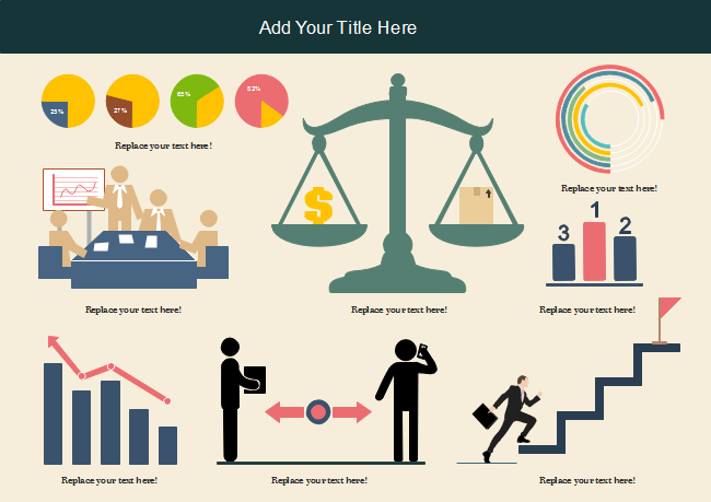
In this chart, different graphic formats are used. For instance, as seen in the example below, a business report is visualized by bar charts, pie charts, vector icons as well as maps. If you need to present different kinds of statistics, it is best to use a mix of different chart options.
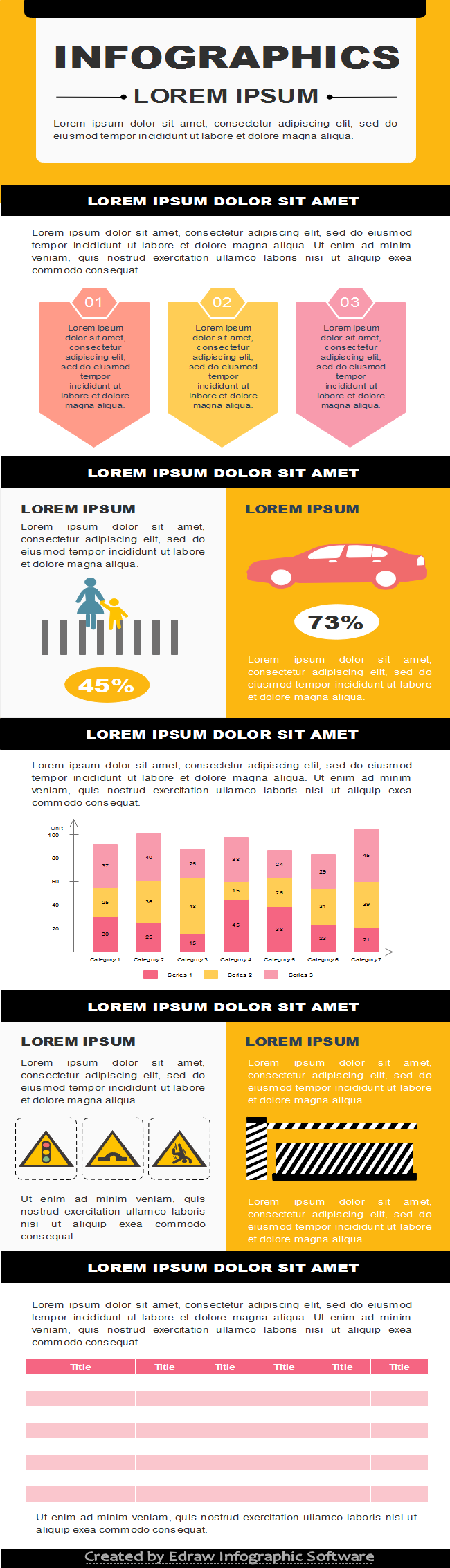
Information in List Form
This is another common form where information is portrayed through a mix of visuals and list-based data. As seen in the example given below, the presentation comprises text mostly which can be presented with colorful infographics. Information is enhanced with attractive colors and icons.
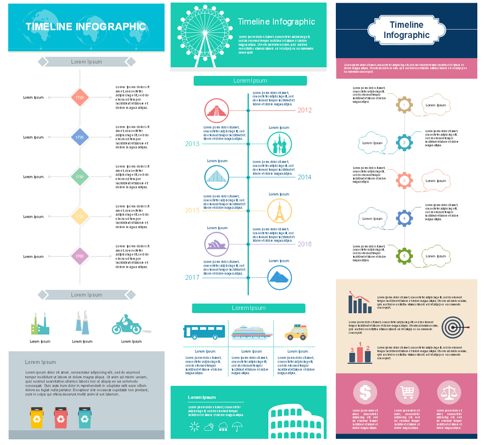
Timeline
This is another popular way to represent data - timeline. Here we can see the story of EdrawMax and its development in chronological order. This type of infographic is a helpful tool to depict brand stories and visualize how a product, person or trend developed over time. The timeline includes images, different chart elements, and icons.
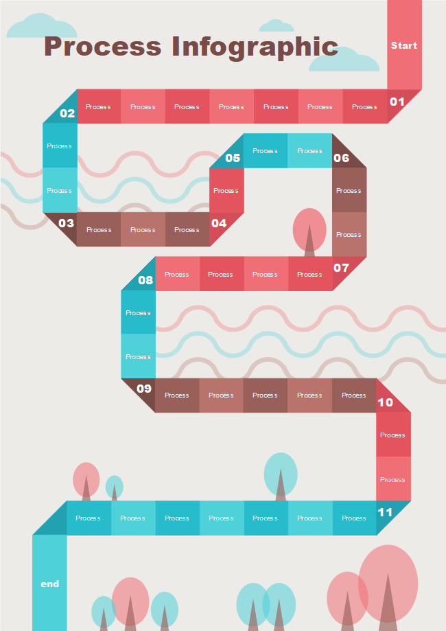
Process Map
It is another popular format that makes the use of images as well as text blocks in different colors to showcase a process flow. It could also be a decision-making method that is illustrated with a mix of visuals and short text boxes. Usually, these are data-rich reports that are broken down into informative and light-hearted messages and visuals.
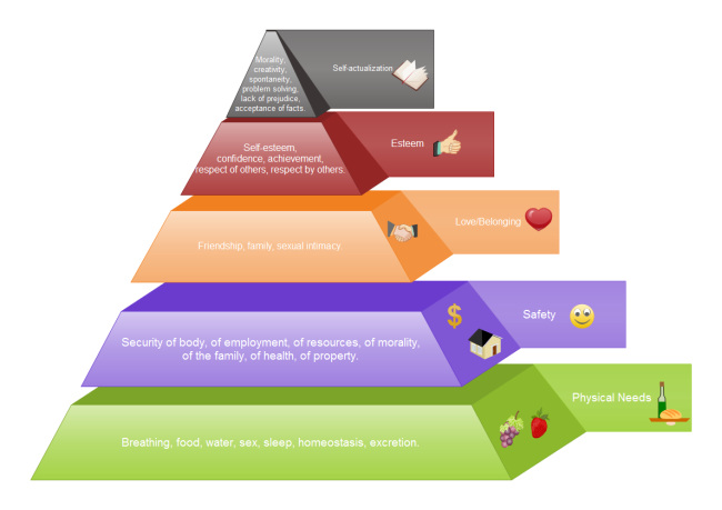
Hierarchical Data
It is another popular format that makes the use of images as well as text blocks in different colors to showcase a process flow. It could also be a decision-making method that is illustrated with a mix of visuals and short text boxes. Usually, these are data-rich reports that are broken down into informative and light-hearted messages and visuals.
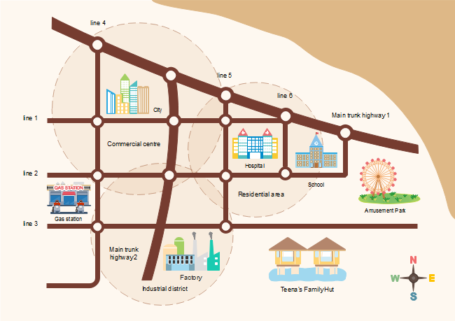
Location Maps
Maps are often used to show trends of different kinds and that could span global, national or local regions. With the use of different icons and color-coding, it helps to visualize statistics of different kinds that would stand out easily to the readers.
Comparison Charts
Infographic maps are also used to showcase comparisons between two products, services, events or ideas. As seen above, two distinct brands are showcased in direct comparisons with their logos and distinct services illustrated with contrasting visuals.
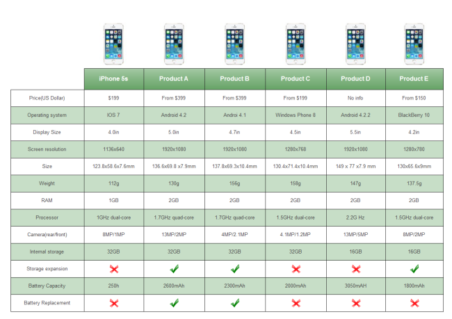
Photo-Graphic
Such a chart is enriched with photographic images and includes text, line charts, and icons. Usually, high-quality images are used in the background. These charts are rich in visuals and include distinct formats.

Image Source: www.visme.co
Single Chart
If you are wondering what are single chart infographics then the above form is a good example. The whole infographic only has one variable. Here bars or column-like structures are used, often in 3D form and include essential data that are easy to read and compare.
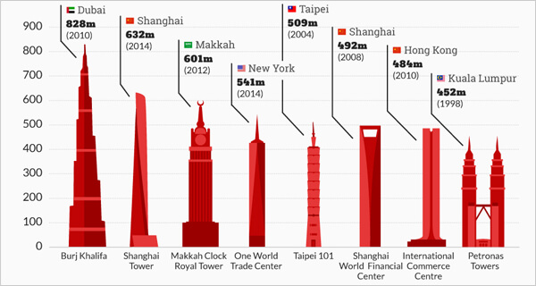
Image Source: www.visme.co
Excellent Map Infographic Creator
When it comes to creating world map infographic the Edraw software is one of the easy to use and versatile applications that one can opt for. It has several pre-made templates that make it easy for one to get started along with tools to add visualizations, customize the same and make edits in different ways.
EdrawMax
All-in-One Diagram Software
- Superior file compatibility: Import and export drawings to various file formats, such as Visio
- Cross-platform supported (Windows, Mac, Linux, Web)


Features
The features that this software offers are several:
- It has several templates to offer such as subway or street maps and other geo maps that are updated and pre-made.
- Geo-mapping comes along with solutions for adding directions, to add on geospatial information of different kinds.
- It is easy to set up sales regions or marketing campaigns as well as computer networks.
- Premade shapes available allow one to create customized maps or add on map shapes so that location information is visualized.
- Subway map creator is another useful feature; it helps to create subway maps easily; there are auto connections and it helps draw lines for subways easily along with the addition of station names in labels and with distinct shapes.
- Directional map maker is another feature that includes spatial as well as directional samples, map templates that users can opt for as well as a library to access for vector shapes of the different design elements; these elements can be exported to other formats easily such as on Mac or Windows.
Pros
- Map infographics can be created smoothly, especially with vector map symbols that are premade.
- It is easy to start creating infographic maps easily with the use of examples and map templates available.
- Editing is easily done with a point and clicks as well as drag and drop functions.
- Diagramming resources are regularly updated and enhanced.
- Technology support is available even for the free version
- It works on Windows 7 to 10 as well as on Vista and XP, Mac OS X 10.8 and later versions.
How to Create a Stunning Map Infographic?
EdrawMax comes with a large built-in library that includes several templates, drawing tools and shapes as well as over 10,000 vector icons to use on a user-friendly interface.
If you are new to EdrawMax for creating a unique illustrative infographic map, it can be done with the following steps:
Step 1: Choose a Template
When this option is selected, it showcases several template designs that one can choose from.
Step 2: Library Symbols
The next step is to look at library symbols. The easy buttons on the left-hand side of the application guide users by the consecutive steps to choosing the different elements for starting to create their infographic map.
Step 3: Adding Text
Here one gets a blank interface to add on the text as desired, with the use of text blocks, lines or images.
Step 4: Customize and Edit Details
Once the basic elements are chosen as well as the layout, one can click on each feature or aspect and edit the same which could include adding text, changing background colors, images or shifting locations.
Step 5: Export and Share
The last step is the ease with which one can share the created map over social media or email as well as export it to other software platforms.
EdrawMax is the application to opt for when business people, teachers and students wish to create different diagrams that showcase the flow of information, with the combination of text and images. The software is user-friendly and first-time users will be able to follow the steps to create simple or professional, elaborate flowcharts, organizational charts, network diagrams, mind maps and so forth.
Summary
It might seem daunting to create professional-looking infographic presentations but that is what versatile and easy to use software like EdrawMax makes possible. With EdrawMax, one is able to create different maps and diagrams with ease. The software allows cross-platform compatibility as well for Linux, Mac and Windows users.

Edraw Content Team

