Control Chart
Know it All about Control Chart
A control chart, usually referred to and perceived as the Shewhart chart, a statistical control chart, or an SPC chart is a few graphical apparatuses commonly utilized in quality control examination to see how an interaction changes after some time.
The fundamental components of a control chart include:
There are many benefits of using a Control chart that will help you immensely in many ways. Those areas as following;
If you are thinking of creating a control chart, you need to know process variations and their type before making a control chart. There is a whole process through which you can easily monitor and check if your strategy is stable or unstable. There are different types of variations for some special causes and common causes.
1: Common cause variations
The first type of variation process is the Common cause variations that are unique, unsurprising and consistently present in your cycles and can come under the variations for common causes.
The perfect example of the common cause variations can be the traffic. Consider how long it requires you to drive to work each day. You may go to a similar course each day, yet the drive is rarely something very similar. Maybe it takes you a usual short way from the time you take off from your home until you manoeuvre into the parking garage. Because of basic cause variations, for example, construction work, stop lights, some natural cause or gridlock—occasionally it will take less time, and different days it will require some investment.
Even though you don't know precisely when you will work tomorrow, you realize that it will fall within a satisfactory period, and you will show up on schedule. When variations stay inside your upper and lower limits, there is no pressing need to change your interaction because everything works inside unsurprising boundaries.
2: Special cause variations
In this type of variation, the causes are generally irregular and unusual. For instance, running on empty, motor disappointment, or a punctured tire could expand your drive by an hour or more, yet these sorts of unique causes won't occur each day.
At the point when particular cause variations happen, it's as yet a smart thought to break down what turned out badly to check whether these oddities can be forestalled later on. In our driving model, you could ensure you stop at a service station when you're coming up short on gas and ensure your vehicle is all around kept up to guarantee appropriate activity.
There are steps that you need to take even before creating a control chart. Following is the list of things you need to do before you start your control chart.
These charts are the ideal chart to use in any way because they recognize common cause variety from particular cause variation. Follow these simple steps and make one for yourself.
Step 1: Choose the period because it is crucial to gather the information and build control limits.
Step 2: Gather all the essential information you need and begin plotting. Presently, from your data, ascertain the normal. Additionally, add a control line to your chart.
Step 3: After the control line, remember to calculate both the upper limits and the lower limits. Make sure to colour these lines differently in your chart and export them to your computer.
Suppose you need to record the measure of time it takes to drive to work each day for a set number of days. Consistently measure the extent of time it takes from the second you take off from your home until you manoeuvre into the parking area. After the information is plotted on a control chart, you can compute the average time it takes to finish the drive.
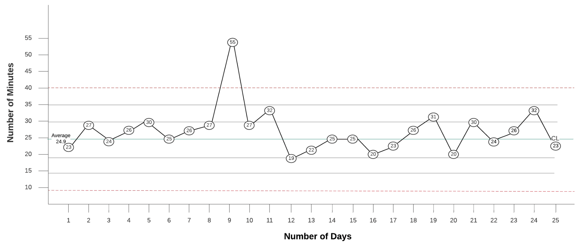
Source: cloudfront.net
In our chart above, the provided information was gathered for 25 sequential days. The determined normal demonstrates that it requires 24.9 minutes on average to make the outing every day. This usually turns into your control line, which appeared in green.

