Food Infographic
Edraw Content Team
From childhood till old age, we all hear from the people around us that how much food is important for our growth and health. When we were children, we always heard that enough food consumption is necessary for good growth and height.
When a teenager gets admitted into a gym, he gets mentored by his trainer about the particle group of food that is important for muscle growth. And finally, in our adulthood or old age, we get lectures from our doctors about the healthy food that is good for our digestion.
This article will see the importance of food and the nutrients we get from them. We will also see the food infographics, its importance and advantages, some examples, and how to make it.
What is Food Infographic?
To live, survive, and be healthy, nature sets the rule for us about the good consumption of food. Food is a godsend that gives us nutrients. These nutrients give us necessary minerals that our body requires to stay healthy and fight diseases.
With enough food, our body stays active and works properly. Our various organs like the stomach, heart, brain, etc., require the minerals from food to work properly. Our digestion, nervous, respiratory, and other systems work properly by extracting the minerals from the food.
Some of the nutrients and minerals necessary for our body are fats, proteins, carbohydrates, vitamin A, B-group vitamins (including folate), and vitamin C. The most important function of food is that it helps build cells that are the building blocks of our life.
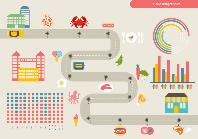
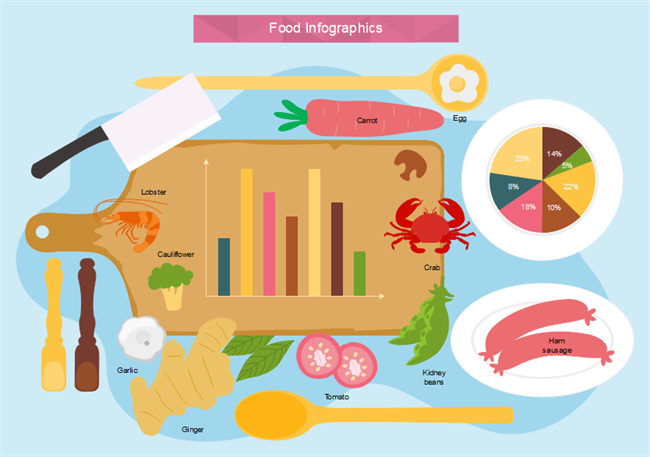
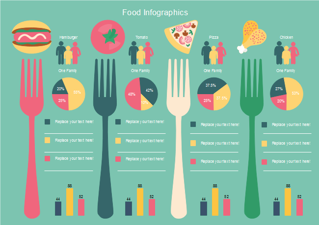
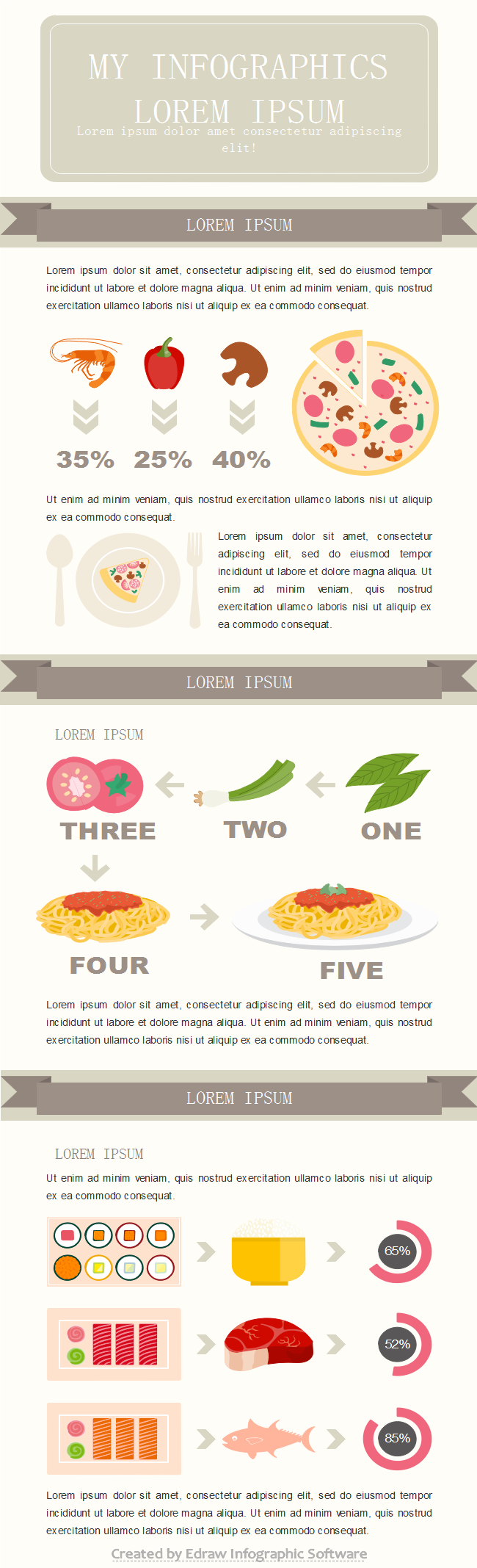
Food infographics are the pictorial representation of food and its importance in daily life. The definition of food infographics is vast, as the food infographic diagram falls into hundreds of categories.
In some places, you will see infographics about harmful food, and in other areas, you will see the beneficial food charts and their advantages. Nutrients chart is also a part of the food infographics.
Food infographics are an important source of spreading awareness about food, its advantages, disadvantages, importance for our health, and a lot more. With Food infographics, normal people get the idea of what food is good or bad for them. Food infographics are an important source of education among people of all ages. Some food infographics also tell about a particular food's calorie and mineral scale.
Great Food Infographics
This section will show you some best illustrations of different food diagrams. Below pinned diagrams will make your mind more clear about the food infographics.
Example 1: Food Safety Infographic
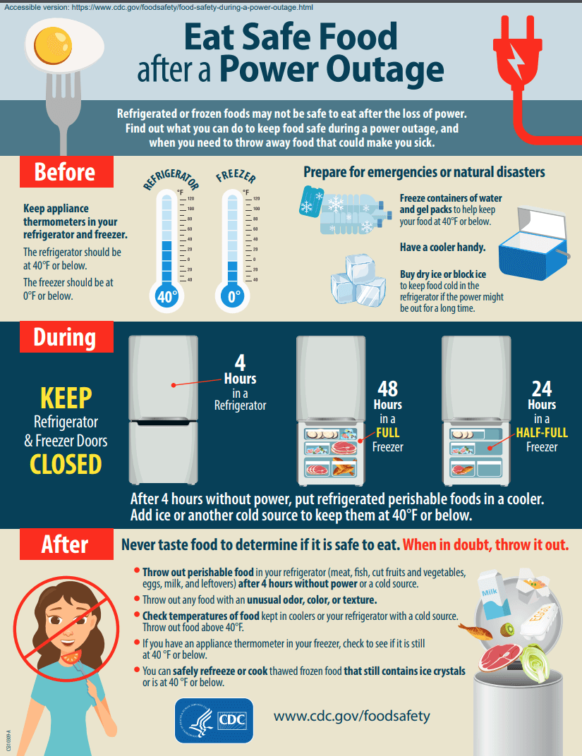
Image Source: www.cdc.gov
The food infographic diagram shows us how to protect the food from getting spoiled. The diagram tells us that even refrigerated food is not safe for us when we keep it inside the freezer for a long time. The refrigerator should have a 40 Fahrenheit or below for keeping our food safe. This infographic's best information is to throw away the food that we doubt is spoiled without tasting. If there is a power cut of 4 hours and the refrigerators have not gotten the electricity to run, we should throw away the foods as the chances are greater than the food inside is spoiled.
Example 2: Healthy Food infographic
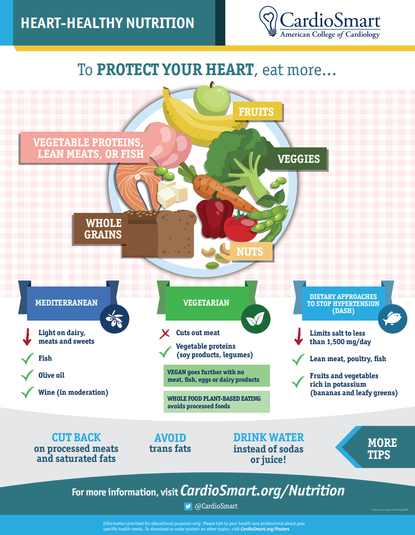
Image Source: www.cardiosmart.org
The diagram is all about the food balance we should keep throughout the week. To protect our hearts, we should eat meat as it contains fats that cause cholesterol. The doctors always advised us to include vegetables and dairy products. Dairy foods, vegetables, and meat should be eaten in balance to keep ourselves healthy. The diagram also shows the foods we should cut out completely from our diet. The main information is to drink more water.
Example 3: Food Insecurity Infographic
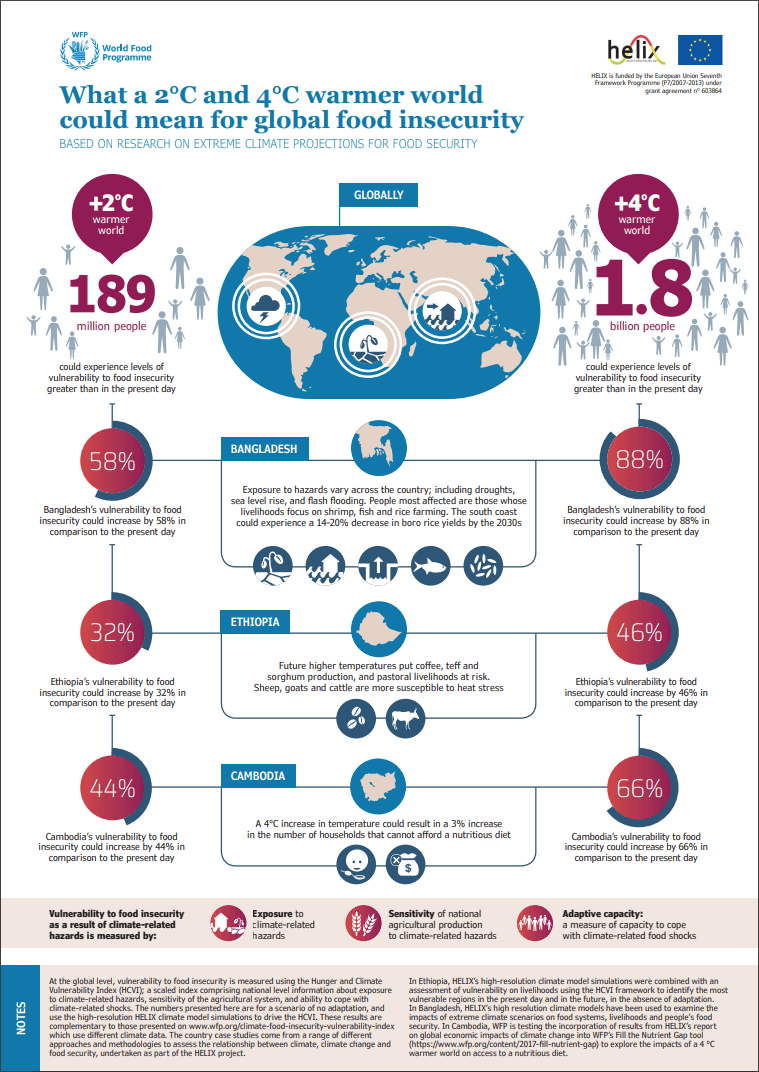
Image Source: www.wfp.org
In this food infographic, we see horrible information about the food insecurity faced by different world countries. Over 180 million people could face food insecurity if the climate worsens. Bangladesh is the most vulnerable country to food insecurity. Cambodia and Ethiopia are also facing food insecurity as the climate is getting hotter in these regions, which causes damage to almost all the crops. If 4 degrees are more added to the current world temperature, over 1.8 billion people could face food insecurity.
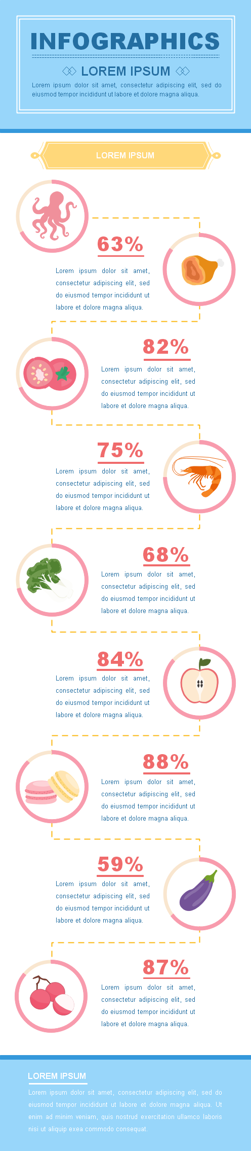
Example 4: Fruit Infographic
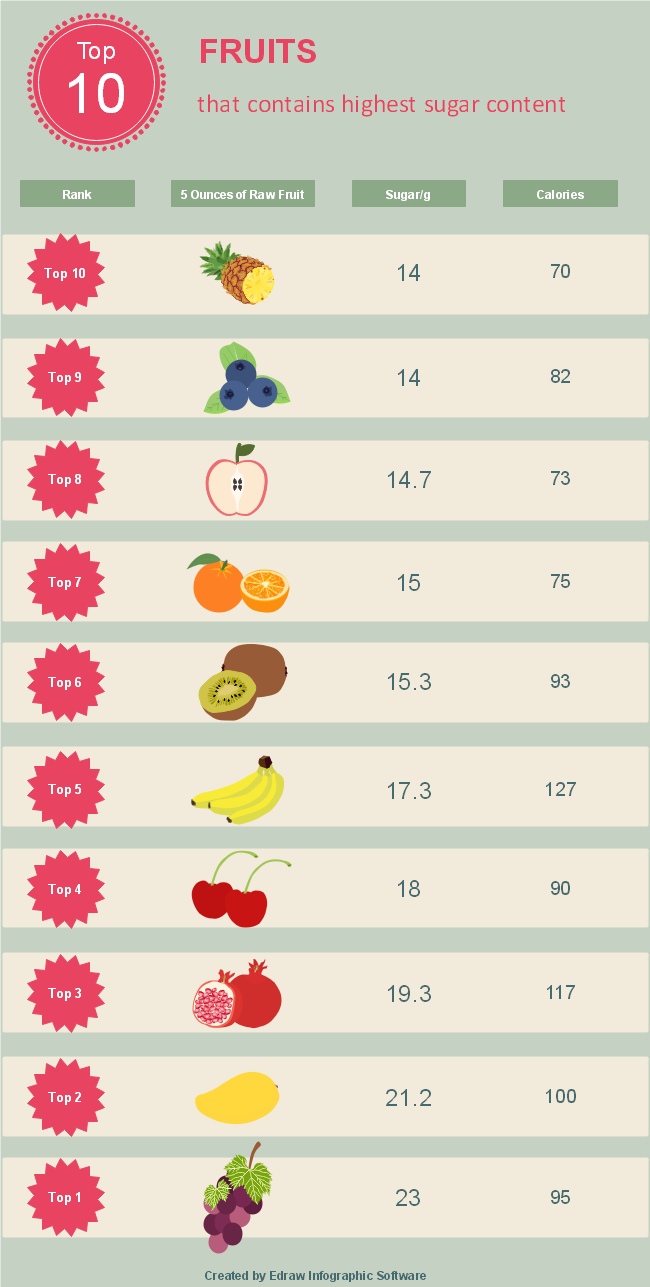
Even the fruits can also harm us if they are not eaten in a balanced order. Sugar in fruits can also cause diabetes. Fruits not only contain sugar but calories also. Grapes have the most sugar. Meanwhile, bananas contain more calories than other fruits. The fruits should be consumed by seeing their sugar level. Especially the diabetic patient should keep track of their fruit consumption. As mentioned above, this is also a type of food infographics. The food chart can also contain the calorie scale.
Example 5: Food Poisoning Infographic
Image Source: www.cdc.gov
The information about the diseases caused by spoiled or other food can also be given in the food infographics. The infographics show us the data about the symptoms of food poisoning. Food poisoning is caused by eating spoiled food. If you have symptoms like bloody diarrhea, fever higher than 102 Fahrenheit, frequent vomiting, dehydration, and diarrhea for more than three days, then you should immediately consult the doctors. The symptoms mentioned above are the severe symptoms of food poisoning, and they should never be taken for granted.
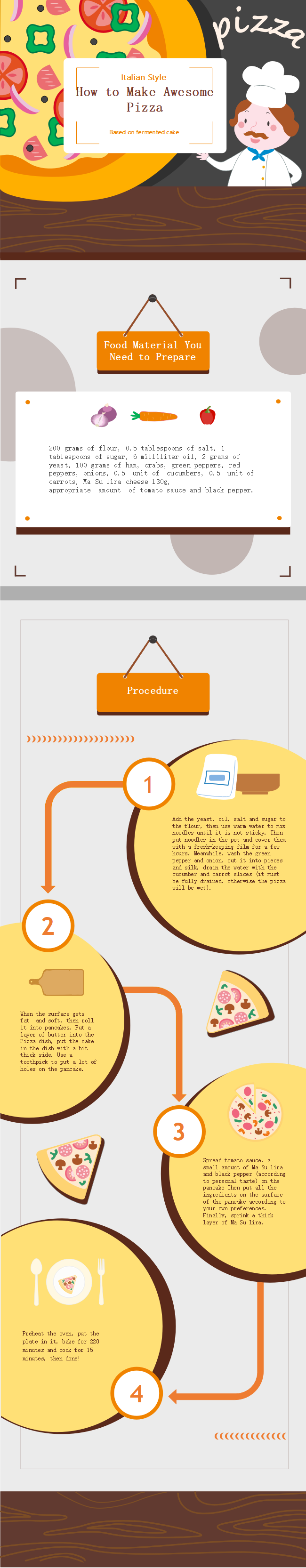
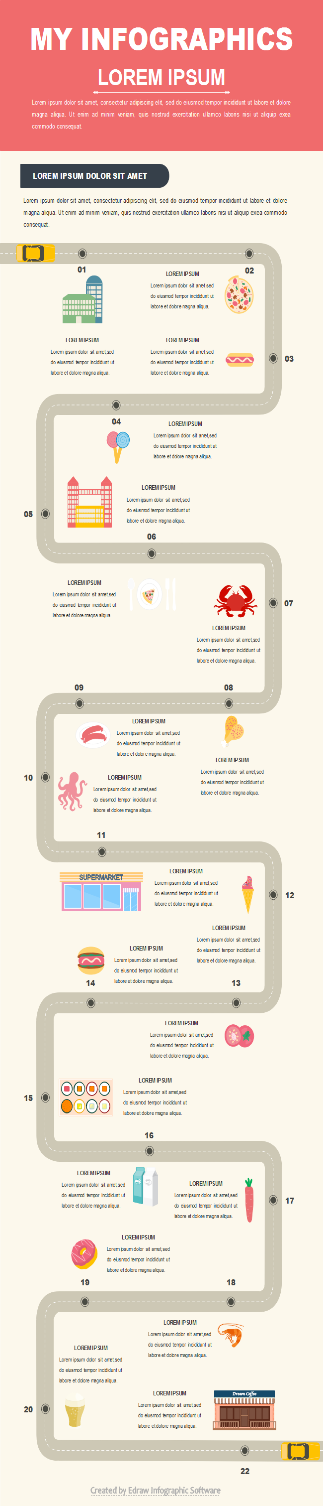
Example 6: Recipe Infographic
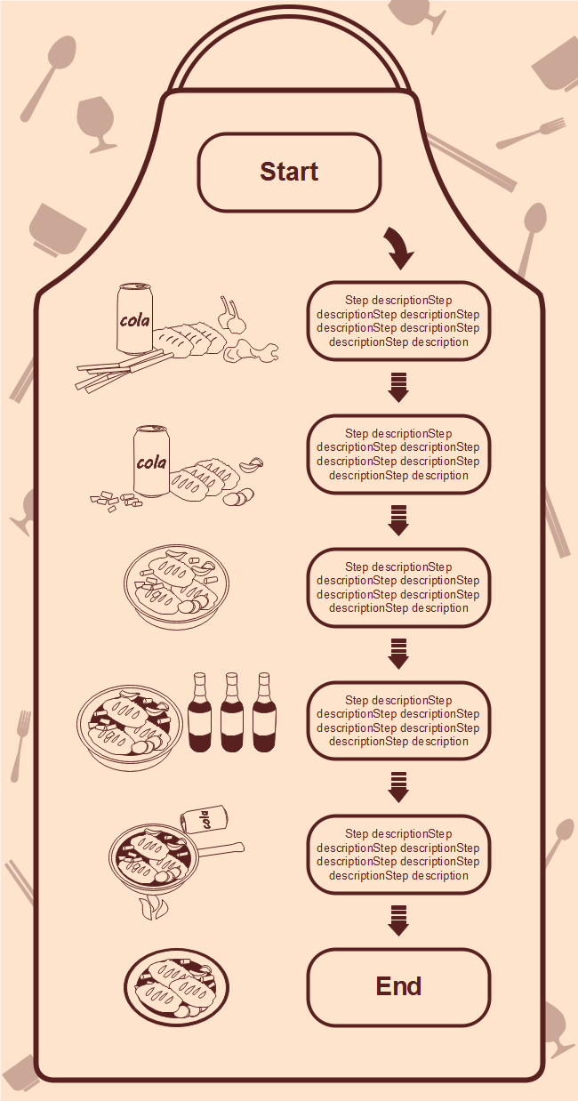
Recipes can also be shared through food infographics. The infographics give you data about food recipes. You can make any recipe and share it through food infographics. You have to add the photos in the animated form and add the information beside them.
How to Create a Food Infographic?
This section will tell you the process for making perfect food infographics. All the below steps will be followed sequentially.
Step 1: Choose the type of food infographic
The first step in making a food infographics is choosing the type of food infographics you want to make. There are hundreds of food infographics. Some of them are listed below.
- Food calorie chart infographic
- Diseases caused by food infographic
- Food and nutrients deficiency infographic
- Benefits of a particular food infographic
You have more choices, but you always have to opt according to your data.
Step 2: Get the best title
The second step is to get the best title for your infographics. The title should be not too long or short. The best thing about the title is that it must give the meta description of the whole infographics in a few words.
After selecting the best title, you have to write the overview in the form that describes your whole infographic.
Step 3: Gather all the data
The third step in making the infographic is to gather all the data you want to provide in your chart. The data should be correct and relevant to the title and overview. The main part of the infographic is to provide the data in a visual format.
Never forget to add graphs, graphics, colors, etc., to your infographic. It will make your project more appealing and easy to understand.
The best practice is to get the data from the source to produce the information you are making infographics. For example, to raise awareness about the Covid-19, you will get the data from the World Health Organization, Vaccine manufacturers, etc.
Step 4: Structure and the template
The structure and the food infographic template are also important aspects of building a good food infographic. Choose the colorful template that attracts the audience towards itself. Give the information in food infographics in the hierarchy form. The hierarchy form makes data look clean and short, which the average individual loves.
Step 5: Add more graphs
The best infographic always includes more graphs. The graphs made the data in figures rather than large paragraphs. The information in the form of the chart is always understood quickly.
Also, add graphics and colors to the graphs. Please don't make your graphs like they are taken out from the spreadsheet. Make them attractive and easy to get.
Step 6: Flow of information
While making your food infographic, you have to know how your information will flow. Also, add the visuals besides the relevant information.
Finish a point first and then start the next one. The fonts of the food infographics texts should be dazzling. Writing data in the hierarchy form will be better if the information is connected.
Step 6: Be responsible for all the data
If you are working for an organization, you should always work in a team while making food infographics. Every person in your group should be responsible for the data gathered and always confirm it before integrating it with the food infographics.
After finishing the food infographic, confirm the data more than once because that data will be published, and ordinary people will see it and absorb this knowledge.
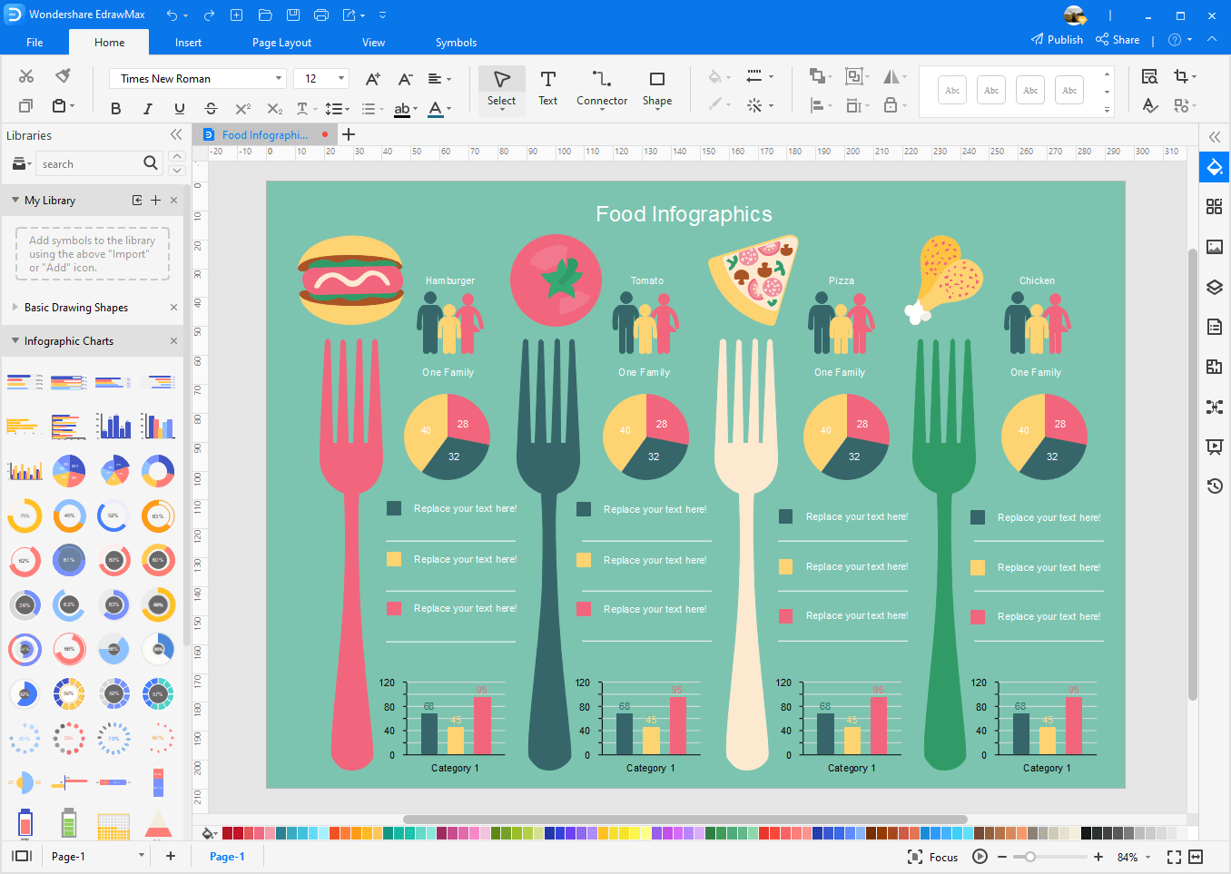
Why Use EdrawMax for Making Food Infographics?
EdrawMax allows you to customize food infographics in minutes using existing symbols and templates. It lets you drag and drop the graphics and edit to your liking. You are also allowed to add local images, insert charts and maps, use backgrounds and titles, and edit texts. You can configure an extensive set of options to make beautiful food infographics.
- Drag and drop pre-made symbols.
- Create interactive food infographics with built-in editable charts and graphs.
- Set custom infographic page size.
- Draw new elements with drawing toolkit.
- Publish to PDF, PNG, SVG, PPT, PS, EPS, JPEG, etc., with a single click.
- Insert local images.
- More than 10000 elements available, including icons, arrows, callouts, titles, backgrounds, etc.
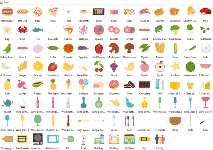
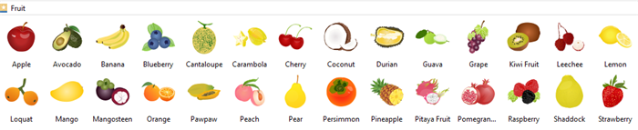
Various Vector Food Infographic Elements
You get access to a library of vector food clip arts like vegetables, fruit, meat, sweats, the tableware, etc. They are fully editable.
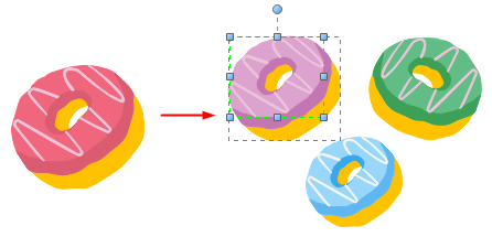
Editable Built-in Clip Arts
It's easy to edit the food infographic design clip arts from the pre-defined library. You can re-color, resize, and rotate the elements based on your needs.
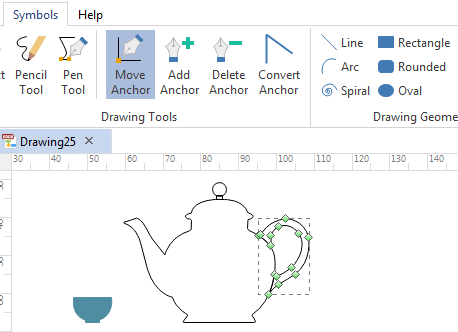
Draw New Elements
Unlike other infographic tools which are limited to the built-in shapes, EdrawMax also allows users to draw custom symbols when they have special requirements. With the embedded drawing toolkit, users can design any infographic elements they like at any time.
More Free Infographic Templates
There are plenty of infographic templates in the software. They can be used as quick starting templates. Every single element, such as the chart, food graphic, title, background, or content, can be modified.

An all-in-one platform for 210+ diagrams.
・ Simple alternative to Visio
・ 26k+ symbols
・ 10K+ free templates
・ 10+ AI diagram generators


Edraw Content Team


