5 Charts Used for Competitor Analysis
A marketing competitor analysis plays an important role in your marketing plan. Making a competitor analysis to know enough about competitors is very important for business marketing. By doing the analysis, you will identify the strengths and weaknesses of current and potential competitors and establish what makes your product or service unique, so that you can develop the correct marketing strategy to win the battle. Here are 5 charts business people often use when doing a competitor analysis.
Chart 1: Spider Chart (Radar Chart)
A spider chart is a data visualization method of displaying multivariate data in the form of a two-dimensional chart of three or more quantitative variables represented on axes starting from the same point. As it's an effective method for comparing two or more products over a range of characteristics, it's always used for competitor analysis. Like the following examples, you can create a series of spider charts representing different characteristics, or you can make everything in one chart.
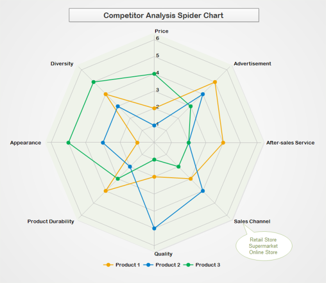
Chart 2: Comparison Table
A comparison table is a traditional method for competitor analysis. Make a list of factors and score the elements one by one for all the competitors. You can use either numbers or graphical indicators showing the scores. The comparison table is quite straightforward and easy; thus, it's always used as a basic competitor analysis tool.
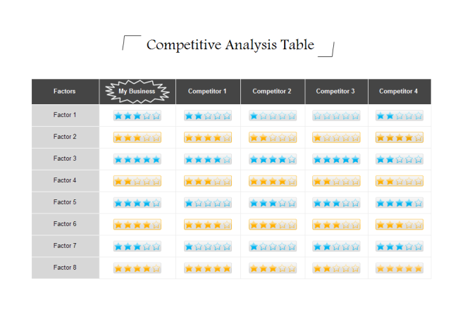
Chart 3: Scatter Chart
A scatter chart has a set of individual dots showing the relationship between two sets of data. When used for competitor analysis, we list product features on one of the axis, and show the score on the other axis, then use different colors of scatters to represent various brands/products.

Chart 4: Bubble Chart
A bubble chart is a scatter chart variation that visualizes three data dimensions. The third dimension of data is presented by the size of the bubbles. For example, in the example below, the X-Axis shows the individual product price; the Y-Axis shows the monthly sales, and the size of the bubble represents the future growth of the product.
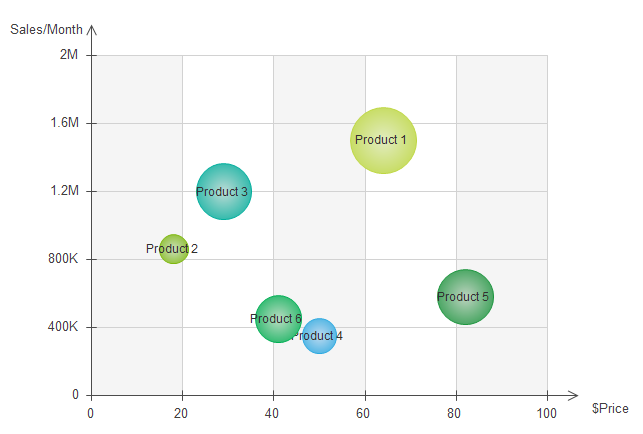
Chart 5: Matrix Chart
The matrix chart is a variation of the comparison table. The difference is that with a matrix chart, you can easily use different colors to represent different degrees. Like the picture below: the green color represents a relatively low score, and the red color means it's done pretty well.

An all-in-one platform for 210+ diagrams.
・ Simple alternative to Visio
・ 26k+ symbols
・ 10K+ free templates
・ 10+ AI diagram generators


Related Articles


