Column Chart
Know it All about Column Chart
Do you ever feel stuck in visualizing grouped data of different classifications? Do you have trouble comparing different data sets over different periods? Worry not, we have got just the thing for you!
A column chart is an easy way to compare numerical data values of the same or related categories over some time or even in absolute time. The value of each category is depicted by the length or height of the respective column since they are proportional to each other. The columns are easy to compare with each other because all of them start from the borderline of zero.
Column charts are very useful in comparing different classifications by a single measure. This helps users to determine how the categories are behaving as well as performing against each other.
Rectangular bars represent each category. At a glance, the highest and lowest performing categories could be measured by distinguishing the heights of the rectangles. Column charts are also used to compare performances with a standard benchmark and perform a deviation analysis.
1. Reader-friendly
They provide simpler visualization for the viewer and are extremely effective because they target the human instinct of understanding heights in contrast to other visual representations that may require some form of skill set or training to understand the data.
2. Precise data measure
They are specifically useful when the data has a few specific categories with single values for each. If multiple values per category are involved, clustered column charts or stacked column charts are used.
3. Time-specific
A column chart is an excellent choice while portraying data sets for a certain span of time. It helps to understand changes over that period easily, which is comparatively more natural for the human mind to decode. Business owners, publishers, and public bodies can use them to display profits, growth, development, and financial effect on different units.
As helpful as they are, column charts have their limitations.
Now, let's look at some situations where column charts would be useful. We have listed a few scenarios below.
Thus, we see column charts are to be used when drawing comparisons between different entities. It is now up to you to choose whether your situation is suitable for column charts or not.
1. Basic Column chart
In this type, the height of each column/bar is proportional to the value of the data represented. The values are typically displayed on the vertical axis and the categories or entities on the horizontal axis.
2. Grouped column chart
They are used to visualize data for multiple datasets along with analyzing and comparing data points in sub-categories. On one axis, they have discrete values, and on the other, there are vertically aligned rectangular bars. Examples of situations where they can be used are to compare the income generated by different products of a company over a certain period of time or across different areas.
3. Column Chart with scrolling
This type of column chart is used to plot comparative data or to visualize change over a certain duration of time. The interactive scroll allows plotting a bigger number of data values on a single chart. The scroll accommodates easy navigation through the chart. This column chart has vertically plotted rectangular bars on one axis and discrete data points on the other. The scroll bar is added at the bottom horizontally, which can be moved along the chart to navigate through it. The navigation helps to keep the data clutter-free and provides a clearer view providing ease to the eye.
4. Stacked Column Chart
A stacked column chart is used to make part-to-whole comparisons over time or across different entities.
In this chart, data series are 'stacked' in vertical columns on top of one another. They can show over time change as it is easy to compare total heights of columns, and they help in displaying the amplitude of how much the different members of a category are contributing to the total.
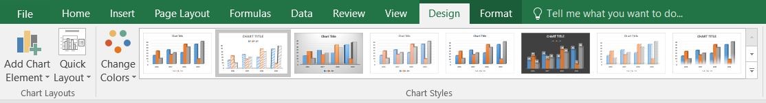
To create a column chart in Microsoft Excel 2016, follow these steps.
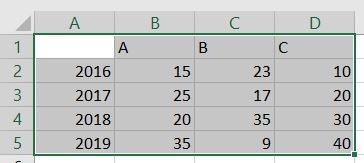
Step 1: Enter data in a spreadsheet. (The spreadsheet is the very first display on your monitor when you open Microsoft Excel).
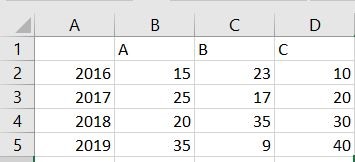
Step 2: Select the data.
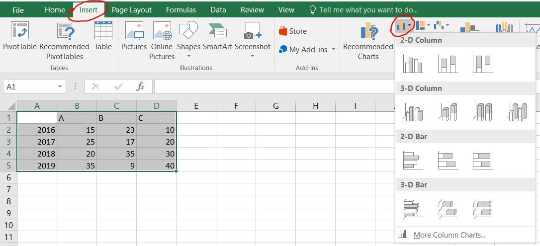
Step 3: Click on Insert, and then Insert Column or Bar Chart (according to preference).
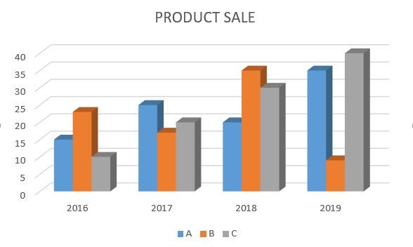
Step 4: Then select the type of column chart you prefer from the different varieties available, and you will have a column chart ready in no time.
You can enhance the charts by looking a bit further. Change its design, layout, or even shapes using the following steps:
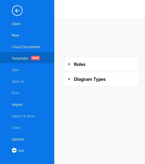
To create a column chart in the EdrawMax desktop, follow these steps.
Step 1: Install and launch the EdrawMax software on your PC. The picture below is the home screen of the software.

Step 2: Click on "Templates" and then select “Diagram Types." This will display a drop-down menu that includes many different options.
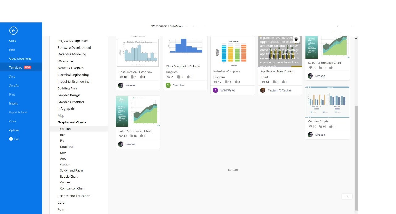
Step 3: Click on “Graphs and Charts” and then click on “Column." This will display many different templates for column charts. Now, you can choose your preferred template.
Step 4: After finalizing your preferred column chart template, click on “Use Immediately” (in blue on the top of the screen).
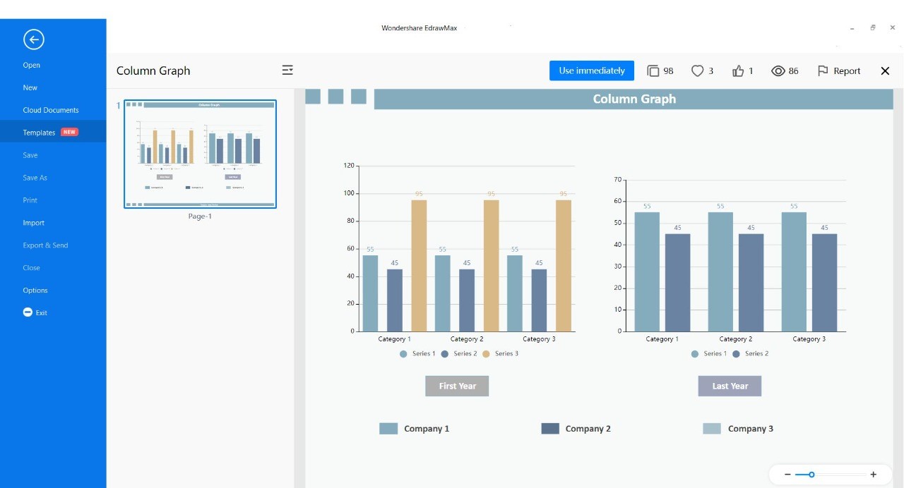
Step 5: After selecting your template of choice. It will lead you to the screen for final formatting, as shown in the image below. Here you will be able to enter all data values and names of categories or entities.
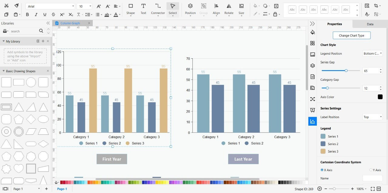
A color grind is available at the bottom to change the color of the text and bars. On the left-hand side, options like shapes are available, whereas, on the right-hand side, there are multiple editing options such as many different chart styles, legend display editing, series gap, category gap, axis color, legend color, and positioning of the charts, etc.

・ Simple alternative to Visio
・ 26k+ symbols
・ 10K+ free templates
・ 10+ AI diagram generators
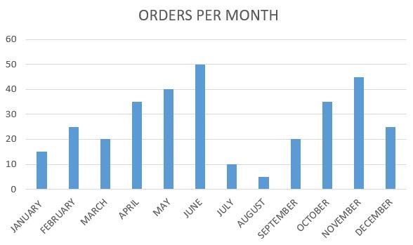
Example 1
This is a user-defined chart; this means that the process of clicks will be the result shown on the chart. The data is of sales from January to December. Its process includes a horizontal scroll bar formatted by clicking on "control."
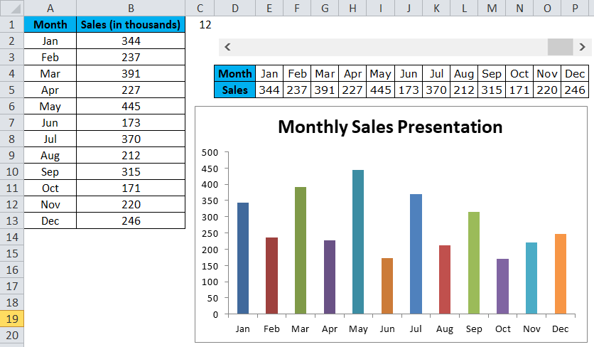
The following updates were made; the current value and minimum value is "0", the maximum value is "12" since the span of a maximum of 12 months is included in the sales data. The incremented change is "1". The cell link is set as "$C$1".
This means that one click on the cell (C1) will be read as one value on the scroll bar, and another number of clicks will be added as one each as the increment value is set as "1". If the scroll bar is clicked thrice, it will display only three months. Otherwise, it can be clicked up to 12 times.
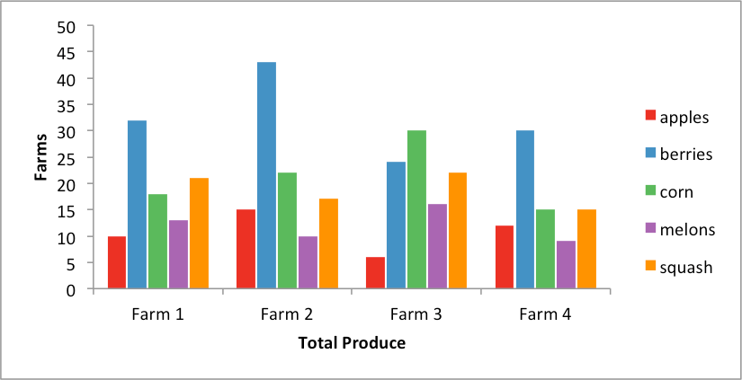
Example 2
This grouped column chart represents the total number of animals brought into a veterinary clinic over the period of 12 months.
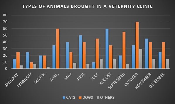
Cats and dogs are the most common types that are brought in veterinary clinics; hence they are categorized separately, and other animals that are rarely brought in are categorized collectively, e.g., snakes, hamsters, rabbits, etc.
The best option to visualize numerical data with categories is column charts. With the variety of several ways to input and read data, any type of entrepreneur can use these for large-scale data management. Column charts target the natural human nature with the display of height comparison.


