Improve Presentation with Charts and Graphs
The Power of Charts and Graphs
- Simplify complex statistics and ideas.
- Help viewers get the point instantly.
- Make information visually pleasing. Engage audience better.
- Add interest to dry data. Turn information communication into fun process.
- Help analysts extract more useful information from data.
Empower Presentation with Charts and Graphs
The purpose of presentation is information communication. It will be more effective if it is a two-way communication. Unfortunately, many presenters just indulge in the unidirectional transmission while forgetting the audience feedback. Such presentation without resonance may lead to failure. So here comes the question: How to engage the audience?
There is an easy skill to solve this problem: use charts and graphs to make your presentation slides visually attractive and pleasing.
Here are some basic types of charts and graphs. Beware of the principles to use them. You can gain more from Edraw Max - an automatic tool for making cool charts and graphs.
1) Column Chart (Vertical Bar)
A column chart (column graph) is a chart with vertically-arranged columns - the height of which represents the value. It is best for comparing means or percentages between 2 to 7 different groups. As you can see from the example below, each column is separated by blank space. For this reason, the x-axis should be based on a scale that has mutually exclusive categories. Categories that are based on a continuous scale are better suited for a histogram.
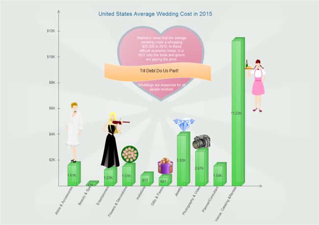
This is a 3D bar chart showing different categories of cost in wedding. We can see at a glance that Venue, Catering & Rentals is the biggest cost. It is created by Edraw - a cool tool for making charts and graphs.
2) Horizontal Bar Charts
A bar chart (bar graph) is a chart with horizontally-arranged bars (rectangular or cylinder) - the lengths of which are proportional to the values that they represent. This kind of chart is used when comparing the mean or percentages of 8 or more different groups. Similar to the column chart, the horizontal bar chart should only be used when comparing categories that are mutually exclusive.
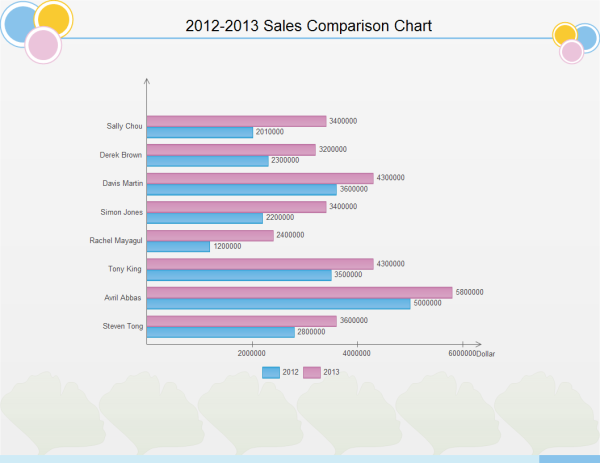
This bar chart compares 8 salesmen's sales performance in 2 years. The first comparison is from the perspective of salesmen, which is illustrated by bar length differences. By using different colors, the difference between two years can be shown clearly.
3) Pie Charts
A pie chart (circle graph) is a circular chart that is divided into slices to illustrate proportion. Pie charts are perfect for illustrating a sample break down in a single dimension. In other words, it is best to use pie charts when you want to show differences within different parts based on one variable. It is important to remember that pie charts should only be used with a group of categories that are the parts of a whole.
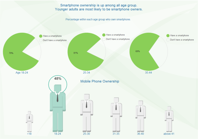
Pie charts in the above example show the smartphone ownership percentage in different age groups.
4) Line Charts
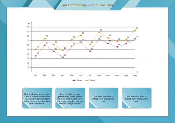
A line chart is made by a series of data points that are connected by a line. Line charts provides clear demonstration of trends over time. This is done most often to measure the long term progression of sales, or any other empirical statistic important to businesses or organizations. It can also be used to compare two different variables over a period of time. See an example below.
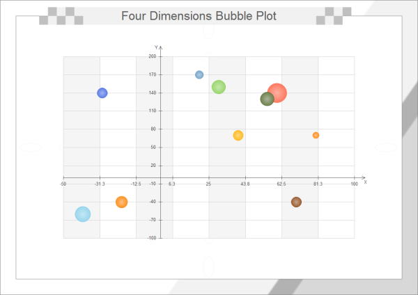
5) Scatter Plot
A scatter plot, scatterplot, or scatter graph is a type of mathematical diagram using Cartesian coordinates to display values for two variables for a set of data. Scatter plots are used to depict how different objects settle around a mean based on 2 to 3 different dimensions. This allows for quick and easy comparisons between competing variables. Through such visuals, the viewers can quickly see the difference between two objects or its relation to the average, which is shown as the large square on the chart.
6) Spider Chart
Spider chart is a graphical way to compare data by displaying data in a "web-like" form looking like spider web.
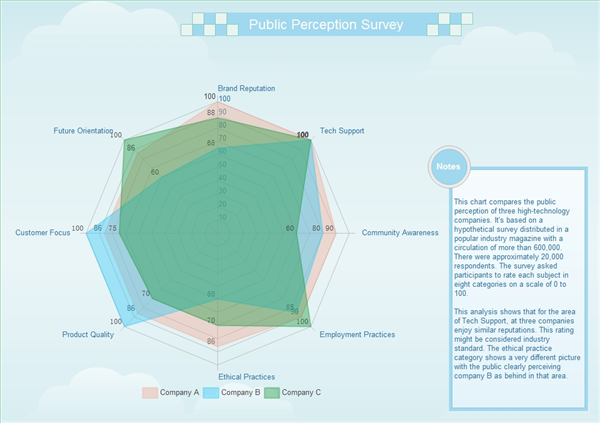
This spider chart above compares the public perception of three high-technology companies. It's based on a hypothetical survey distributed in a popular industry magazine with a circulation of more than 600,000. There were approximately 20,000 respondents. The survey asked participants to rate each subject in eight categories on a scale of 0 to 100.
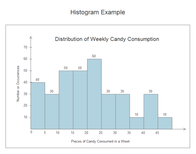
7) Histogram
Like pie charts, histograms break down the sample distribution in one dimension. Unlike horizontal and vertical bar charts, histogram's x-axis is not divided into mutually exclusive categories. There is no gap between the bars. The x-axis is a continuous scale.
Unique Presentation Templates for Unparalleled Presentation
Maybe you 've already got bored with MS PowerPoint's templates. Now you can select more styles to breathe life to your presentation. Hundreds of vector templates are available, you are sure to find some you like.
Business Plan Template
This set of business plan template is available in vector format. It contains 11 pages. Click the picture to download and customize it for your own use.
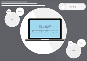
PPT Slide Template
A 12-page ppt slide template is readily available in vector format. Anyone could download and use for your own designs.
Consumer Analysis Template
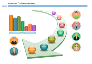
Click the picture to have a full view of the consumer analysis plan and download it for your own use.
Process Steps Template
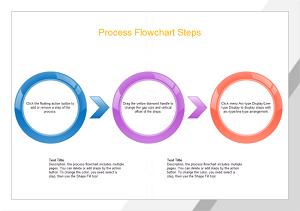
Click the picture to have a full view of the process steps template and download it for your own use.
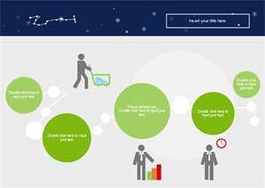
Business Presentation Template
This editable 4-page business presentation template is offered for free. You can click and download anytime you need it.
Market Analysis Template
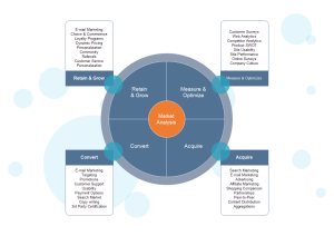
This nice-looking chart template is well prepared to benefit our users. With a few clicks, you can change the text, color and style.
More Infographics for Improving Presentation
Do you feel that those commonly-known charts and graphs are not personalized enough? Then you can try some unique infographics to make slides that are very you. Or design diagrams full of personality that is like no other. Refer to the following examples to get started quickly. Download Edraw and view all infographics.


