Use Radar Charts for Data Analysis
A dynamic and effective tool for data analysis and presentation.
Introduction to Radar Chart
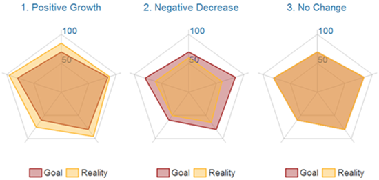
Radar chart is a frequently used method for comprehensive evaluation, particularly useful for holistic and overall assessment through multivariate data. Its advantages lie in vivid visualization and ease of use. Through comparison and analysis, people can figure out their current situation: improving or falling behind. For those time-crunched managers, they can understand the situation at a glance. Generally speaking, there are 3 types of results in data analysis through Radar charts.
Benefits of Radar Charts for Data Analysis
- Vivid and visual description.
- Realization of dynamic analysis.
- Scientific depiction of industrial development track.
- Effective mastery of dynamic data for relevant department.
- Easy application and promotion, making the assessment concise, intuitive and fast, which will encourage people to pursue progress and excellence.
Data Analysis through Radar Chart: Example
For example, we can compare students' test scores with the average score on subjects such as math, computer science, and biology. A radar chart has multiple axes along which data can be plotted. Each axis is a category. The data is shown as points on the axis. The points belonging to one data series can be joined or area so enclosed is filled. A point closer to the center on an axis indicates a lower value and vice versa. In some applications, low values may be more desirable than high values, e.g. price/earning, price/sales, price/book of stocks.
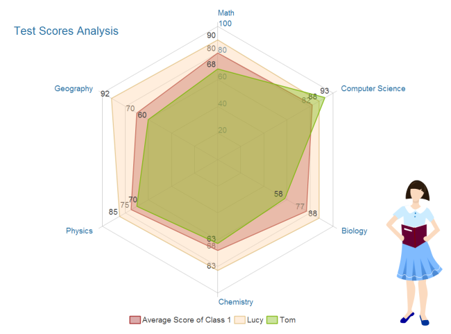
From the above radar chart example, we can figure out the following information:
- Class 1 is excellent in computer science and didn't do well in Chemistry scoring only 68 points, the lowest among all subjects.
- Lucy excels in study with all subjects above the average.
- Tom should pay more attention to study since most of his scores are below the average. His strength is computer science in which he scores high and much higher than average.
Radar Chart Software
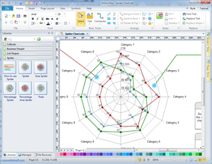
You can draw a radar chart manually which is complex and time-consuming. Or you can let Edraw help you crack the hard-nut for you. It offers many pre-formatted templates so that users just need to make some modifications before use. Edrawdoesn't require any drawing skill at all with the drag and drop interface. Try it now to gain beautiful radar charts like the above presented ones. You can gain vector predefined radar chart symbols and video tutorial about how to use it.
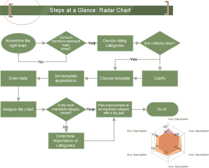
Steps to Make Radar Charts
In Edraw, only a few simple steps are needed to make a professional and intuitive radar chart. To be creative and make it understandable, Edraw has prepared a flowchart to show the steps to make radar chart at a glance.
To get detailed help, please go to this link: how to edit spider charts.
You can also get things done quickly by leveraging the spider chart templates.


