Data Visualization Process - How to Visualize Data
The Ben Fry Visualizing Data Process
The Ben Fry visualizing data process is very helpful. It involves 7 steps. For more details, refer to his book: Visualizing Data.
1. Acquire: Obtain the data, whether from a file on a disk or a source over a network.
Data can be collected from many resources such as books, files and digital documents. This is the beginning and fundamental step of data visualization.
2. Parse: Provide some structure for the data's meaning, and order it into categories.
You may have collected immerse data, but it is necessary to restructure the collected data. This structure will make it easier to know convey to others what data you have by format, tags, names, and indices.
3. Filter: Remove all but the data of interest.
Not all data is useful. Filter out the data that cannot serve your goal. If you are focusing on the data of a specific period, remove the data of other periods.
4. Mine: Apply methods from statistics or data mining as a way to discern patterns or place the data in mathematical context.
Data visualization is to help viewers seek for insights that may not be gained from raw data or statistics. This step helps get basic understanding of the data that is significant for the whole process.
5. Represent: Choose a basic visual model, such as a bar graph, list, or tree.
Various visual models are available. You need to select the suitable type that best suits your need. Edraw data visualization software helps you produce over 200 kinds of visuals instantly.
6. Refine: Improve the basic representation to make it clearer and more visually engaging.
Polish your work according to some basic color and graphic design theory. You can also rely on Edraw by just choosing one theme which includes harmonious color, font, and line style.
7. Interact: Add methods for manipulating the data or controlling what features are visible.
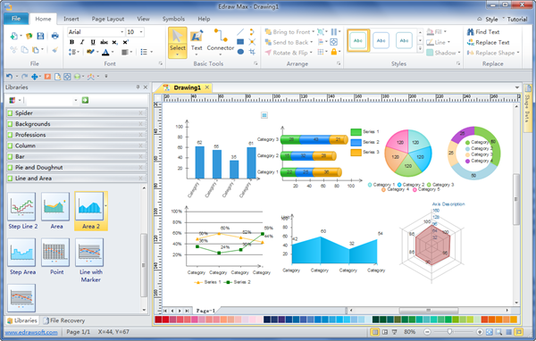
Professional Data Visualization Software to Visualize Data Effortlessly
Creating charts and infographics can be time-consuming. But the right tool makes it easier. Edraw is the optimal tool to create stunning visualizations with ease. It is a fast, flexible charting solution that allows users to explore and interpret dense data sets. It's highly customizable, working with MS programs seamlessly. The user-friendly interface is similar with Word.
System Requirements
Works on Windows 7, 8, 10, XP, Vista and Citrix
Works on 32 and 64 bit Windows
Works on Mac OS X 10.2 or later
Sample Models for Data Visualization
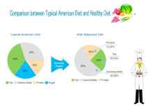
| Pie Charts |
|
Used to show percentages. Limit the slices to 4-6 and contrast the most important slice either with color or by exploding the slice. View some vector pie chart examples. |
| Column Charts |
|
Suitable for showing changes in quantity over time or comparison of different categories. It works best with 4-8 bars. Refer to some featured column chart examples. |
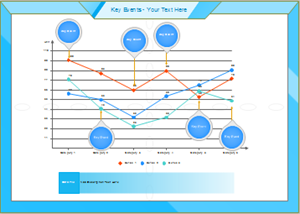
| Bar Charts |
|
Good at comparing quantities. For example, comparing figures between four different countries. You may like Edraw's ready-to-use bar chart examples. |
| Line Charts |
|
Used to demonstrate trends. For example, a simple line chart can show that the sales keep going up. The trend is good. When presenting, show an uprising arrow later to underscore the point: The future looks good! Check out some creative and attractive line graph templates. |
| Spider Charts |
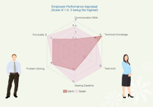
|
Provides a view of data comparison in multivariate data when there are many categories to compare. Some vector spider chart examples are available in Edraw. |
| Area Charts |
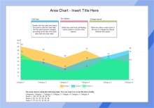
|
An area chart displays quantitive data based on the line chart. The area between axis and line are commonly emphasized with colors, textures and hatchings. Area charts emphasize the magnitude of change over time and can draw attention to the total value across a trend. |
| Bubble Plot |
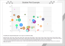
|
A bubble chart is used to visualize a data set with two to four dimensions. The first two dimensions are visualized as coordinates, the third as color and the fourth as size. |
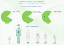
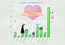
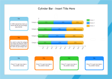
More Data Visualization Templates
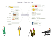
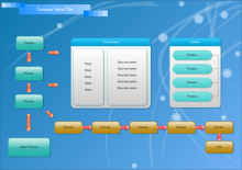
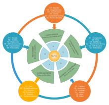
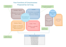
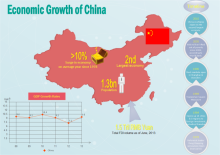
Besides the above mentioned charts, there are a lot more visual models that can facilitate data visualization, such as mind map and flowchart. Many diagram examples and templates are provided for free download below. All are high quality in editable vector format. Starting from ready-made templates to make your own visualization is the fastest and simplest way. They are excellent examples created by Edraw.
|
|
|
|
|
|
Conclusion
There are many methods to visualize data, new solutions and chart types come out constantly, and each strives to create more attractive and informative charts than before. It is advisable to focus on the principle that visuals should clarify and summarize the key message to be clear and concise rather than confusing and overloading the reader with superfluous information.
For more chart templates, please visit here.


