Progress Report Visualization Using EdrawMax
EdrawMax accelerates the growth and production of government and enterprise clients around the world.

Challenges
We have a lot of data spanned over various dimensions. We need suitable representation tools that are easy to understand, communicate the message at a glance, and do not take too much time to create.
Copying all the statistics and numbers from the pre-existing file formats is error-prone and consumes a lot of time and resources. We need a tool to efficiently import the data from spreadsheets, surveys, and CSV files.
Accuracy in statistics and data is the foundation of decision-making in sales and marketing. The highest data quality provides confidence in that data. When the data quality is high, the sales and marketing team produces better outputs.
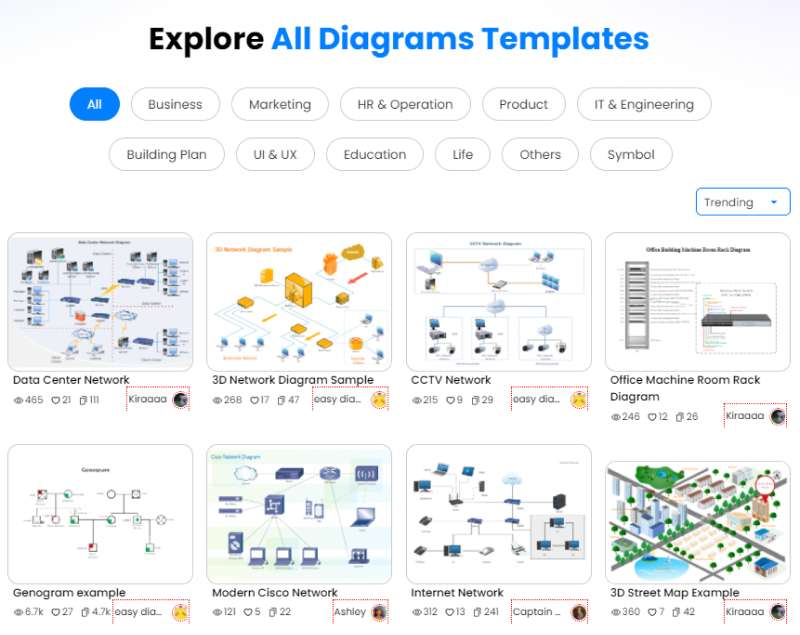
Source:EdrawMax Template Community
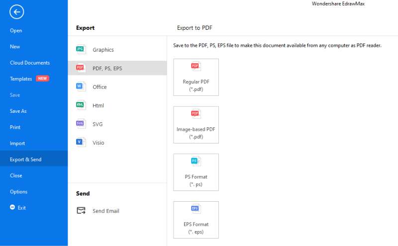
Source:EdrawMax
- Bar Graph: They compare several categories of data for displaying numerical data.
- Line Graph: It graphically displays data that changes continuously over time.
- Pie Chart: Pie chart represents composition, nominal or ordinal categories of data, showing percentage or proportional data and comparing areas of growth within a business.
- Histogram: It represents the shape of the data's distribution, summarizes large data sets graphically, and communicates the data distribution quickly to others.
- Area Chart: Area charts show a simple comparison of the trend of data sets over a period of time. It also displays the magnitude of a change and compares a small number of categories.
Source:EdrawMax Online


Ready to Upgrade Your Business?
Our team will be happy to discuss plans, products, and services with you.
Contact Sales For Individuals
Power of Diagrams in the Manufacturing Industry | EdrawMax Customer Story

EdrawMax Helps You Design Like A Pro | EdrawMax Customer Story