Improve Business Reports with Charts and Graphs
Conveying your research results to your colleagues, leaders, and clients in a way that is both professional and clear is a crucial skill in your career. Learning some skills to make it cool will surely be rewarding. In a report (business or academic), charts and graphs go a long way in illustrating findings that are clear and concise.
How to Use Charts and Graphs to Create Effective Reports
Charts and graphs simplify data in a presentable and visually pleasing way. They can add charm and interest to your reports. The main challenge with using such infographics is selecting the proper type from the wide variety available. Each type of charts comes with both strengths and weaknesses. Instead of staying in your comfort zone by overloading business report with pie or column charts, you can improve it by applying more kinds of effective charts to suit different needs. This article will list some basic charts and how to successfully implement them into your business reports.
1) Column Chart (Vertical Bar)
A column chart (column graph) is a chart with vertically-arranged columns - the height of which represents the value. It is best for comparing means or percentages between 2 to 7 different groups. As you can see from the example below, each column is separated by blank space. For this reason, the x-axis should be based on a scale that has mutually exclusive categories. Categories that are based on a continuous scale are better suited for a histogram.
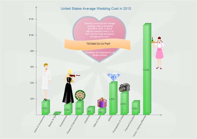
This is a 3D bar chart showing different categories of cost in wedding. We can see at a glance that Venue, Catering & Rentals is the biggest cost. It is created by Edraw - a cool tool for making charts and graphs.
2) Horizontal Bar Charts
A bar chart (bar graph) is a chart with horizontally-arranged bars (rectangular or cylinder) - the lengths of which are proportional to the values that they represent. This kind of chart is used when comparing the mean or percentages of 8 or more different groups. Similar to the column chart, the horizontal bar chart should only be used when comparing categories that are mutually exclusive.
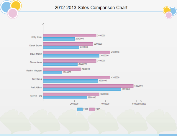
This bar chart compares 8 salesmen's sales performance in 2 years. The first comparison is from the perspective of salesmen, which is illustrated by bar length. By using different colors, the difference between two years can be shown clearly.
3) Pie Charts
A pie chart (circle graph) is a circular chart that is divided into slices to illustrate proportion. Pie charts are perfect for illustrating a sample break down in a single dimension. In other words, it is best to use pie charts when you want to show differences within different parts based on one variable. It is important to remember that pie charts should only be used with a group of categories that are the parts of a whole.
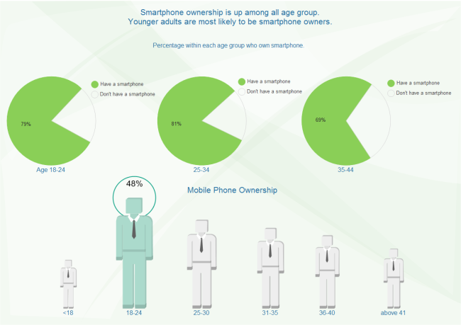
Pie charts in the above example show the smartphone ownership percentage in different age groups.
4) ine Charts
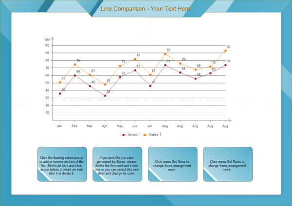
A line chart is made by a series of data points that are connected by a line. Line charts provide clear demonstration of trends over time. This is done most often to measure the long term progression of sales, or any other empirical statistic valued for businesses or organizations. It can also be used to compare two different variables over a period of time. See an example below.
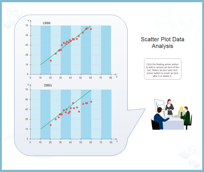
5) Scatter Plot
A scatter plot, scatter plot, or scatter graph is a type of mathematical diagram using Cartesian coordinates to display values for two variables for a set of data. Scatter plots are used to depict how different objects settle around a mean based on 2 to 3 different dimensions. This allows for quick and easy comparisons between competing variables. Through such visuals, the viewers can quickly see the difference between two objects or its relation to the average, which is shown as the large square on the chart.
6) Spider Chart
Spider chart is a graphical way to compare data by displaying data in a "web-like" form looking like spider web.
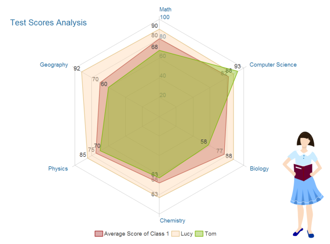
From the above spider chart example, we can figure out the following information:
- Class 1 is excellent in computer science and didn't do well in Chemistry scoring only 68 points, the lowest among all subjects.
- Lucy excels in study with all subjects above the average.
- Tom should pay more attention to study since most of his scores are below the average. His strength is computer science in which he scores high and much higher than average.
7) Histogram
Like pie charts, histograms break down the sample distribution in one dimension. Unlike horizontal and vertical bar charts, histogram's x-axis is not divided into mutually exclusive categories. There is no gap between the bars. The x-axis is a continuous scale.
Chart and Graph Solutions
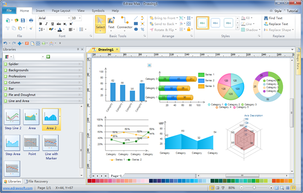
You can gain solutions for all of the above mentioned charts in only 1 program - EdrawMax. It is unparalleled for its automatic functionality.Totally 11 kinds of charts and graphs can be generated from predefined templates which contain floating action buttons. With such buttons,users can easily modify the template and quickly gain a brand new chart. What is more, after the data is changed, the shape will adjust itself automatically.Soitdoesn't have to be hard to make charts and graphs.
How to Create Vectorial Charts
Before drawing, gather data you need. It is viable to prepare data a tidy table format. If so, it's easier to create a chart at that point. The next step is using Edraw to make vectorial charts extremely fast.
In Edraw, only a few steps are needed to gain characteristic charts for information conveyance. You can make the most of the well-designed examples to get started instead of starting from scratch.
More Infographics to Empower Reports
Learning to use charts effectively will make your reports both professional and clear. Besides the above mentioned charts, there are much more kinds of infographics that EdrawMax can generate for displaying information, such as flowchart, mind map, Venn diagrams, tree diagrams, and so on. They will help you impress the audience more easily. Harnessing the full potential of these attractive diagrams is a really useful endeavor. So go ahead, experiment with these charts and graphs to bring your reports to the next level of excellence!
Unique Presentation Templates for Impressive Reports
After creating the charts, you can add them into beautiful presentation slides to show your analysis better. Here are some free unique presentation templates.
Download Full Software Package and View More Examples for Free


