Which to Choose, Line Graphs or Scatter Charts?
Overview of Line Graph and Scatter Chart
Look at the pictures below, you may find that the line graphand the scatter chart look similar. Here I present the correlation between weight and height using line graph and scatter chart respectively.
Line Charts
In the line chart, you can record the continuous periodic data conveniently. On the x-axis, category data are distributed with even intervals. On the y-axis, numerical values are recorded with points obviously. However, it's almost impossible to put two variables in one line chart.
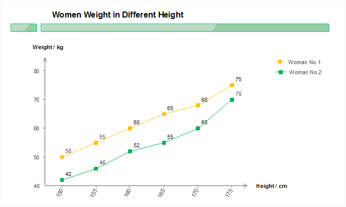
For example, if you want to explore the correlation between women's weight and height using line charts, you need to draw at least two lines - regering to two women's height and weight information. However, two women's data is far from enough. Looking at the line graph below, you may feel puzzled because it's painstaking to draw lines of data from many women from the charts one by one and then draw a conclusion.
Scatter Charts
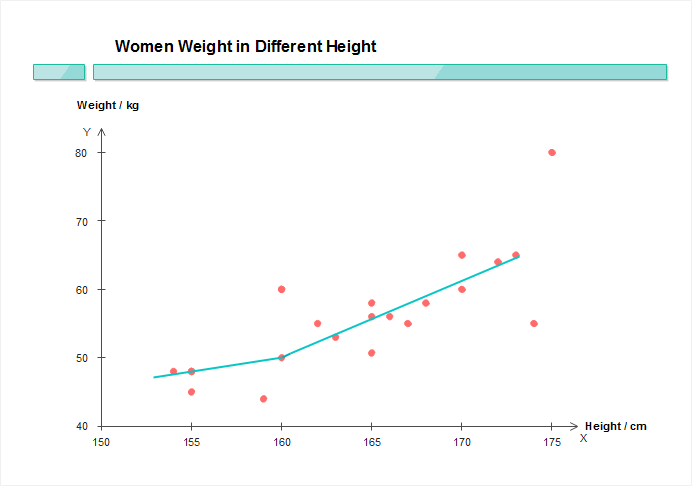
Scatter charts feature displaying values for typically two values for a set of data, thus illustrating the degree of correlation between two variables. For instance, to display a link between a woman's height and her weight, you need to choose a group of women to research, then measure their height and weight. You record the data in a scatter chart, setting "height" to the x-axis, and "weight" to the y-axis. Such a scatter chart allows you to accumulate big data from many people, thus obtaining a visual comparison of the two variables. Such a scatter chart is useful to determine the correlation that might exist in a convincing way.
Download an interactive chart software for free.
When to Choose Line Graphs
Long Text Labels on the X-axis
Comparing with a scatter chart where variable data distributes unevenly on the horizontal axis, line graphs work better in holding long text labels because category data are distributed on the x-axis with equal intervals.
Y-axis Value Changes over Time
A line graph features showing trends, the best use of a line graph is data that changes over time. It's easy to find that almost all graphs about product sales, grade marks and other data that changes over time at vase units, such as days, weeks, months, quarters and years, are presented in line graphs. People involved in need to adjust their strategies according to the trend for better development.
When to Choose Scatter Charts
Random Data Distribution on the X-axis
Although line graphs can be applied to indicate tendencies based on other continuous periodic values, such as speed, temperature, distance etc., you have to make sure the periods are equally distributed on the x-axis. However, different from line graphs, the x-axis of a scatter chart is a value axis where you can record data without even intervals.
Show Correlation from Big Data
If you are running a software, you need to do user behavior analytics to improve your product. In this case, you need to collect a large number of convincing data. A line chart is not able to hold so many data. Besides, linear or non-linear trends, clusters and outliers displayed in a scatter chart help to illustrate the patterns in the data.

Conclusion
From the analysis above, we can tell that line graphs and scatters are applied to different occasions because of their own features. Think twice about your purpose before choosing a chart to analyze your data.
Further Reading:


