Histograms for Effective Data Analysis
Introduction to Histogram
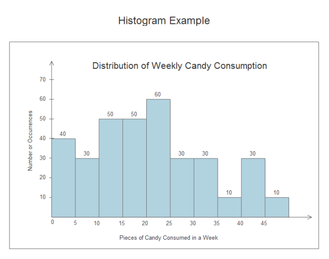
Histogram is a chart representing a frequency distribution; heights of the bars represent observed frequencies. In other words a histogram is a graphical display of data using bars of different heights. It is similar to bar chart but it uses vertical column to display data. Unlike horizontal and vertical bar charts, the x-axis is not divided into mutually exclusive categories. The x-axis is a continuous scale. To construct a histogram, a section of the number line is divided into equal chunks, called bins. Note that for a histogram, the bins all must be the same width. Refer to the following diagram for better understanding of histograms.
How to Use Histogram to Analyze Data
The nature of a histogram makes it easy to find values for ranges of data, across many bins. To get started, collect your data by searching online, gaining it from books or doing your own researches. These data must contain the following two types:
- Input data This is the data that you want to analyze by using the histogram tool.
- Bin numbers These numbers represent the intervals that you want the histogram tool to use for measuring the input data in the data analysis.
After your data is ready, use EdrawMax - an automatic histogram tool to construct histograms easily in minutes. It can help you save tons of time and energy because it has automated many steps of the drawing process.
Make Histograms with Automatic Software for Data Analysis
EdrawMax can automatically create histogram for you. All you need to do is tell EdrawMax what to do by clicking the floating action button and it take care of the rest. Edraw automatically determines the range of the histogram (where to start and stop on the number line) as well as the bin size (the width of each bin on the number line). You can change these options later by dragging the yellow control handles. As you increase the number, the height of column increases automatically right afterwards.
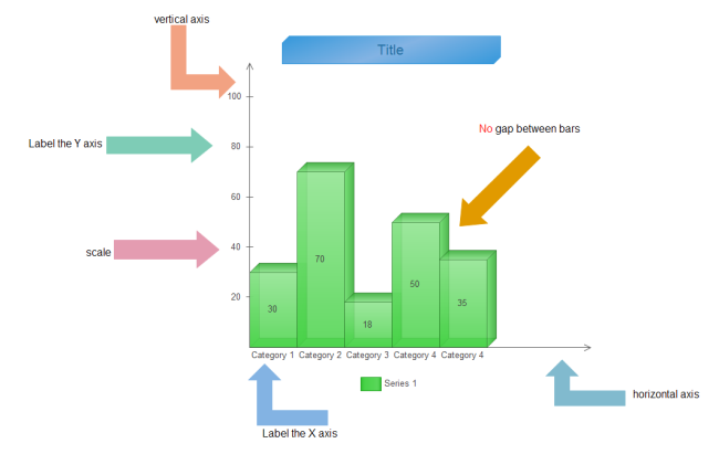
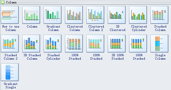
Column Chart Symbols
Included are a series of column chart templates in vector format. 3D shapes are also available. Just drag and drop a suitable template onto the canvas and let Edraw crack the hard nut for you.
How to Construct Vector Histograms
Follow these simple steps to make your own featured histograms in vector format. You can share them with others by transforming them into various formats.
Open the Column Chart Template from the Chart library. Drag the shape from library to start your column chart.
Double click value text on column to edit the chart data. The column height changes according to the rate of column value and axis max value.
Use the floating menu to add/delete a category/series and set max value or other appearance options.
When you complete the histogram, you can save it as the project file for revision later. You can print it or export it in the html, pdf,svg, transparent png format. You can also export it to MS Word, Excel or PowerPoint with one click.
More details can be found in article: How to Create a Histogram.
Histogram Template