Bar Chart vs Histogram
Understanding the differences between bar charts and histograms is beneficial because you may need to compare various elements. It is crucial to make the right choice depending on your data. Acquiring this knowledge is vital when you have categorized or continuous data that you wish to display graphically. As bar charts vs. histograms gain popularity, you should know the primary and most conspicuous difference: the presence of spaces between the bars in a bar chart, whereas a histogram has adjacent bars without separation.
These two types of charts are used to ease data analysis, enhance information communication effectively and simplify ideas and complicated statistics. They also come in handy when you must make presentations comprehensible and compelling and add interest to statistical essay reports. The information below contains details about histogram vs. bar chart to make the right selection and display information appropriately.
- Part 1: What is a Bar Chart?
- Part 2: What is a Histogram?
- Part 3: Key Differences Between Bar Chart and Histogram
- Part 4: Commons between Bar Charts and Histograms
- Part 5: How to Create a Bar Chart?
- Part 6: How to Create a Histogram?
- Part 7: Draw Bar Charts and Histograms with EdrawMax
- Part 8: Conclusion
Part 1: What is a Bar Chart?
A bar chart comprises multiple bar graphs that represent comparisons between data categories. The grouped data is displayed in parallel rectangular bars with varying lengths but equal width. Each rectangular block is representative of specific data, and its length is dependent on values held. These separate entities do not touch each other.
Bar charts are useful in showing positive and negative values and can be either vertical or horizontal; vertical displays time series data, whereas horizontal conveys data that varies over space. Consequently, it has two axes, one representing data values (Y-axis) and the other showing categories (X-axis).
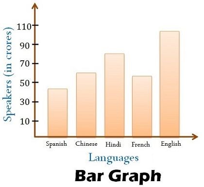
For example, the bar chart below shows the number of speakers speaking specific languages; the languages are categories, and their bars have spaces in-between because they are discrete variables. Therefore, there is a comparison among which languages have the most speakers. English appears to have the highest number of speakers, whereas Spanish has the lowest.
Part 2: What is a Histogram?
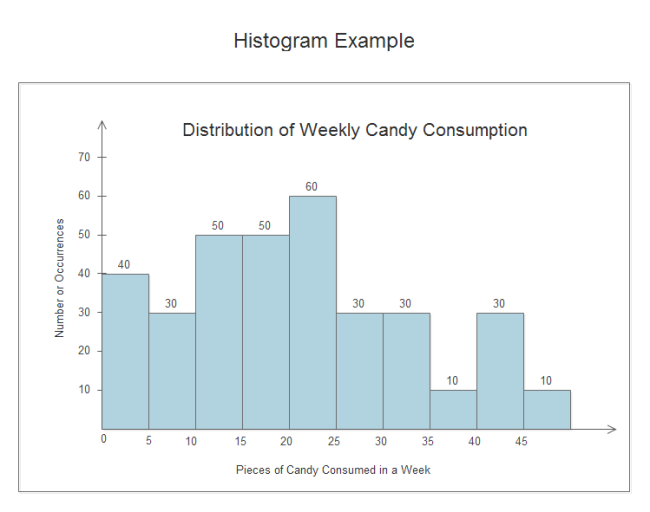
A histogram is a type of bar chart that displays the frequency distribution of continuous data. It is useful in representing statistical information, whereby the different heights of the bars depict observed frequencies. These adjacent bars are attached because the number of observations lies in-between the value range, known as bin or class. The vertical Y-axis represents data values, whereas the horizontal X-axis represents the number of ranges.
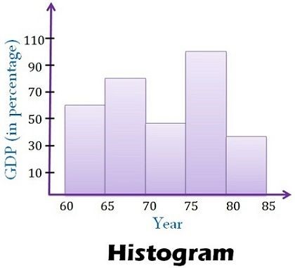
For instance, the histogram below indicates the progress of gross domestic product (GDP) of a certain country from 1965 to 1985 onwards. Note that the years are continuous in intervals of five and are connected because they are dependent on each other. From the data displayed, this nation has produced GDP continuously but in varying values. Between 1975 and 1980, the nation produced the highest GDP percentage, which reduced to the least percentage in the next five years between 1980 and 1985.
Part 3: Key Differences Between Bar Chart and Histogram
| COMPARISON ITEMS | BAR CHART | HISTOGRAM |
| Meaning | A bar chart entails the representation of data through bars that compare different categories of data. The grouped data is displayed in parallel rectangular bars of equal width but varying length. | A histogram is a type of bar chart that caters to the representation of data through bars showing continuous data frequency. It shows the number of observations as they lie in-between the value range, known as bin or class. |
| Usage | A bar chart is useful in showing visual comparisons of separate variables counted in a predetermined period. | A histogram is useful in showing continuous data frequency. It involves non-discrete variables. |
| Types of data | Discrete numerical or categorical data. | Non-discrete quantitative data. |
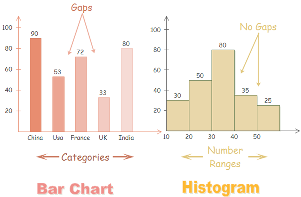
| Space between bars | The bars are separated by spaces. | The bars do not have spaces but instead are attached to one another. |
| Width of bars | The bar width must be the same. | The bar width is not necessarily the same. |
| Reorder bars | It is possible to reorder the bar blocks. | Reordering the bars is impossible after completion. |
| Elements | Elements are reflected as individual units. | Elements are taken as ranges and thus grouped. |
| Rendering | Each data point is rendered as a separate bar. | The grouped data points are rendered based on the class or bin value. |
| Axis label placement | The columns are situated over a label representing a categorical variable. | The columns are located over a label representing a quantitative variable. |
| Required values | Quantitative values. | Quantitative values. |
Here is the further differences between bar charts and histograms:
With bar charts, each column represents a group defined by a categorical variable; and with histograms, each column represents a group defined by a quantitative variable. It is always appropriate to talk about the skewness of a histogram; that is, the tendency of the observations to fall more on the low end or the high end of the X-axis.
Differently, bar charts' X-axis does not have a low end or a high end; because the labels on the X-axis are categorical - not quantitative. Therefore, it is less appropriate to comment on the skewness of a bar chart.
Part 4: Commons between Bar Charts and Histograms
Bar charts and histograms can both be used to compare the sizes of different groups. Like many other visuals, histograms and bar charts are gaining increasing popularity for the following benefits.
- Ease of data analysis.
- Simplify complicated statistics and ideas.
- Add interest and fun to presentation (reports, essays, and so on).
- Make presentations more compelling and comprehensible.
- Enhance effective information communication.
Part 5: How to Create a Bar Chart?
Creating a bar chart involves first drawing two perpendicular lines, one vertically and another horizontally, on a spacious paper.
Secondly, take the basis of the observed variable along the vertical line, which will become the Y-axis, and categorization along the horizontal line, which will act as the X-axis.
Thirdly, for each class, mark signs of equal breadth on the X-axis and leave no less than half a breadth of space between two classes.
Finally, on the Y-axis, mark the values of the provided variable to prepare the bar chart bars.
Part 6: How to Create a Histogram?
To construct a histogram:
- Begin by taking the observations, which are a range of values, and dividing them into logical series of intervals known as bins.
- Ensure that you count how many values fall into each interval.
- Draw two perpendicular lines, one vertically and another horizontally, on a spacious paper.
- Place the independent variables or classes on the X-axis, whereas dependent variables or occurrences go to the Y-axis; ensure that you mark accordingly.
- Prepare the rectangular blocks without leaving any spaces in-between.
Part 7: Draw Bar Charts and Histograms with EdrawMax
Ever think about making a sleek-looking chart or graph in less than 5 minutes? You can realize it right now with EdrawMax - an advanced automatic diagram maker, which can generate many kinds of diagrams, including histograms and bar charts. The learning curve could be flat, leaving only simple steps for users to do. You can now try it for free!
An all-in-one platform for 210+ diagrams.
・ Simple alternative to Visio
・ 26k+ symbols
・ 10K+ free templates
・ 10+ AI diagram generators


Part 8: Conclusion
The bar chart vs. histogram comparison indicates multiple differences between the two, making them entirely different. As bar charts are used to compare categories, histograms provide quantitative analysis, whereby data points are grouped into specific intervals. Therefore, you can use a bar chart to summarize large data in visual form and utilize a histogram to predict future process performance.
Although both have the X-axis and Y-axis, which are horizontal and vertical, the display of the data differs; the bar chart has spaces due to the comparison of independent variables, whereas the histogram has connected bars due to the presentation of continuous dependent data. So, the bar chart is perfect for categorized data, whereas the histogram suits continuous numerical information.
Related Articles


