When Should I Use a Bar Chart?
Overview of a Bar Chart
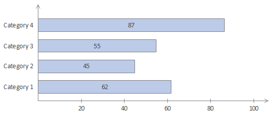
Bar chart is the chart that you use one unit to describe a fixed value, then draw rectangular bars of corresponding length proportion based on values, and finally sequence them with an order. This chart presents the value of each category intuitively and visually for making a comparison of different categories.
Most bar charts are designed horizontally which shows the difference with column charts. Commonly, bar charts shows the categories on the y-axis (the vertical axis) and values on the x-axis (the horizontal axis).
Types of Bar Charts
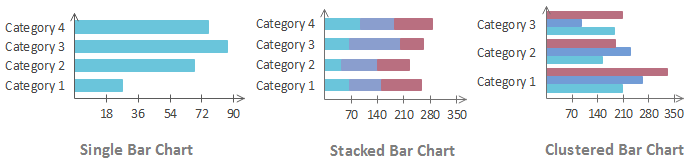
There are 3 types of bar charts containing the single bar chart, the stacked bar chart and the clustered bar chart.
Try an easy and effective Chart Maker - Edraw. Download it for free.
When to Use a Bar Chart?
Occasion 1 - Values of each category need to be viewed intuitively.
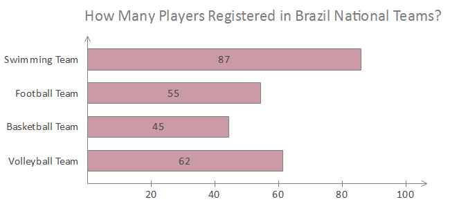
If you want to know the quantity, ratio and frequency of each category in a chart, you should choose a single bar chart. For a single bar chart, you can see the values of items clearly with the length of each bar. Take below chart as an example, you can find the quantities of registered players in each Brazil national teams visually.
Occasion 2 - Items on the chart have over 5 categories.
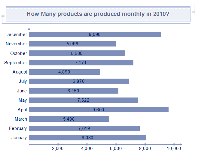
If categories are more than 5, it might be difficult to view the label of categories in vertical column charts. For this reason, horizontal bar charts help you view a large number of categories. Take the following single chart as an example, it is clear and comfortable to view month lists next to the vertical axis.
Occasion 3 - A comparison of data is needed on the chart.
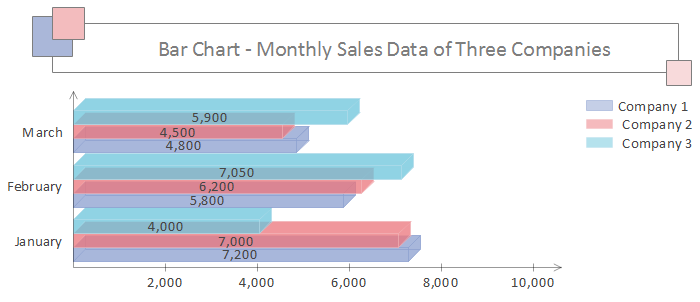
As far as you know, single bar chart is intuitive to view the values. But if you want to know data of a group of categories, the clustered bar chart really helps. Clustered bar charts are good for comparing among each element under those categories, and comparing items across categories. For instance, if you intend to know monthly sales data of 3 companies, you will see a visual comparison with below clustered bar chart.
Occasion 4 – A part to whole relationship of the category is needed.
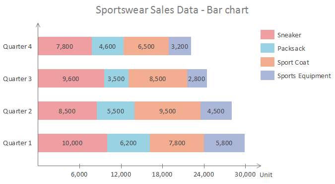
The stacked bar chart indicates a part to whole relationship among each category. As a clustered bar chart makes it complex to present the differences between the total of each group, stacked bar charts come in to solve it. For example, sales differences of each type of sportswear perform distinctive in 4 quarters. In below chart, you may view it vivid to know each part to whole relationship.
In conclusion, bar charts are used when viewing values of each category, more than 5 categories occurring, data comparison and a part to whole relationship of category. Have a trial of Edraw, you can draw all types of bar charts simply.
Further Reading:


