How Bar Charts Differ from Pie Charts
Graphs and charts such as line charts, pie charts, column charts, bar charts and area charts are effective tools in displaying data clearly and distinctly. Among these graphs, bar charts and pie charts are the most prevalent ones applied to presentations, brochures, websites, magazines and newspapers to create better visual effects. Out of the differences between bar charts and pie charts, these two types are used in different situations. This article explains how bar charts differ from pie charts.
Bar Charts Vs. Pie Charts - Appearance Difference
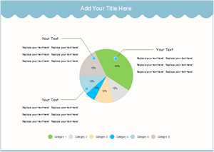
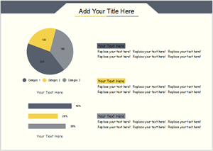
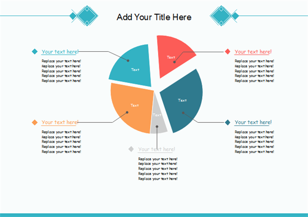
A pie chart is a circle showing the proportions of several subjects with the different subjects split into wedge slice. The history of pie charts can be dated back to 1858 when Joseph Minard first drew one, and got the name out of the resemblance between his chart and a pie. As time goes by, pie charts now have variants, such as Perspective Pie Chart, Doughnut Chart, Exploded Pie Chart, Polar Area Diagram, Ring Chart and Spie Chart.
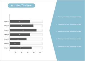
A bar chart shows rectangular bars plotted vertically or horizontally on axes with varying heights to represent categorical data. On a bar chart, you can see clearly the value of a subject, for example, the rainfall of a city. A bar graph shows comparisons among discrete categories. One axis of the chart shows the specific categories being compared, and the other axis represents a measured value. Some bar graphs present bars clustered in groups of more than one, showing the values of more than one measured variable.
Explore excellent chart software: Try it FREE.
Bar Charts Vs. Pie Charts - Usage Difference
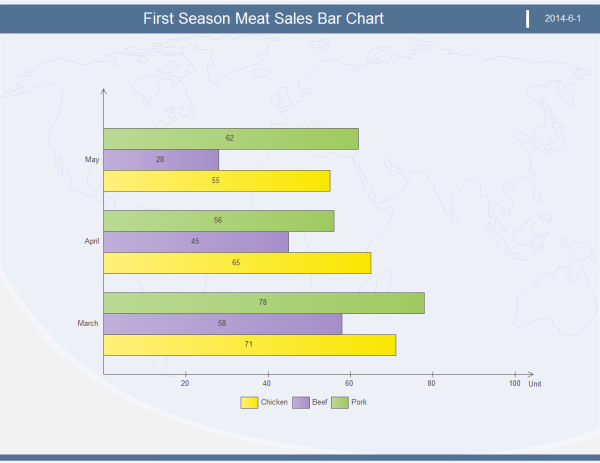
For the reason that information on a bar chart can extend vertically and horizontally with no limitations, bar charts can hold both data in discrete categories and data of one category in different periods. Bar charts provide a visual presentation of categorical data. For example, in the following " First Season Meat Sales Bar Chart“, the vertical axis gives the period - three months of the first season, the horizontal axis gives the concrete scaling values of three kinds of food - chicken, beef and pork that are marked with bars of green, purple and yellow respectively.
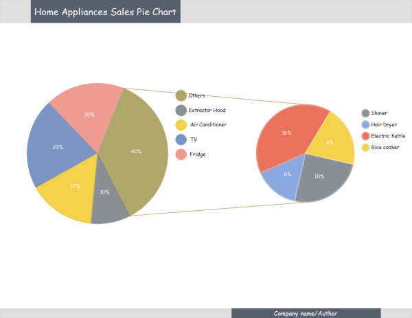
Since a pie chart displays proportions of specific statistics by arc length or angle scale of the corresponding slice, it can't show more than a few values without separating the visual encoding (the "slices") from the data they represent (typically percentages). When many subjects are compared on a pie chart at the same time, it relies much on colors, textures or arrows to separate the slices so that readers can read clearly and then understand the chart. Allowing people to get the difference of subjects distinctly at a glance, pie charts are widely used as presentation tools for children education. Take the following "Home Appliances Sales Pie Chart" for an example, the pie charts on the left displays the appliances that sell well immediately - fridge and TV; the pie chart on the right divides the "Other" slice into detailed parts and shows that hair dryer sells best among other appliances at a glance.
Bar Charts Vs. Pie Charts - Advantages and Disadvantages
A great number of chart users hold the view that bar charts are much more flexible than pie charts, because they can chart multiple categories during multiple periods. It's an ideal choice to use bar charts if you need to make comparisons of subjects during the same period, especially when there is a big gap between values of the segments. However, on a pie chart, instead of concrete values, what you can see are percentages that a subject takes up of the whole. The pie stands for the overall 100%.
Pie charts are not as prevalent as bar charts, because they can't display concrete data of each segment such as values directly at a glance. Besides, readers can make comparisons of arbitrary data segments quickly on a bar chart, but are not able to compare two slices that are not neighbors at once. Every coin has two sides. Both bar charts and pie charts have their benefits, what you need is to figure out the differences between them and choose the appropriate one in different situations.
Templates of Bar Charts and Pie Charts
Edraw chart software offers you many templates of bar charts and pie charts to view and download.