Donut Chart
- Part 1: What are Donut Charts
- Part 2: Brief Donut Chart History
- Part 3: Types of Donut Charts
- Part 4: When do I need Donut Charts?
- Part 5: Advantages and Disadvantages
- Part 6: How to Create a Donut Chart in Excel?
- Part 7: How to Create a Donut Chart in EdrawMax?
- Part 8: Examples of Donut Charts
- Part 9: Conclusion
Part 1: What are Donut Charts
They are wondering what donuts have to do with charts? Well, donut charts are an excellent data visualization tool. They get their name because of their shape, which is a circle with a hole in the middle.

It is a variation of a pie chart and is pretty similar to it, except that the hole can also present additional data. Basically, donut charts are used to represent data and compare the contribution of each value to the whole. The size of the segments indicates the value. Furthermore, donut charts can work when multiple data sets are to be assessed.
In this article, we will walk you through the perks of using donut charts.
Part 2: Brief Donut Chart History
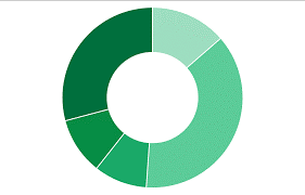
As we may know that earliest known pie chart is generally credited to William Playfair's Statistical Breviary of 1801. As time went on, people found out that a special type of pie chart - doughnut chart. Doughnut charts provide a better data intensity ratio to standard pie charts since the blank center can be used to display additional, related data as shown in the example
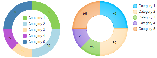
Part 3: Types of Donut Charts
Unlike other charts, donut charts only have two types: a simple donut chart and an exploded donut chart. Let’s take a look at how they are different from one another.
• Donut Chart
This type is the primary type of donut chart. It consists of a ring that displays the data. If the data labels consist of percentages, each round will depict 100%.
• Exploded Donut Chart
As opposed to the simple donut chart, the Exploded donut chart emphasizes the individual values. It depicts the contribution of each value to the whole. This type of chart is used to visualize hierarchical relationships.
It consists of multiple rings that represent multiple data sets.
Part 4: When do I need Donut Charts?
Figuring out which type of chart to use is a hassle. We often get confused and struggle with making the right choice. So, we are going to walk through different situations in which donut charts are the best option.
As mentioned above, donut charts are ideal for comparison. They can be used to different data points that total 100%. The key feature is that donut charts can only have 2 to 5 categories as you want your audience to get the information at a glance.
So, donut charts are ideal to use when you have less than five categories in a single data set. Moreover, if you have multiple data series, no negative values, and no zero values, then donut charts are the perfect choice for you.
Keep your data and requirements in mind, and then decide whether you need a donut chart or something else.
Now that we know when to use donut charts, it is time to look at their advantages and disadvantages.
Part 5: Advantages and Disadvantages
Advantages of Donut Charts
As compared to other charts, donut charts have quite a few advantages. Here, we have listed a few.
- Customizable:Donut charts can be edited according to your needs. You can insert them anywhere and can be drawn in different colors.
- Easy to Understand: These charts require a very minimal explanation as they are very easy to understand.
- User-friendly: Donut charts are user-friendly in the sense that they are easy to draw and have a simple structure.
- Multiple Data Series: Donut charts can easily study values of multiple data sets by adding more rings.
- Neat Look:These charts are concise, which gives them a neat look. Your work looks tidy and clutter-free.
Disadvantages of Donut Charts
Following are the disadvantages.
- Fewer Categories: In case of having several categories, the chart can become cluttered and difficult to understand.
- Not for Changing Data: If you are using data that may change over time, then donut charts are not suitable.
- Vague Values: It is difficult to determine the exact value because it is divided into segments for comparison and not for knowing the value.
Like all things, the pros and cons are bound to exist. So, use your data to decide whether donut charts are suitable for you or not.
Part 6: How to Create a Donut Chart in Excel?
It is extremely easy to create a donut chart in Excel. Follow these steps.
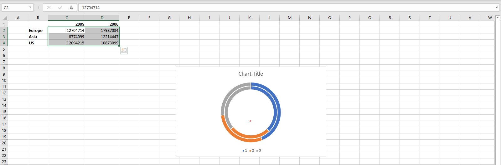
Step 1: Add Values
Open Excel and add the values that you want to compare between.
Step 2: Add Donut Chart
Select the two data sets, go to the Insert Tab, and click on the Pie chart symbol. From the drop-down menu, add the Donut chart.
Step 3: Edit the Donut Chart
At the top of your screen, different chart styles will be given. Choose the one that you like the most.
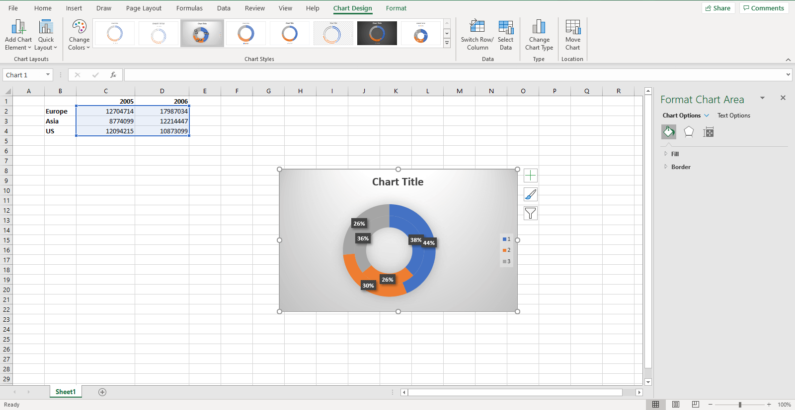
Double click on the chart area to open the editing task pane on the right side of your screen.
Step 4: Experiment
From the editing task pane, use different options to see what works best for you. You can add different colors and effects using the “Fill and Line” and “Effects” options, respectively. Furthermore, you can also change the size and properties of the chart area.
So, use different combinations and select the best one. Once you are done, save your file and enjoy!
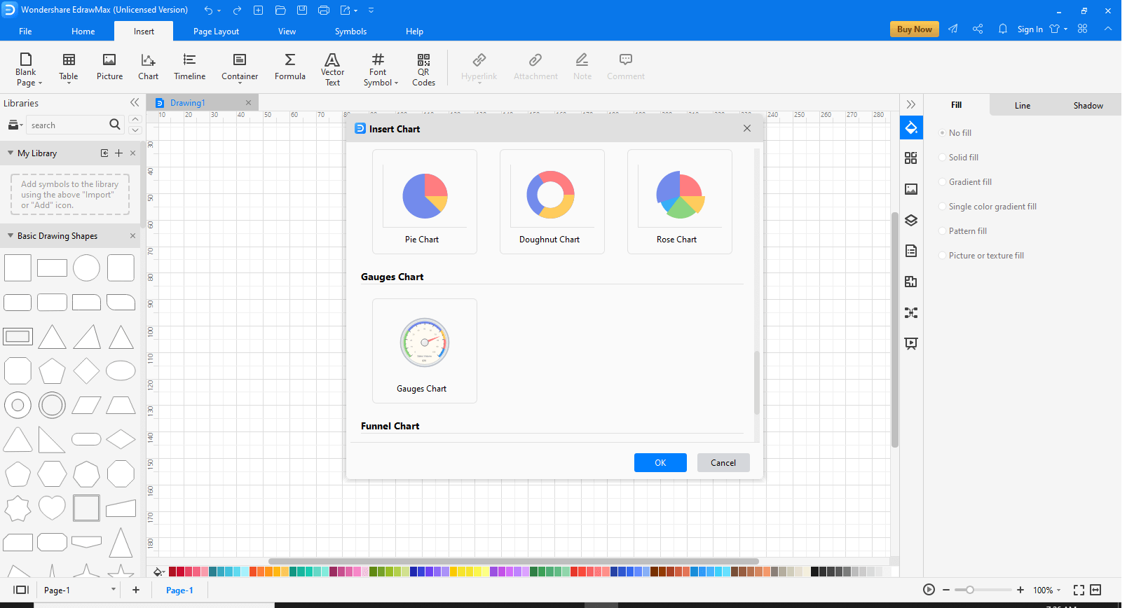
Part 7: How to Create a Donut Chart in EdrawMax?
EdrawMax is an all-in-one diagram software that has inbuilt templates that you can use for data visualization. Follow these steps to create a donut chart using EdrawMax.
Step 1: Install and Launch EdrawMax
Go to the official website of EdrawMax and download the software.
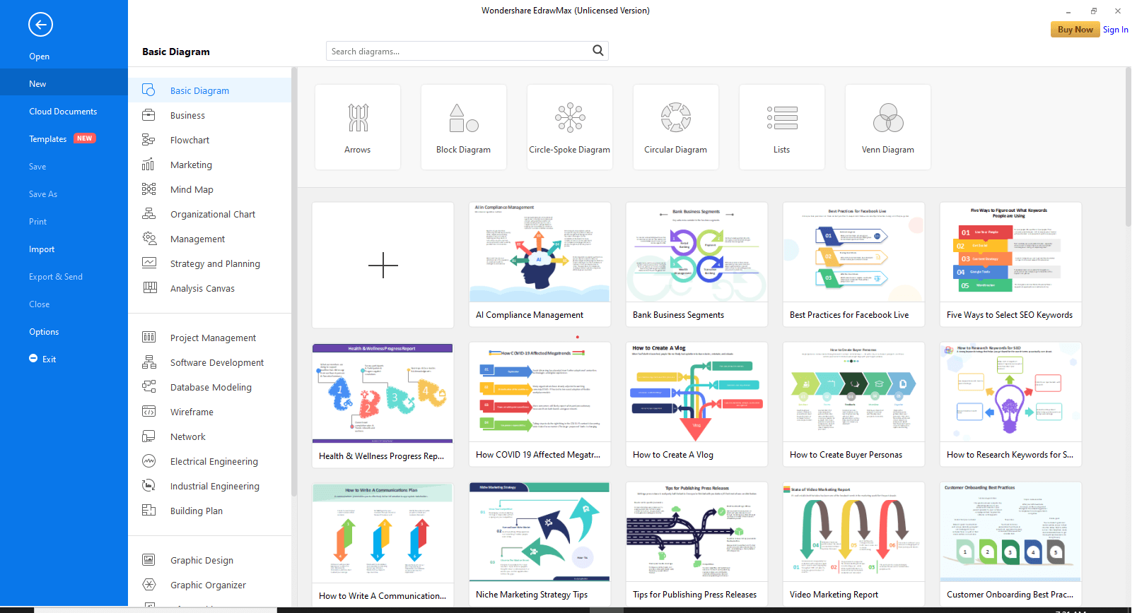
Step 2: Open Empty Workspace
Click on the “+” to open a new empty workspace.
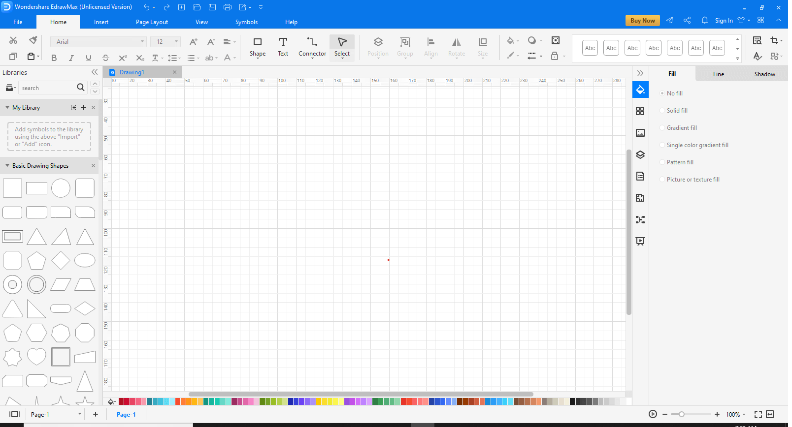
Step 3: Go to Insert
Click on the Insert tab at the top of your screen to view the different options.

Step 4: Add Donut Chart
From the “Insert Chart” window, choose the “Doughnut Chart” option to add it to the workspace.
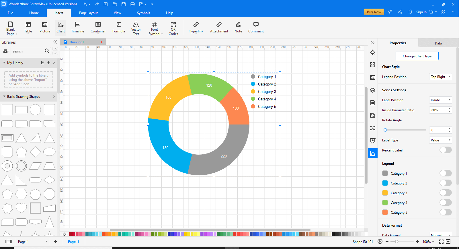
Step 5: Edit as per your requirement
Once the chart has been added, on the right of the screen, different editing options will be available. Use these options to make your Doughnut chart more appealing and customize it according to your work.
An all-in-one platform for 210+ diagrams.
・ Simple alternative to Visio
・ 26k+ symbols
・ 10K+ free templates
・ 10+ AI diagram generators


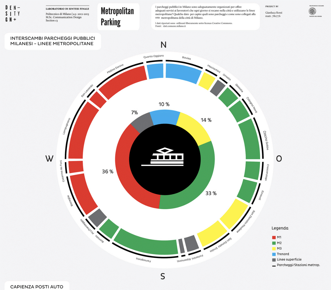
Part 8: Examples of Donut Charts
- Finance and Economics: To study statistics and observed data.
- Sales and Marketing: To view goals and how much they have been achieved.
- Competitive Analysis: To compare two sets of data having an ordinary parameter.
- Executive Dashboard: To indicate key performance indicators.
These are some examples of where and when gauge charts can be used. You can also adjust and customize the gauge charts as per your requirement and use them in any way you wish.
Part 7: Examples of Gauge Charts
Example 1
This is an example of a donut chart being used for the cost breakdown of a project. The chart is divided into different segments.
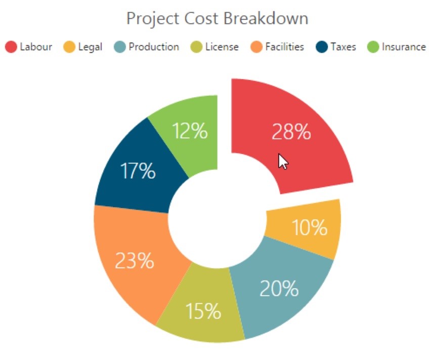
One of the segments is detached to highlight and emphasize it. The key is given to show which color is for what utility. The percentages show that a particular thing costs this much. For example, 20% of the total cost of the project is spent on production.
You can quickly analyze what costs what percentage and then increase or decrease the cost of a particular segment according to your need.
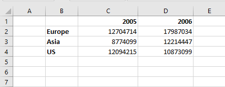
Example 2
Here is another example in which two data series have been taken. Two different donut charts have been created to study the data.
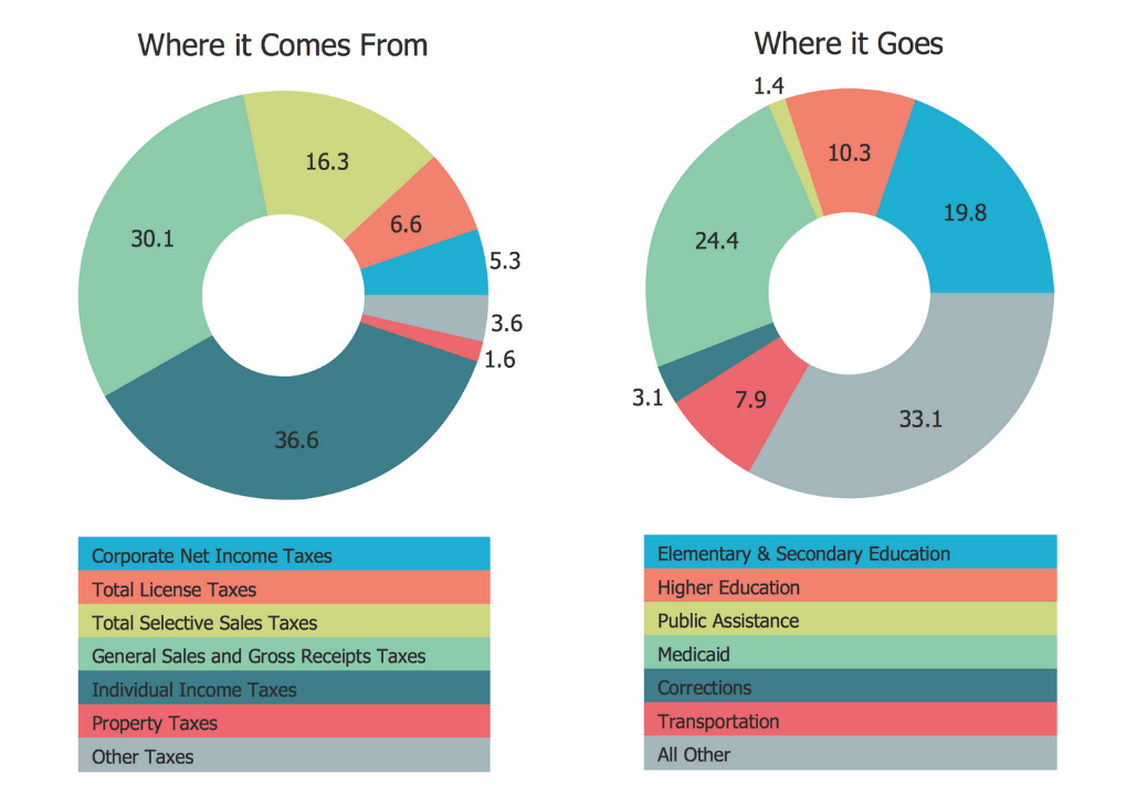
The first chart represents where the revenue came from, and the second chart is used to show where the expenditures happen.
You can use donut charts in different fields such as businesses and statistics to explain data and work results.
You may customize lots of doughnut chart features according to your own needs.
Part 9: Conclusion
Donut charts are excellent for data comparison and visualization. You can use them with ease as they are simple and not at all complex. However, you have to be mindful of the data you are using because certain conditions are not suitable for a donut chart. Moreover, you can draw donut charts by hand or by using software such as Excel and EdrawMax.
Have fun working with donut charts!!


