Stacked Bar Chart
- Part 1: What is a Stacked Bar Chart?
- Part 2: Types of Stacked Bar Chart
- Part 3: How and When to Use Stacked Bar Chart
- Part 4: Advantages and Disadvantages
- Part 5: How to Make a Stacked Bar Chart in Excel?
- Part 6: How to Make a Bar Graph in EdrawMax?
- Part 7: Examples of Stacked Bar Chart
- Part 8: Conclusion
Part 1: What is a Stacked Bar Chart
If you are handling data and realize that the values generated have a few variables. You need to plot these on a single graph and also keep it simple. Do not worry, the Stacked Bar Chart is the best solution to your needs.
Stacked Bar Chart, also known as the Stacked Bar Graph, is a type of Bar Graph and can be called an extension to a normal Bar Graph. In a Stacked Bar Chart, any variable that exists is stacked end to end upon its corresponding value. Just like a normal Bar graph, the Stacked Bar Chart consists of two axes.
This article will implore this visual tool.
Part 2: Types of Stacked Bar Chart
There are two distinct types of a Stacked Bar Chart and the depend on the type of variable data that is present.
1) Simple Stacked Bar Chart
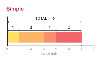
In a simple stacked bar chart, all the variable values should add up to the total value covered by the bar. This is ideal for measuring the amount each variable value constitutes for.
2) 100% Stacked Bar Chart
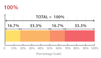
In a 100% stacked bar chart, the values are present in percentages. The total of these variable percentages should add up to 100%. This helps analyze the percentage each variable took in every data set present.
Part 3: How and When to Use Stacked Bar Chart
After understanding the different types, it's essential to know how to use a stacked bar chart. A stacked bar chart can be used to analyze more than one type of information on the same bar. When more than one variable gets involved in one bar, it is essential to realize which variable is the primary variable and which is the secondary so that it is easier to plot a stacked bar chart.
It can be used to plot data in which both genders are used as a variable. In another case, if rain data is covered, then the variable could be the different seasons. It is important to know that the increase in variables can generally question the credibility of the data collected.
Part 4: Advantages and Disadvantages of Stacked Bar Chart
As everything out there has its pros and cons, so does the Stacked Bar Chart.
Advantages
- Color-Coding: Since every variable needs to be distinct, they are color-coded. This makes it very easy to read the data present.
- Good for Comparison: They are good for comparison between different variables and how much they have contributed to the final value.
- Neat look: They make all the data concise and limit it to one final variable for each bar making sure that less space is occupied, and everything looks neater.
Disadvantages
- Harder to read: The information might be concise but with each addition in the variables, it becomes harder to read.
- Higher Error chance: A stacked bar chart in comparison to other visual tools such as a pie chart, seem to have a higher error chance.
- Not for everyone: They might be a type of bar graph, but their complexity makes them limited to individuals who can work with a bit of complexity.
Part 5: How to Make a Stacked Bar Chart in Excel?
If you are working in an office, an application you must know about is Microsoft Excel. It is the most used application when compiling data. Keeping that in mind, Excel also allows you to easily convert your already present data into the form of a Stacked Bar Chart. Following these simple steps will allow you to make your Stacked bar graph.
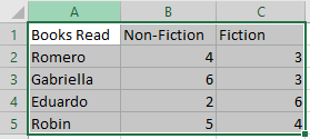
1) Make a table
The first step is to make a table with three or more values, the values will be displayed respectively for the type of orientation selected for the Stacked Bar Chart.

2) Select the Table
The next step is to select the Table in which the values exist. In this case, it is from A1:C5.
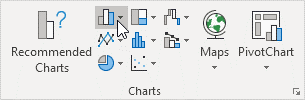
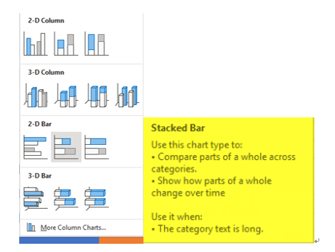
3) Tap the Column Symbol
On the top there should be a symbol present in the charts box, the symbol would be of Bar Graphs.
4) Select preferred Stacked Bar Chart
A pop-up will drop down which will contain several types you can choose from. You can choose vertical or horizontal as you please. Since the values have more detail, we will select the Horizontal Bar Graph.
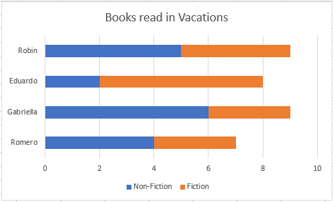
5) Enjoy the Result
The final Stacked bar chart should look like this
Part 6: How to Make a Bar Graph in EdrawMax?
EdrawMax is one of the most useful software for data representation. It has inbuilt templates that help you create your desired visualization tool quickly. The following steps will help you make a Bar Graph in EdrawMax.
Step 1: Install EdrawMax
Go to the official website of EdrawMax and download the software.

An all-in-one platform for 210+ diagrams.
・ Simple alternative to Visio
・ 26k+ symbols
・ 10K+ free templates
・ 10+ AI diagram generators


You have both the free and paid version available. For basic tasks, the free version is sufficient.
Step 2: Launch the App
Once the software has been installed, open EdrawMax. The interface will look like this.
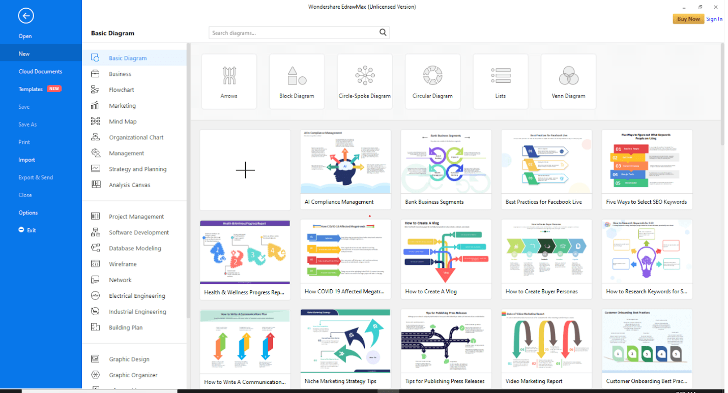
At the top right corner, there is an option of signing in. This will enable cloud storage. However, you can use EdrawMax without signing in as well.
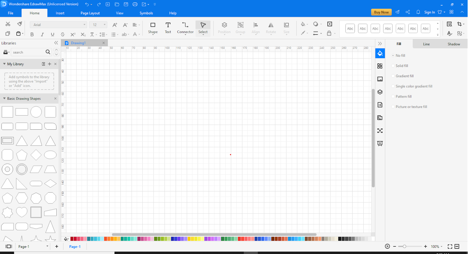
Step 3: Open a New Canvas
Click on the “+” sign to open an empty workspace.
Step 4: Go to Insert
At the top, go to the Insert tab.

Click on “Chart” to view the templates. A pop-up will appear.
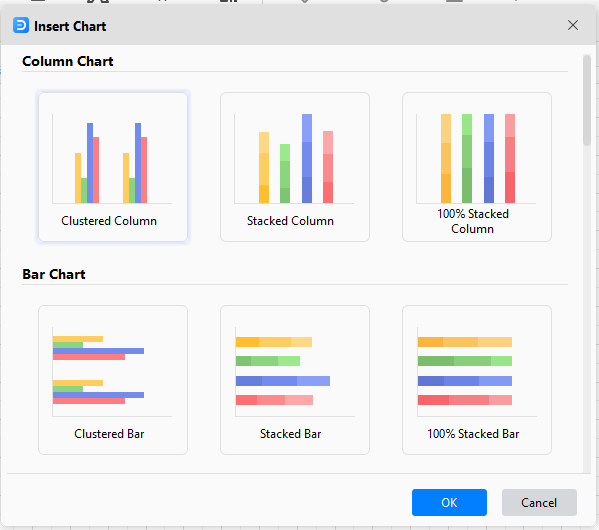
Step 5: Choose template
Scroll down to find the “Bar Chart.” Select it and click “OK.”
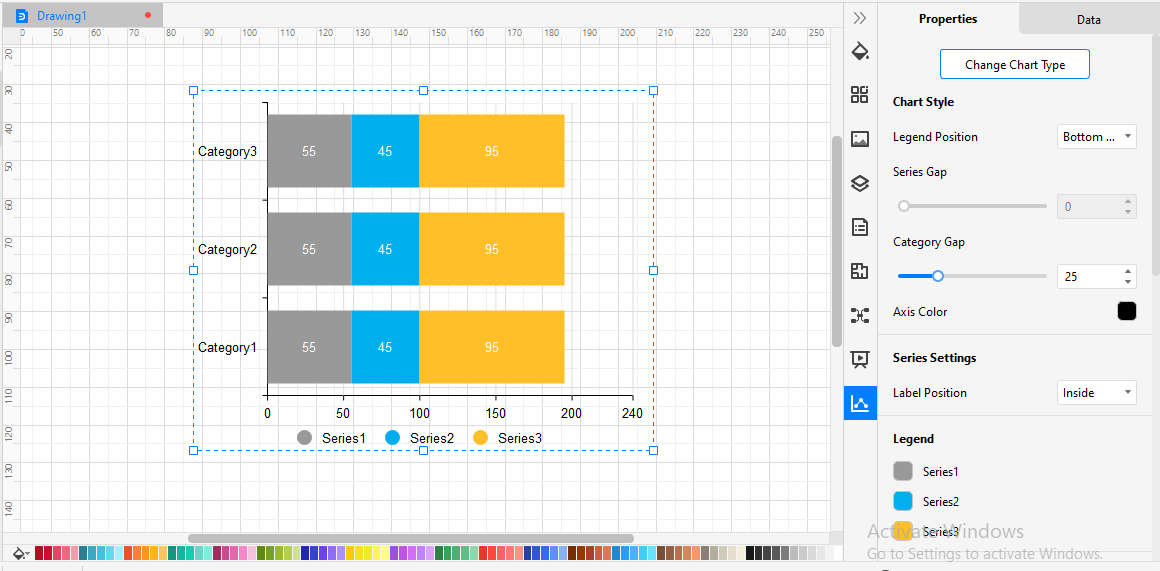
Step 6: Customize Stacked Bar Chart
Once the chart has been added, on the right of the screen, different editing options will be visible. These options can be used to make your Stacked Bar Chart more appealing and stand out. The bar at the bottom can be used to make it more colorful as well.
Part 7: Examples of Stacked Bar Chart
To understand how a Stacked Bar Chart works, we will utilize examples to make things much clearer.
Example 1:
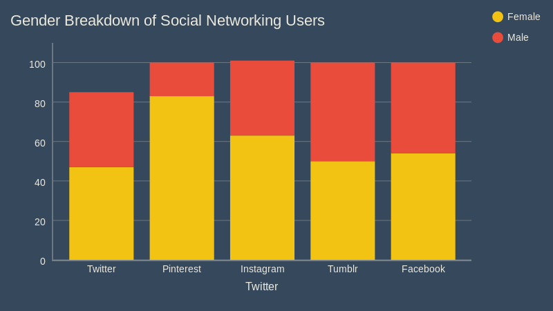
Here is a very simple example of a stacked bar chart. This is a vertically stacked bar chart in which the percentage of people using different social media platforms is recorded. The fixed values: the social media platforms are present on the x-axis while the percentage values are on the y-axis. One more important thing about the graph is that the gender breakdown is visible. The two variables are the genders using social media platforms. If a regular bar graph was used, two bar graphs would be needed, this graph easily compiled it together in one graph.
Example 2:
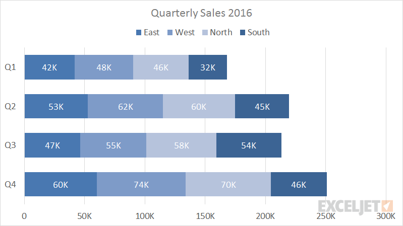
Here is a relatively complex example in quarterly sales have been recorded for 4 different offices of the same firm. This is a horizontally stacked bar graph where the quarters are listed on the y-axis and the number of sales on the x-axis. In this graph 4 variables are plotted on the same bar. Total sales of each office are treated as a variable for the respective quarter and compiled as such. The East is the primary variable, West is secondary, North is third and South is the last variable in this Graph. As visible with an increase in variables, reading the graph gets more complex.
Example 3:
This example shows 7 different products acting as variables, for 8 different strategies.

This is a vertically stacked bar chart where the different products that were used to analyze 8 different strategies are variables in this graph. As it is quite visible, with a substantial increase in variables, the graph has become much more complex to read. Although the graph does show how variables can be stacked upon each other to be part of the same bar. This might be saving a lot of space, but the time required to read and analyze this graph’s data is increasing.
Example 4:
Check out some 3D bar chart template below. Download them to make them your own. In Edraw, you can change its color easily through the Color Bar.
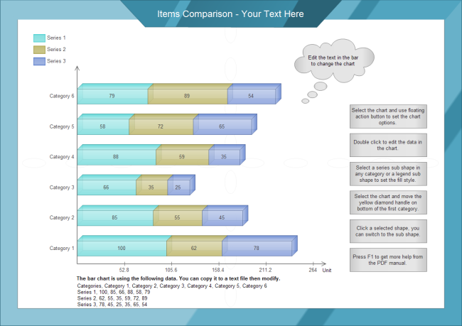
Download Comparison Stacked Bar Chart Template in PDF Format
Download Comparison Stacked Bar Chart Template in Editable Format
Example 5:
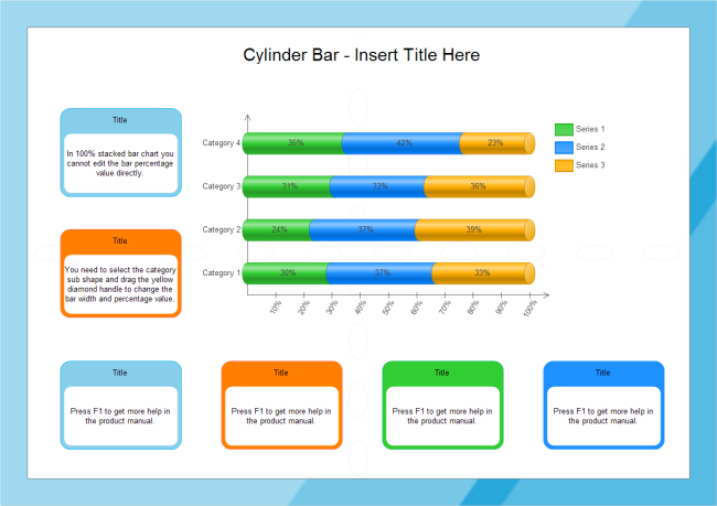
Download Stacked Bar Chart Template in PDF Format
Download Stacked Bar Chart Template in Editable Format
Part 8: Conclusion
The Stacked Bar chart is an extension of the Bar Graph, verily it is a very useful visual tool in many cases, but it also has its limitations. Do remember that the more variables you add, the more complex it gets, in such cases a pie chart might be more suitable. Apart from that, it is a great tool for comparative analysis, it can easily be made through either Excel or EdrawMax. So instead of stacking your work, stack your data instead!
You May Also Like


