When to Use a Column Chart
Overview of a Column Chart
A column chart is a tool to represent data graphically. What does it look like? Column charts display vertical bars going across the chart horizontally, with the values axis being displayed on the left side of the chart. Column charts work well in showing data changes over a period of time by displaying the comparisons among subjects on an overall chart. They are often used to show data comparisons in a visual way.
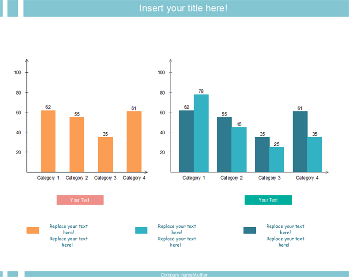
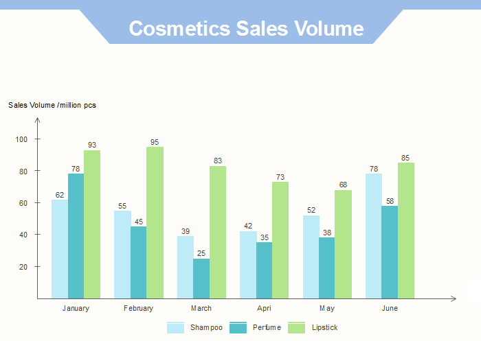
Different types of column charts are put into use, such as clustered column, 3D clustered column , cylinder column, stacked column, 3D stacked column, 100% stacked column and 3D 100% stacked column.
Try an easy and effective Chart and Graph tool - Edraw. Download it for free.
Occasions of Using a Column Chart
Column charts and bar charts are commonly used visual tools to display data and they look alike. However, these two types of charts suit different occasions because of their own features. When to use a column chart? The following are some occasions that a column chart may be preferred:
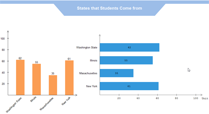
Occasion 1: The Data Reflects the Rank of Values to Focus on Extreme Values
Under such a circumstance, a column chart would be a great choice because it shows columns that grow from smallest on the left to largest on the right on the horizontal axis. Here I list some examples of this occasion:
- Showing votes ranked by states to show which state performed the best.
- Showing sales volume of the same home appliances ranked by momths to show which monthl sells the most.
- Showing average scores ranked by subjects to show which subject students are weak in.
Occasion 2: Items on the Chart Have Short Category Labels
It’s essential to make category labels under the columns of each column clear to see and easy to understand. When the audience get confused on the labels of each column, you begin to lose information and they get lost in your column chart, which is not good. Here I conclude that if the category labels are long and complicated, bar charts that allow long label texts are second to none. Otherwise, a column chart with labels beside each other displayed from the left to right would work best.
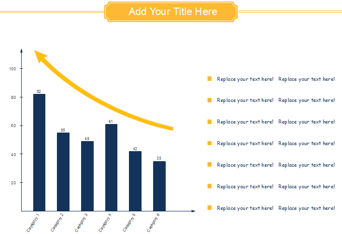
Occasion 3: A Trendline is Needed on the Chart
A trend line is a line associated with a data series on a graph indicating a statistical trend. A trendline does not represent the data of that data series, and instead, it is used to depict trends in your existing data or forecasts of future data. Comparing with other charts, a column chart has a definite advantage in displaying a trendline because of its column height changes naturally in the direction that the chart develops. If you plan to use a trendline, you are sure to find that trendlines match best with column charts.
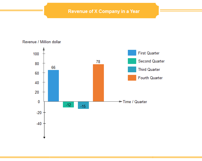
Occasion 4: The Chart Data Contains Negative Values
In mathematics, a negative number is a real number that is less than zero. Negative values represent opposites and are often used to represent the magnitude of a loss or deficiency. We learn mathematics since our childhood, and have been taught that numbers below the horizontal axis are negative numbers. In this case, when making comparisons among data, column charts work much better if negative values exist.
From the description above, we may draw the conclusion that cloumn charts should be used when the data reflects rank of values to focus on extreme values, items on the chart have short category labels, a trendline is needed or the chart contains negative values.
Further Reading:


