Comparison Chart
- Part 1: What is A Comparison Chart?
- Part 2: A Brief History of Comparison Charts
- Part 3: Pros and Cons of Comparison Charts
- Part 4: When to Use A Comparison Chart?
- Part 5: Variations of A Comparison Chart
- Part 6: How to Create A Comparison Chart with Excel
- Part 7: How to Create A Comparison Chart with EdrawMax?
- Part 8: Examples for Comparison Chart
- Part 9: Conclusion
Part 1: What is A Comparison Chart?
Used for competitive analysis, comparison charts represent the features of various items that need to be compared with each other. They are also known as comparative diagrams and provide qualitative as well as quantitative analysis. The comparison charts can compare the advantages and disadvantages, represent the change in trends, and depict differences. They are very dynamic and thus can cater to almost any scenario.
Part 2: A Brief History of Comparison Charts
Since the comparison charts have multiple roots, a specific date of origin cannot be assigned. They are believed to be invented mainly in the 18th and 19th centuries, with the earliest root being the nautical chart which dates back to the 18th century. William Faden, an English cartographer and map publisher, is given the credit of making them popular.
Later more roots were discovered, and the horizon widened. However, the popularity of these charts began with the creation of Charle’s Smith and John Thompson’s comparison charts of heights and mountains. They were widely accepted and are often tagged as the first comparison charts.
Part 3: Pros and Cons of Comparison Charts
For decades, comparison Charts have been appreciated for their wide application and numerous advantages. However, like every other data visualization method, they have their disadvantages too.
Even though the pros outnumber the pitfalls, we’ll have a look at both of them to understand this chart better.
Advantages
- Summarises large data sets into comprehensive analysis and visual representations.
- It is simple to make and offers quantitative as well as qualitative analysis.
- The parameters and items for comparison can be limitless.
- It provides reader comparison at a glance.
- The charts are easy to interpret, reader-friendly, and widely accessible.
Disadvantages
- It can be lengthy and laborious than the visual representation graphs.
- All comparison charts do not offer a detailed illustration and have to be understood with just words.
- It is easy to manipulate the data and cause misconceptions.
- Sometimes they do not offer a quick overview at a single glance and need to be read thoroughly.
Part 4: When to Use A Comparison Chart?
The versatile nature of these charts makes them widely applicable in different scenarios. They can be used whenever a comparison or evaluation is needed. Here are some situations where they are effective.
- When a comparison needs to be drawn between two or more objects.
- To analyze the performance of different products.
- Guage the effect of a certain parameter on the product.
- Used for research purposes to overview a situation, evaluate the existing possibilities, and validate the models.
- Effective in decision-making and inspecting the alternatives.
Part 5: Variations of A Comparison Chart
Comparison Diagrams are the most common types of tools used for competitive analysis. The reason is pretty clear; they are very versatile. From making comparisons via table to doing it via schematic diagrams, comparison charts cater to all needs. Let’s see some basic variations of these charts.
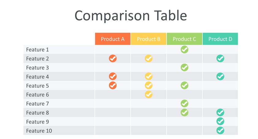
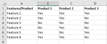
1. Comparison Tables
This is the most basic and common way of making comparisons. Different tables are drawn, and comparisons are made between two or more objects. The data can be represented in three ways: numerical, words, or as a scoreboard. In the scoreboard form, a sheet lists several parameters on one side and products on the other. If the feature is present, the corresponding box is ticked.
Generally, the comparison tables are more widely used for study purposes and require a thorough read of the chart to devise a conclusion.
2. Quantitative Charts
Comparison Maps provide a schematic depiction of the data and are very useful when comparing a considerably large amount of data. The infographics fuse the data sets with the text and explanation to make them understandable. Due to numerous data representation methods, these charts are further divided into multiple types. Let’s have a look at few major variants.
- Bar Graph
- Pie Charts
- Dot Chart
- Line Charts
This is a friendly and widely accessible way of communicating comparisons between several products. Bars for each product are drawn for a specific parameter and are encoded with colors to differentiate between them.

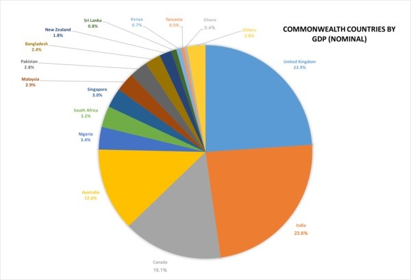
For drawing a complete comparison, pie charts are indeed very useful. They are simple graphs with a visual hierarchy that compare the different sectors of a certain topic. Pie charts are very widely used in sales and marketing, where they help determine the effectiveness of the different marketing techniques.
As the name suggests, dot charts represent the data via small dots. They represent a specific value and are plotted for the different parameters. They are an effective tool for correlation comparison and therefore important for research purposes.

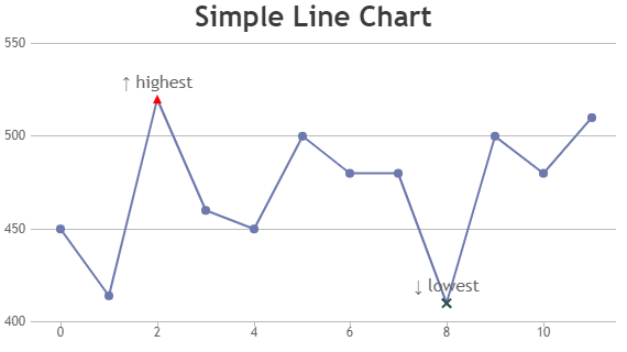
Line Charts are a special type of comparison chart that illustrates the time series data and helps in assessing the trends. They are very simple to read and can handle a humungous amount of data. Due to their importance in competitive analysis, line charts are frequently used by businesses and organizations to gauge their sales and performance.
Part 6: How to Create A Comparison Chart with Excel
Step 1: Launch the Microsoft Excel on your PC and open a blank workbook.
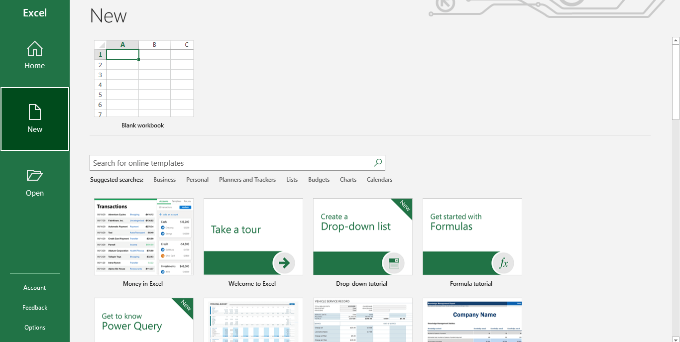
Step 2: Now enter the data for your comparison chart manually or copy-paste from another file. You can also open a pre-made file to proceed to the next step directly.
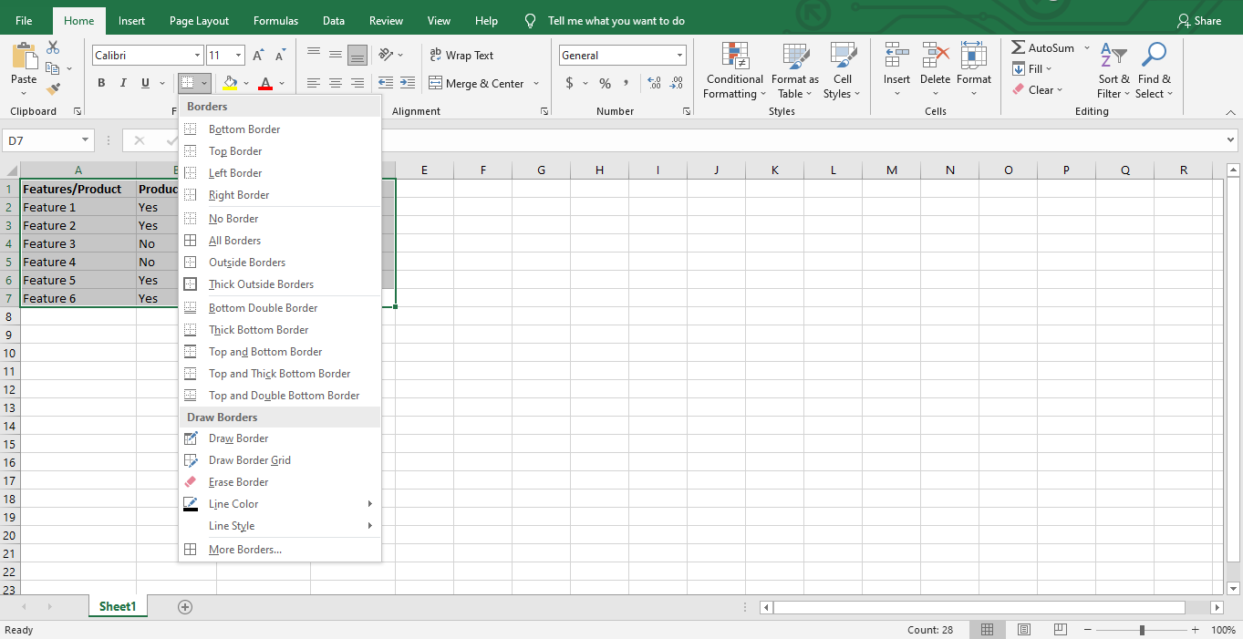
Step 3: Excel does not have a built-in comparison chart option and has to be created manually. Select your data and click Border from the Home tab. Now click on the drop-down arrow and select All Borders. This will create borders around each cell.
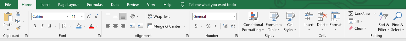
Step 4: The basic comparison chart is ready to be customized according to preference. Use the editing tools in the Home and Insert tab to change text color, shape, size and add images to your chart. You can also edit the border style, thickness, and color.
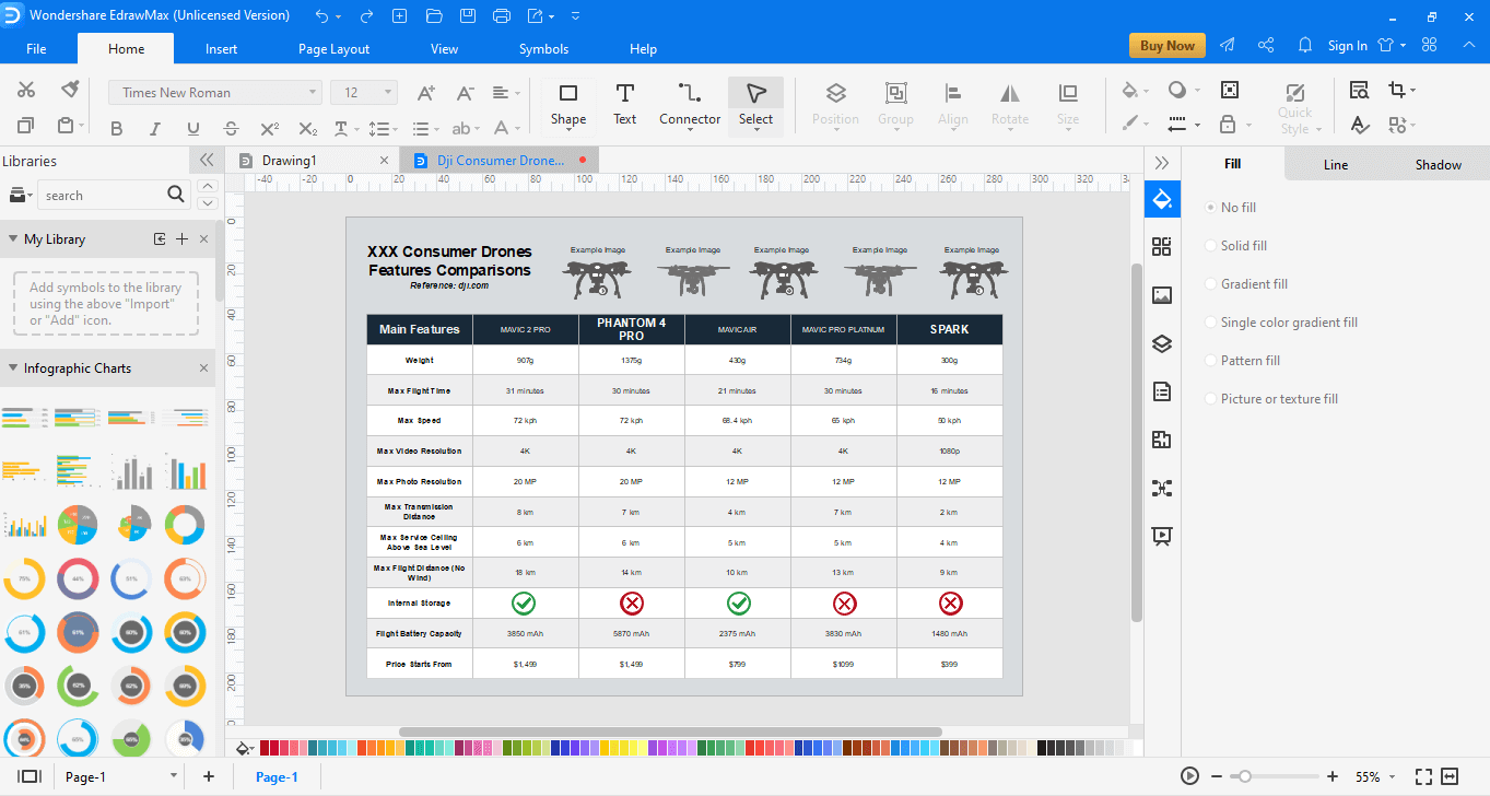
Part 7: How to Create A Comparison Chart with EdrawMax?
Step 1: Download and open the EdrawMax software on your PC.

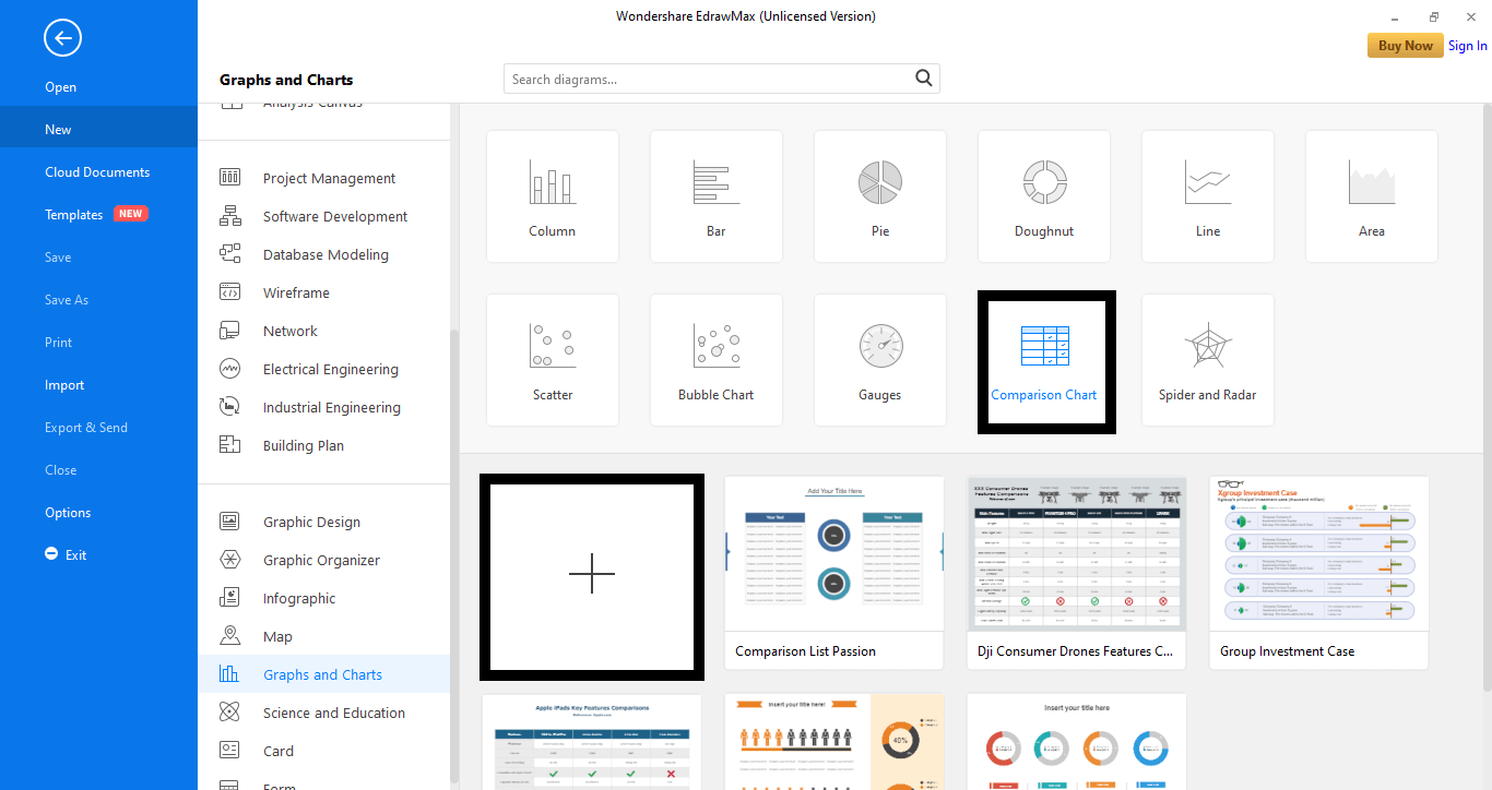
Step 2: In the left column, go to the New tab and select the Graphs and Charts tab from the menu.

Step 3: Next, select the Comparison Chart tab. A range of templates will appear. Select a pre-made template or start from scratch by clicking the plus-shaped icon. (+).
Step 4: A new window with the chosen template will appear. Insert text and details into the chart and edit it with the available editing tools. Symbols are present in the left pane, while the other features and tools can be accessed from the right sidebar.
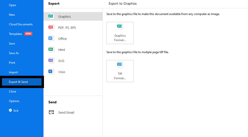
Once you are done, export your file to a local destination by going to the File tab and selecting Export and Send from the menu. Now, choose your desired format and click Ok.

An all-in-one platform for 210+ diagrams.
・ Simple alternative to Visio
・ 26k+ symbols
・ 10K+ free templates
・ 10+ AI diagram generators


Part 8: Examples for Comparison Chart
To understand these charts better, have a look at the examples below.
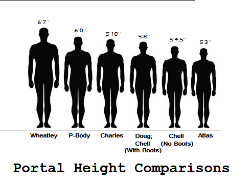
1. Height Comparison Chart
This is a modified version of the bar chart and effectively compares the heights of different people. A 2-D picture is used to represent the person in reference, and the image is altered in length to match the person’s height. The actual height is also mentioned in each picture for better understanding. With this chart, we can easily compare and see who is the tallest and the shortest.
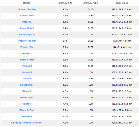
2. iPhone Screen Size Comparison
This is a basic comparison sheet that helps us compare the screen sizes, display types, and dimensions of different iPhones. It lists the models on one side and the features for comparison on the other. The data is filled for each of the products and can be easily compared after a thorough read.
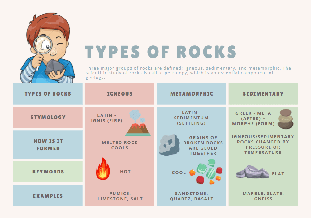
3. Types of Rock Comparison
This is a fun and colorful chart that helps us differentiate between the different types of rocks. The three major types of rocks: Igneous, Metamorphic, Sedimentary, are compared based on their etymology and formation. Examples are also added to fully understand the concept. The chart also represents some cute illustrations to make it fun to read.
Part 9: Conclusion
Now that you have well-understood the comparison charts and are ready to represent your data in a more organized and easy-to-read form, create them with Edraw. The user-friendly tool with a wide array of tools and customizable templates can help you create stunning charts in just a few minutes.


