HR Dashboard
51872
197
Monthly Sales Dashboard
42656
191
Sales Performance Dashboard
29539
168

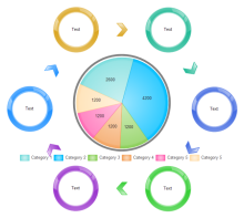
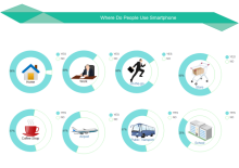
Infographic Ring Charts
16330
136
Basic Column
14115
165
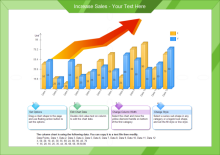
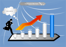
Increase Sales Column
13611
150
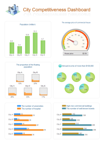
City Competitiveness Dashboard
11511
163
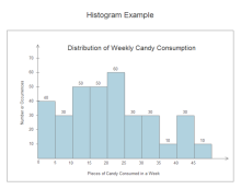
Consumption Histogram
11339
150
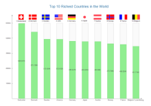
Richest Countries Chart
10091
156
Pie Chart Star
9511
153
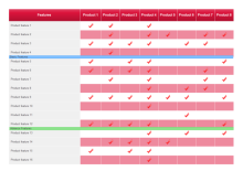
Product Comparison Table
8546
133
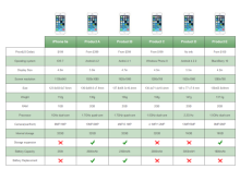
Smart Phone Comparison Table
7971
135
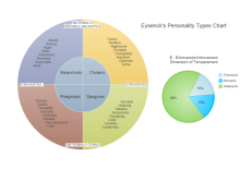
Temperament Categories Diagram
7891
155
Comparison List
7108
154
Retail Dashboard
6617
157
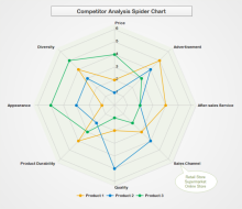
Competitor Analysis Radar Chart
6332
135
Smartphone Use Doughnut
6057
136
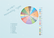
Personality Pie Chart
5898
148
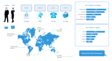
Marketing Dashboard
5870
147
Blank Line Chart
5593
135
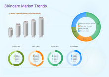
Skincare Market Trends
5203
146

Comparison Dashboard
5142
148
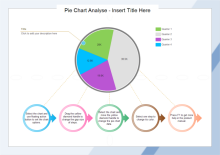
Pie Chart Analysis
5047
145
Sales Status Dashboard
4659
135
Key Events
4623
153
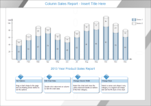
Column Sales Report
4521
134
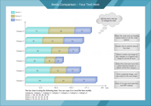
Items Comparison Bar
4463
151
Donut Chart
4391
133
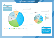
Marketing Plan
4358
146
Infographic Bar Charts
4045
24
Free Download Scatter Plot Templates Online
A great platform for sharing bar chart, pie chart, line chart, area chart, column chart, spider chart, and gauges chart. All shared chart templates are in vector format, available to edit and customize. Explore whatever fits you best and save for your own use.