7 Easy Tips to Make Your Infographics Stand Out
Edraw Content Team
An infographic is the best way to deliver your message as it makes people quickly understand the point. But still, infographics might fail because of some lackings. And when an infographic fails, it wastes your time and other resources.

This article will tell you all about good infographics and how to make them perfect. We will also introduce the five points you must avoid while creating the infographics. In the last, we will tell you seven tips that you must follow to make your infographics outstanding.
What is a Good Infographic?
Before understanding a good infographic, you must understand the basic definition of an infographic. An infographic is nothing but a pictorial, graphical, and colorful representation of some data, knowledge, or information.
An infographic plays an important strategy for understanding the points, processes, and knowledge. It makes topics easy to understand because the information is visual, and a human brain understands the graphics easily.
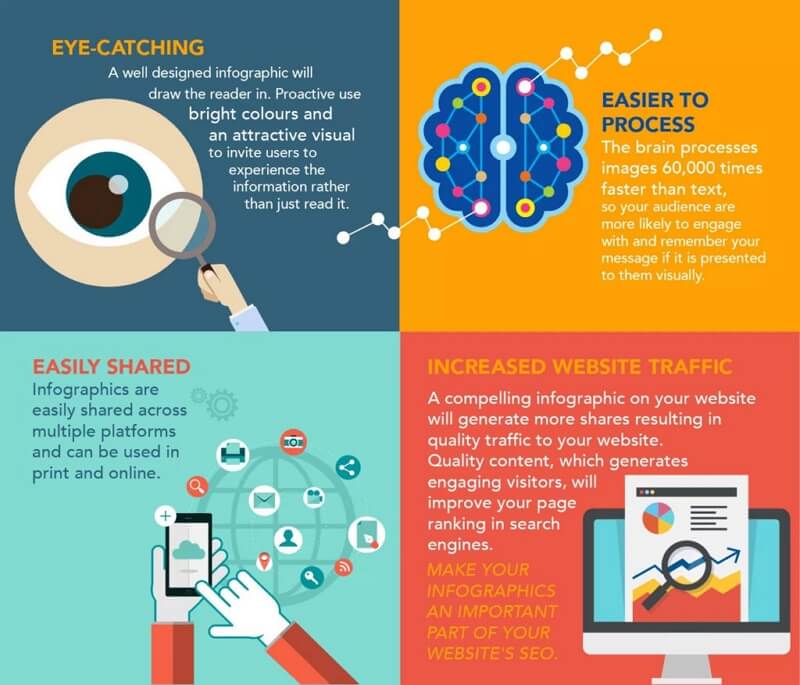
Image Source: proactive.ie
Matt Haworth, the director, and co-founder of UK-based social enterprise Reason Digital that helps non-profit organizations to stand out in their social media content, says,
A great infographic can convey a story, new or previously undiscovered information, or present a new angle or fresh perspective on accepted wisdom. It should be compelling in terms of the information and the visual design. You should understand the key message from looking at it for 5 seconds, but it should also be teaching you things if you look at it for a minute or two.
Source: www.businessillustrator.com
7 Easy Tips to Make Your Infographics Stand Out
Here are 7 tips for creating infographics. They will walk you through the process and logic of designing effective and attractive infographics.
Since the dawn of the Internet, online business has become quite prevailing, along with which, the demand for infographics has continued to skyrocket. Infographics are visualization tool used to explain and present complicated data in a simple way. Yet it has been a type of incredibly successful forms of communication. So needless to say how important to create an effective and eye-catching infographics. There are some tips to keep your infographics on track:
1. Keep Your Infographics Targeted
Try to figure out whom you want your infographics to be present to before making it. Your goal is to create infographics for your target audience, unnecessarily for the whole world. So try to avoid choosing some elements only because it is populous. Try everything to keep your infographics more specific and attempt to select elements that fit your target audience most.

2. Make Focal Point Stand Out
Infographics is born to express complex information in a rather simple way. It helps to make information perceivable and easy to be consumed. It's crucial to make it focused. Do not wish to put everything on the graphics and try to make the focal point stand out. One of vital methods to assess your graphics is that if it can be read at a glance.

3. Tell a Visual Story
Good layouts can make the infographics more attractive and readable. Since the aim of your infographics is to make for a quick read, you should tell a story in an instant. You don't have to add much text but use a timeline to show things changing with time. For example, this infographics is designed with a story to show a new year travel plan. We can easily and immediately get the information of the travel time and destination.

4. Make it Simple
Avoid unnecessary design such as 3D charts, ornamental illustration and extraneous elements. Use no more than five colors in a single layout. Too gaudy decoration and colors may get audience distracted and make it difficult for infographics to be compelling.
5. Use Contrasting Colors
Contrasting colors appear on opposite sides of the color wheel: warm colors like orange, red and yellow; cold colors like blue, purple and green. On one hand, similar colors make the object on the infographics difficult to distinguish from each other. The stronger the contrast is, the easier the infographics can be read. On the other hand, using contrast colors can make the infographics beautiful and stand out from the page. But remember do not apply too much colors or it can be too distracting.
6. Choose Proper Chart Types
Type of your data determines the type of charts you need to use in your graphics. So try to figure out what type of your data is. Is it a comparison between data point? A tend over time? Anoutlier? For example, a column graph is suitable to compare data and a line chart is good at convey of trend over time.
7. Make the Infographics Adaptable to Environment
Sometimes we can make an infographic for an environment that it will never live in. For instance you may design an infographic for print but it's been put into a blog where the text is too small to be read. Before deciding the dimension, you must found out where it will be used. You should make the infographics most adaptable to the expecting environment.
What Will Make a Bad Infographic?
This section will tell you the five don't that you have to be concerned about while making your infographics. These failings make your infographic corrupt in front of the public eye, and your site becomes the least reliable figure among the masses.

Don't put the wrong numbers
Some infographics are published without rechecking the quality of data, which makes a huge problem for the creator. You have to care about the numbers while presenting the statistical data. For example, a pie chart is presented with the wrong numbers in the infographic. They don't make 100% when we add all these percentages. You have to be very careful about the integrity of your data.
Don't select the wrong representation for your data
Another mistake that adds up to the failure of an infographic is selecting the wrong representation of your data. Your data and the chart, graphic, or whatever you choose to represent the data must collide.
The creator has added the percentages and tried to make them hundred representing the bar chart. It is against the laws of statistics. If you are trying to add up the percentages, the pie-chart is the correct option. The bar chart is used to compare the values.
Don't imbalance between the visuals and text.
It is a grave mistake that you should avoid. Always create a balance between the visuals and text information in your infographics. Too much text violates the rules of infographics and makes people avoid it.
Don't confuse people.
Don't add information or visuals that confuses people. Always try to explain your points, so people get them quickly. See the infographics below. You will see that the creator has added too many graphs that confuse everyone.
Don't confuse your audience.
Never confuse your audience. As mentioned above, add both texts and graphics. The graphics must be appealing and made and designed with modern tools. The below infographics never show the qualities of infographics, but its creator still titled it as an infographic.
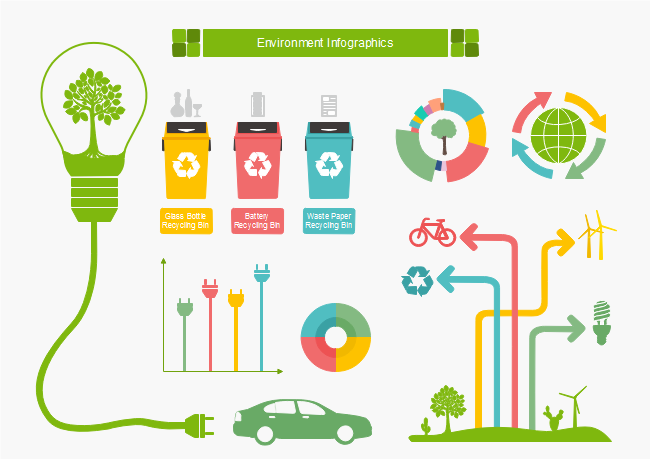
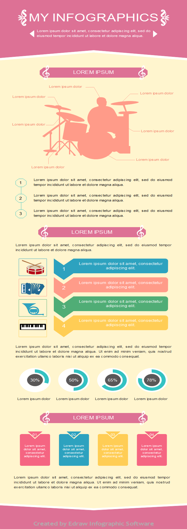
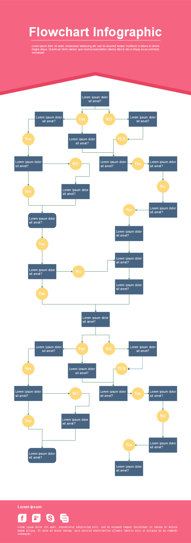
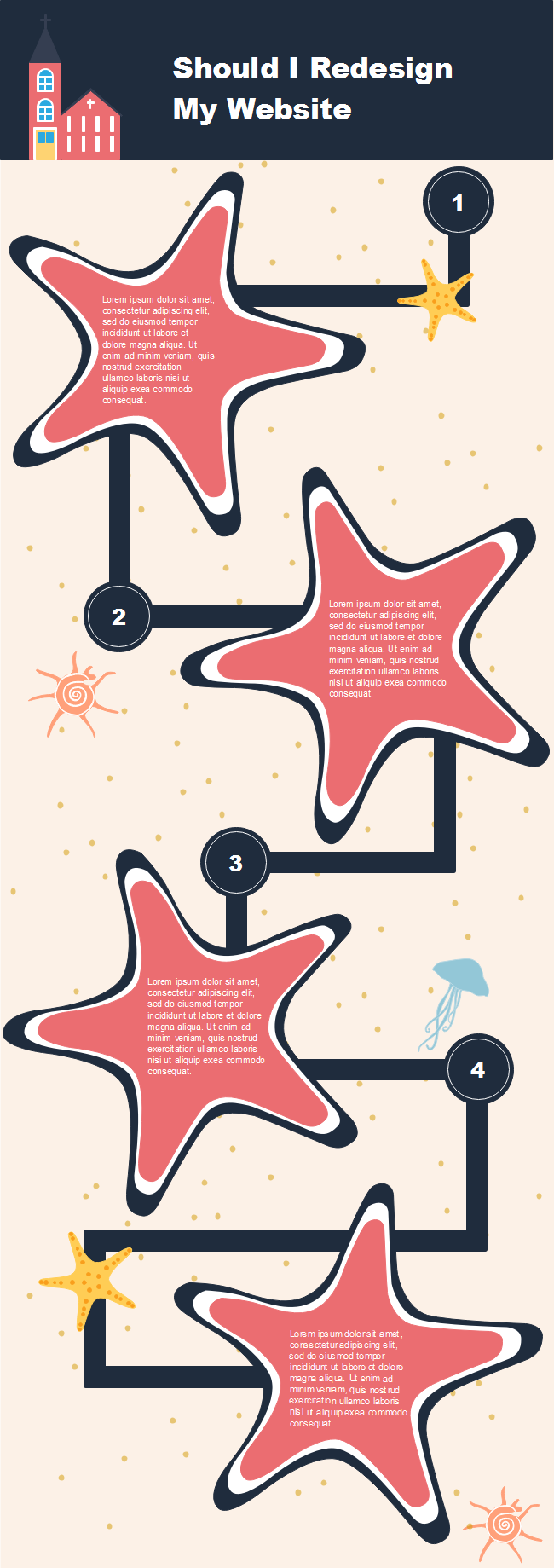
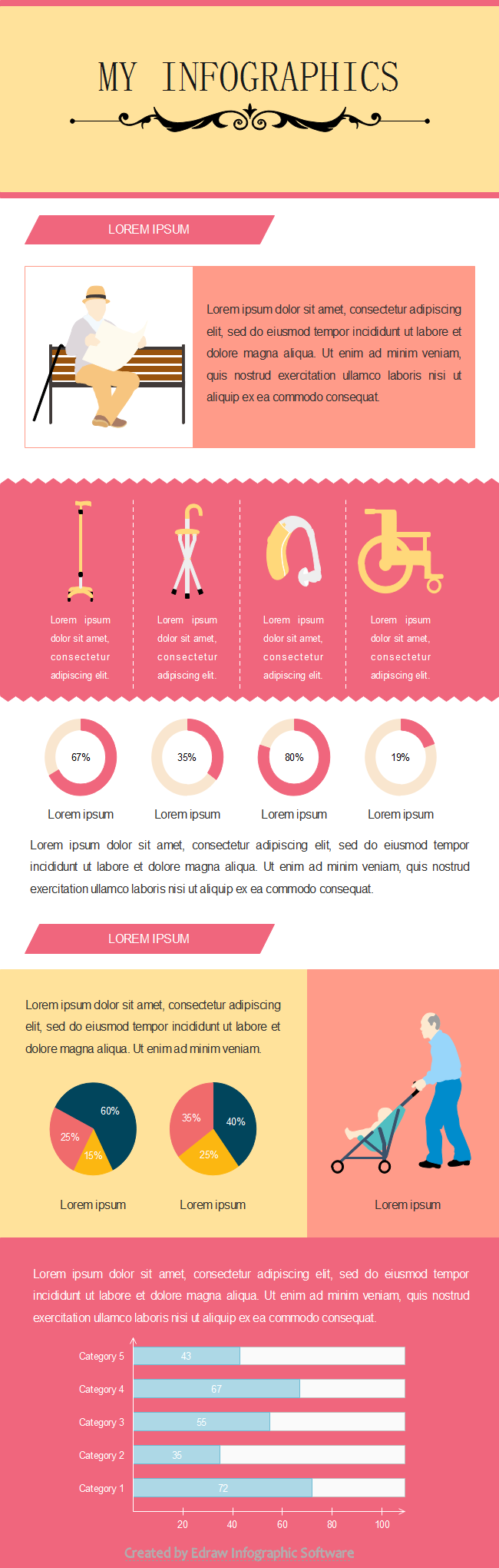
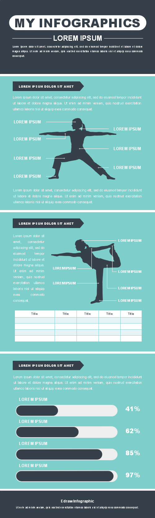
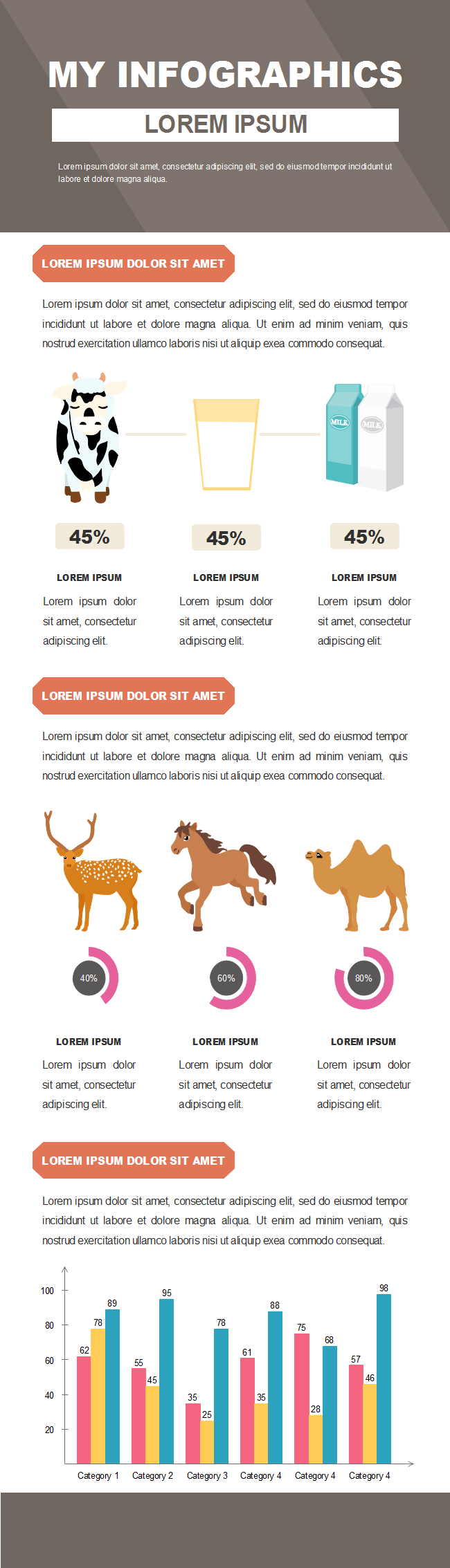
More Free Infographic Templates
Following infographic templates infographic templates are totally editable. You can use any of them to start and save your time.


EdrawMax
All-in-One Diagram Software
- Superior file compatibility: Import and export drawings to various file formats, such as Visio
- Cross-platform supported (Windows, Mac, Linux, Web)
Edraw Content Team
You May Also Like
What is a Cladogram?
Knowledge

