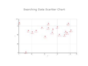
A scatter plot is a type of data visualization that shows the relationship between different variables. As the data scatter chart shows, this data is shown by placing various data points between the x- and y-axis. As per the image, each of these data points looks “scattered” around the graph, giving this type of data visualization its name. The dots in a scatter plot report not only the values of individual data points but also patterns when the data are taken as a whole. It should be noted here that there are three types of correlation: positive, negative, and no correlation. A positive correlation is where one variable increases, so do the other. A negative correlation is whereas one variable increases, the further decreases. No correlation is where there is no apparent relationship between the variables.


 デスクトップ版