Pie Chart
Know it All about Pie Chart
Charts and graphs are a convenient way to interpret statistical details for companies rather than simply showing a set of figures. The pie chart is the most popular of these. Its name derives from similarity to a pie since it displays data in slices and has a circular shape. When you need to show and quantify simple data, a pie chart is a good choice because it's easy to make and comprehend.
A pie chart, also known as a circle graph, histogram, pie diagram, or scatter diagram, is a type of graph that uses a circular graph to view data. The graph's pieces are equal to the percentage of the total in each group. In other words, the size of each slice of the pie is proportional to the size of the group as a whole. The entire "pie" represents 100% of a total, while the "slices" represent parts of the whole.
At a glance, pie charts will help you understand the scale of your portions. They are commonly used in business presentations and education to display proportions among a broad range of categories, such as expenditures, population groups, and survey responses.

Since the 1800s, pie charts are being used to display numbers and maps. By drawing attention to the high death rates caused by poor sanitary conditions during the Crimean War, Florence Nightingale was the first one to popularize the pie chart as a persuasive statistical tool.
Now that you know what a pie chart is, let’s look at some of its advantages:
While there are several advantages, pie charts have a few disadvantages as well. But what are they? Learn about them below:
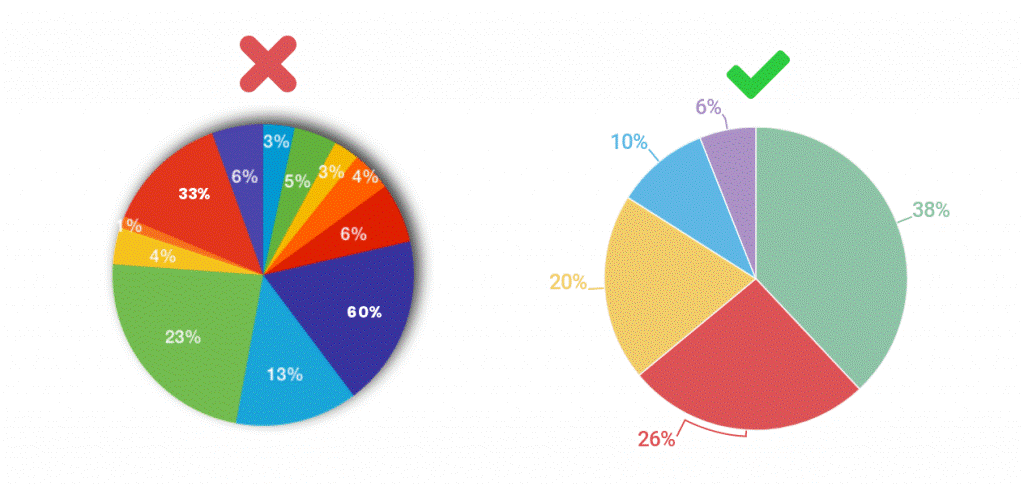
A pie chart is most useful when you are attempting to determine the composition of something. When dealing with categorical results, a pie chart is ideal since each slice can represent a different category. Below is an excellent example of a pie chart.
Moreover, a pie chart can also be used to evaluate areas of growth within a business, such as sales, benefits, and exposure. A pie chart is a circular graph with parts cut out of it (i.e., slices of pie). The contribution of each category to the display of parts of a whole is represented by these segments. Ensure your data represents likewise.
Based on the graph's dimension, pie charts are divided into two forms, a 2D pie chart, and a 3D pie chart.
A two-dimensional pie chart is a circular graph that depicts the percentage of variables in a dataset. This form of pie chart shows the pie chart's entries in two dimensions. Based on how the variables are visualized on the pie chart, the 2D pie chart is further divided into four forms:
A 3-dimensional representation of a pie chart is a 3D pie chart. It's mostly used for decorative purposes, and it doesn't help with data visualization on a pie chart. On the opposite, it causes the graph to be distorted and difficult to decipher. The 3D pie chart is further split into two parts:
You'll need a list of categorical variables (descriptions of your categories) and numeric variables to create a pie chart. Pie charts can be difficult to draw by hand, mainly when dealing with percentages; since the pie is 360 degrees in diameter, drawing 13.9 percent or 56 percent can be difficult. With the large range of computer programs that are available today, this has become easier.
In this article, you will know how to create a pie chart in Excel and on EdrawMax as well.
Making a pie chart in Excel can be very easy if you correctly follow the step-by-step tutorial below. For instance, you are making a pie chart in Excel representing the percentage of people who own certain types of pets:
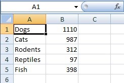
Step 1: Firstly, type your data in an Excel worksheet. In one column, write your groups, and in the other, write your numbers. The categories in this example issue are the different types of pets, so type those into column A. In column B, enter the numbers that correspond to each group. When entering data, don't leave any blank rows or columns.
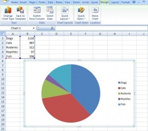
Step 2: Now, select your data. To do that, click the top left corner and drag the cursor to the bottom right corner.
Step 3: Select the type of pie chart you need by clicking "Insert," then "Pie." With simple pie charts, such as the one in this sample problem, the first option (2D) will usually suffice. Excel can insert the pie chart into your worksheet after you press the chart button.
Pro Tip: If you make an error in your entries, you don't have to redo the entire chart; simply type your correction in the original data, and Excel will correct the chart automatically.
You can also make a pie chart in EdrawMax Software with just some quick steps. EdrawMax is an effective tool with hundreds of pre-built templates available for its users’ ease. You can download the application to avail many of its benefits. To create a pie chart, log in to your account and follow the steps below:
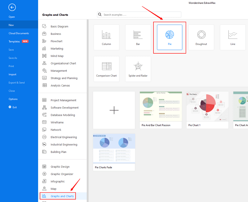
Step 1: Open EdrawMax from your computer, and navigate to [New] > [Graphs and Charts] > [Pie].
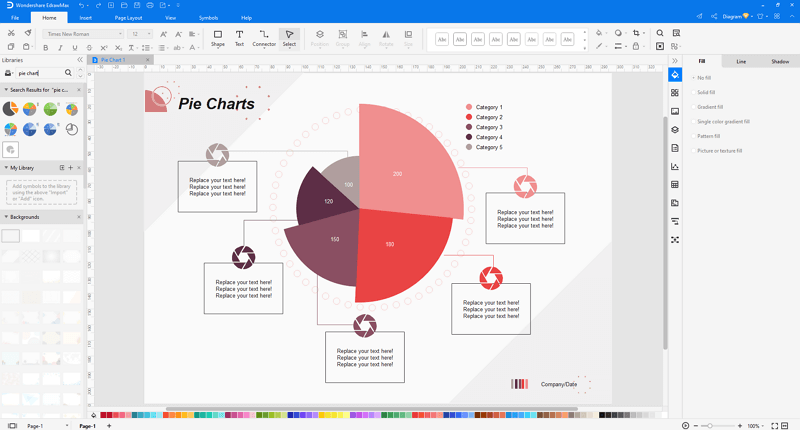
Step 2: Open and make modification on a pre-made pie chart template, or you can create a new pie chart with preset smart shapes and chart editing tools
Step 3: When you have made the pie chart, you are able to save and export the diagram to graphics(JPG, PNG), PDF, editable MS Office file format, SVG and Visio vsdx file format.
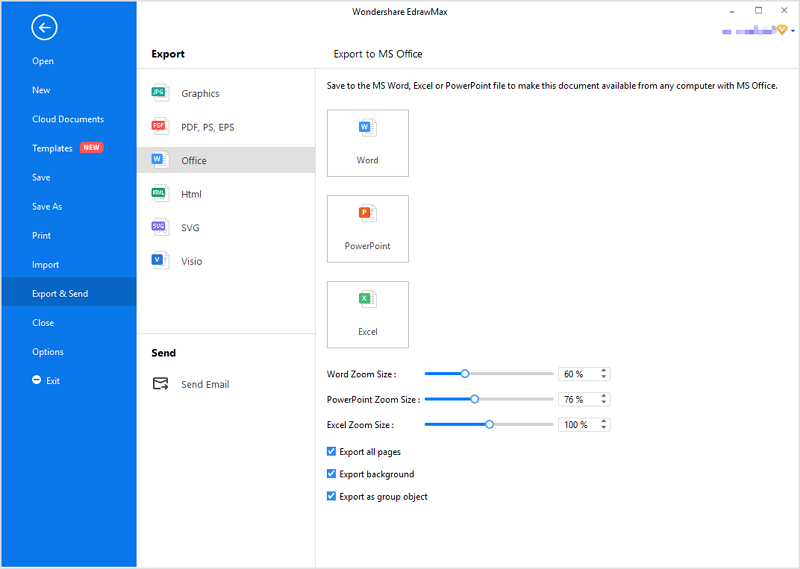
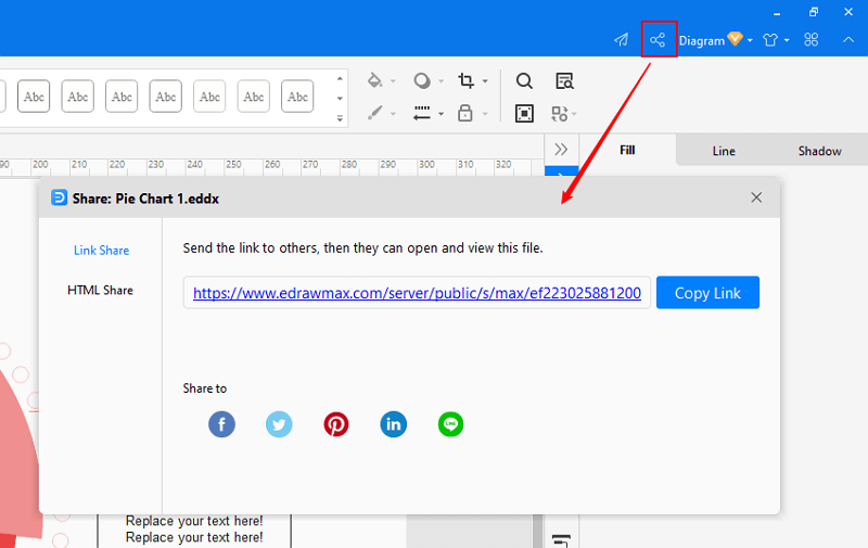
Step 4: Alternatively, you can share your pie chart via social media and sharing links. In addition, you can publish the pie chart into EdrawMax's online template gallery.

・ Simple alternative to Visio
・ 26k+ symbols
・ 10K+ free templates
・ 10+ AI diagram generators
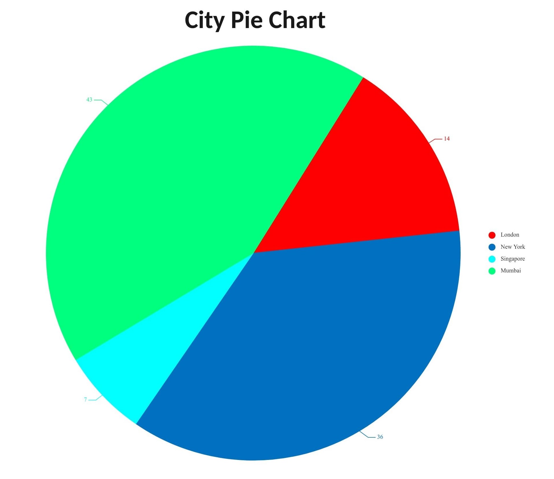
Above is an example of a City pie chart available at EdrawMax. It displays information on the demographics and population density of the four most populous cities on the planet; London, New York, Mumbai, and Singapore.
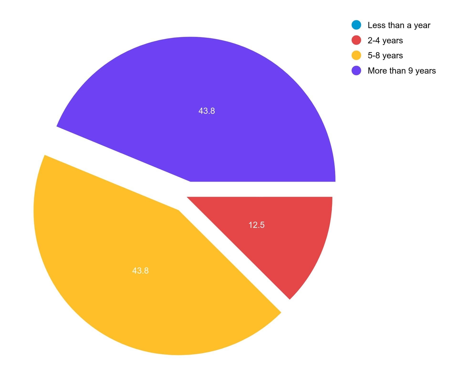
Below is another pie chart template indicating how long employees worked in a company. The chart shows that the majority of them were willing to work in the company.
In conclusion, after reading this article, you'll be able to create a pie chart in Excel as well as on EdrawMax. A pie chart can help you arrange your data in a visually appealing manner that you can use in a variety of settings.


