Line Chart and Area Chart, Which to choose?
Contents
What Are Line Charts and Area Charts
Line charts are usually for discussing trends over a certain time. The Y axis shows numeric values and the X axis represents some key measurements. Line charts are clear and easy to understand since you can see the specific trend for individual data group. In reality line types are welcomed by financial managers to check trend for profits and some other business factors.
Area charts have a close pattern to line charts. However, the room between each line and the X axis is filled with a certain color. Generally, area charts are ideal for indicating the change among different data sets. Area charts have two basic categories: stacked and 100% stacked charts.
Key Points for Selecting Between Line Chart and Area Chart
If you are not sure about the usages of line chart or area chart, just go through the following three key points.
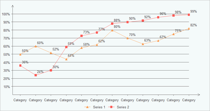
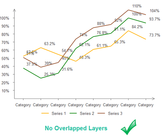
1. Comparisons. Suppose your assignments involved comparing multiple values, then you should use line chart instead of area types. Charts without area shadows would be more effective to show comparisons between different data groups than shaded charts. You can easily show positive or negative relationships between two or more variables.
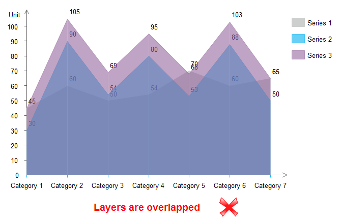
In area charts, you will find it is very hard to show different data groups clearly as the upper layer hides the downside ones, and this becomes even worse especially when you have more than two data categories. The problem still exists even if you increase the transparency of layers.
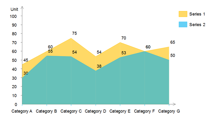
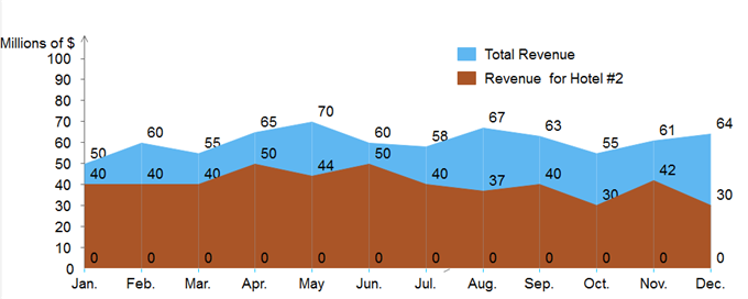
2. Composition Between Multiple Data Groups. Area charts are very suitable for showing part-to-whole details. If your goals include the composition of some aspects, then you should choose area ones rather than line charts. In this case, area charts can clearly show how single parts make up the overall parts. For the practical example below, imagine that you want to quickly get a general idea of the annual revenue of your hotel #1, then you can simply target on the blue color area in the below chart.
3. Distribution or Trend. Suppose your goal is to let readers understand the distribution of your selected data, or how a data group performed within a certain time period, then you should choose line charts. Line charts are good for knowing general tendency and some other related details in your values.
Line Charts vs Area Charts: Summary and Further Tips
In conclusion, although both these two types can be used for visualizing data, they have different purposes of uses. You should better choose the area type for summation relations for more than two different data groups, and use line charts for showing comparisons, distributions, or trends between continuous data sets. Furthermore, you can practice by using a few more tips:
Line Chart Drawing Reminders:
- You could try solid lines instead of straight lines.
- Make sure the height of your individual line does not beyond the normal range. Hence try not to fill the full screen of your chart, instead, leave some room at the top.
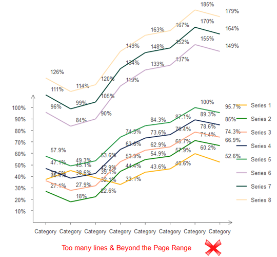
- You should not add too many lines to show your purpose.
Area Chart Drawing Reminders:
- Do not insert too many data categories (should better no more than five data groups).
- Try to highlight the most important data group of your resources.
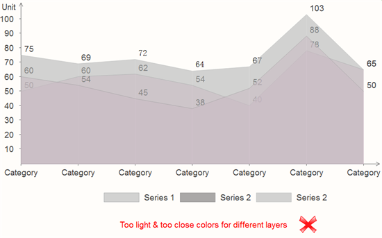
- Avoid very light or very close colors for your data groups. Make sure all of your details in the chart do not fade into the background.
More Free Line Chart and Area Chart Templates
The following free chart examples and templates includes the main categories of charts for business and educational uses. Feel free to click on any of them to see more details.
|
|
|
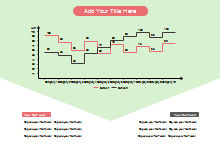
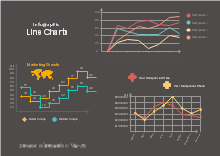
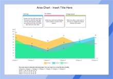
| Step Line Chart Template | Infographic Line Charts Template | Area Chart Template |
Which Chart Tool Should You Use?
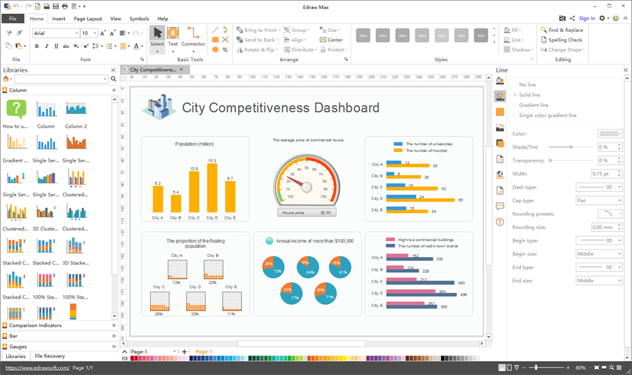
The Edraw chart maker lets you create many different kinds of charts including column, bar, pie, line, area, scatter, spider and gauges. You would surely benefit from the rich built-in chart templates and auto-create features. What's more, you can import data from local files, or one click set the category and series number, show or hide legend and axis, change the axis tick number and category interval etc.
See More
Top 10 Types of Charts and Their Uses
Difference Between Line Chart and Scatter Chart
How to Choose between Bar Chart and Pie Chart
How to Use Bar Chart to Compare Data

