Bar Chart and Pie Chart, Which to Choose?
Contents
What is Bar Chart and Pie Chart
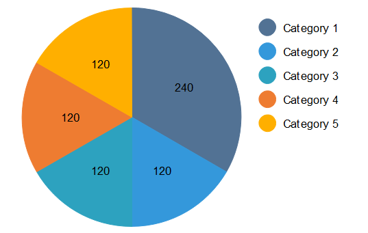
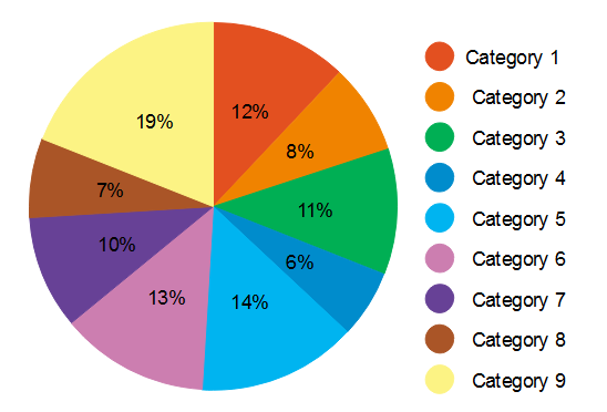
Pie charts are for visual comparisons especially when you have no more than five different categories for nominal or ordinal data. It is a classic method to show how different parts make up the overall factor. Rankings on responses in a consumer survey are usuallyknown as ordinal data, while the nominal type is something like demographic details.
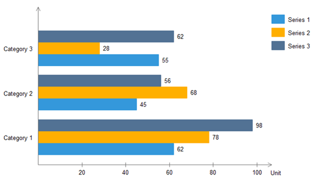
Bar charts are consist of straight single bars, numerical values, and axes, and they may be in stacked or non-stacked formats. If you have several sub-groups within one data category, stacked is the optimal choice for you. In reality, you can use bar charts to analyze financial trends.
Common Points of Bar Charts and Pie Charts
Both of these two charts are popular for visualizing especially for non-time-series data. Users can compare values relative to each other. Practically pie charts and bar charts are ideal for analyzing survey results, such as marketing preferances when a new product comes to the market. Similar to pie charts, bar charts are also good for both nominal and ordinal data at relative sizes. However, that’s not the end. If you want to convey research findings more accurately than before, you should carefully choose between these two types.
Interesting Differences in Data Presentation
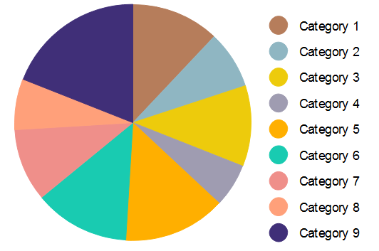
If you want to represent how an overall category is divided into individual part, you may first think of using pie chart. You can clearly see the general composition for each sub-category in a pie chart. It is especially the case when you just have a few data categories to be compared. However, you may feel struggle to find further details about different categories. For example, which data category has the lowest percentages among all the categories if you hide percentage labels.
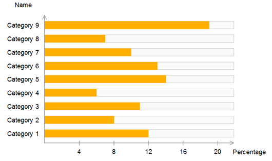
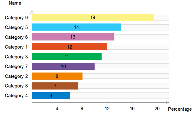
If you choose a bar chart, things look different. Comparisons between different sub-categories seem to be much easier than that in the pie chart. Even if the percentage labels are hidden, you can easily tell the group with lowest percentages. It is mainly because human eyes are good at spotting vertical or horizontal lines instead of general angles without actual percentages, and such findings have already been proved by many brain researchers. In other words, human eyes feel more comfortable at perceiving some certain lengths along axes than judging angles.
What Happened If We Have Multiple Categories
Compared to pie chart, one of the disadvantages of the bar chart is if we increase the total number of categories to more than five, we may find it difficult to quickly tell the general sum of percentages of neighbor sub-categories in a bar chart. Once again, this situation has something to do with the biological functions of human eyes. Normally we are better at checking the sum of combinations of neighbour categories in a pie chart than of several bars in a bar chart. So in brief summary of data presentation, if you want to compare combinations among neighbor components, you should better choose pie chart.
Bar Charts and Pie Charts - Practical Examples
For a Marketing Consumer Survey , the list below show you three cases when pie charts are better than bar charts especially in a consumer survey. However, if your survey includes multiple choice questions, which means readers can pick more than one answer, then you should use bar chart to avoid misunderstanding.
- To indicate that a few dominant data groups represent the majority of the overall data.
- To begin a discussion about a normal trend instead of showing precisely correct data.
- To compare close results from different persons across different factors, such as gender, age, job positions or time periods.
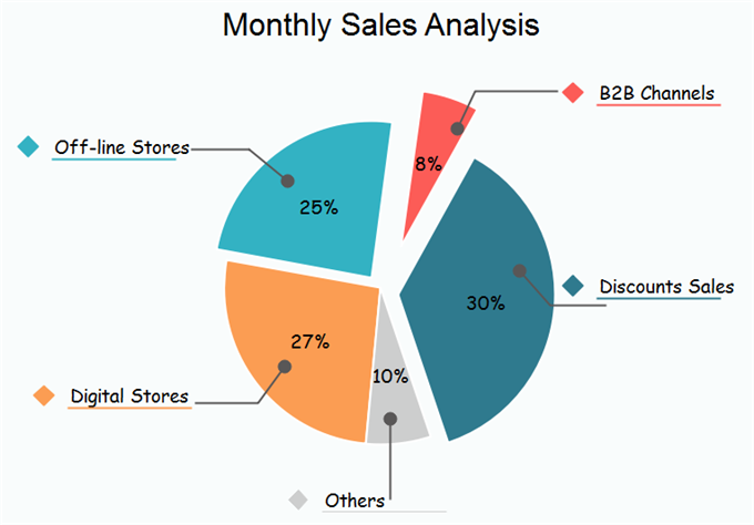
For Time-series Data in Financial Reports , it is not the most common case, but both of these two types can be used for showing time series data in different purposes. For financial reports, bar charts can be shown in chronological order to visualize organizational daily profits. The same layout can also be presented to indicate profits on daily basis across other different business factors like sales or costs. Pie charts, however, are normally used for displaying relative values in numerical related reports. Researchers can input a number of slices showing the relative amount of organizational sales for each department as a fraction of the overall sales of a company. Alternatively, you can set relative amount of monthly sales as a fraction of the summed sales based on year.
Using Both Bar Charts and Pie Charts
Actually, in some cases pie and bar charts can be used together for a better presentation of your reports for mixed results. One of the two types can be a backup for the other one. Furthermore, you can improve the clarity of your original data by strengthening some key factors:
- Using different highlight colors for different data groups;
- Inserting labels for percentages next to the axes;
- Changing suitable category names;
- Hiding unnecessary legends;
- Combing small or less dominant data groups;
- Structuring data categories in the order of magnitude in bar charts;
More Free Bar Chart and Pie Chart Templates
The following free chart templates includes the main categories of charts for business and educational uses. Feel free to click on any of them to see more details.

|
|
|
| Plan Management Bar Chart | Infographic Bar Charts Template | Infographic Pie Charts |
Chart Software Recommendation
The Edraw chart maker provides a super easy method to make column, bar, pie, line, area, scatter, spider and gauges charts. It also contains built-in chart templates to helps you create the best charts and graphs while taking the minimum time. Furthermore, you can import data from local files, or one click set the category and series number, show or hide legend and axis, change the axis tick number and category interval etc.
EdrawMax
All-in-One Diagram Software
- Superior file compatibility: Import and export drawings to various file formats, such as Visio
- Cross-platform supported (Windows, Mac, Linux, Web)
Read More
Top 10 Types of Charts and Their Uses

