How to Choose the Right Chart - A Complete Chart Comparison
As you know, there are many types of charts to be used in data visualization. But most people could not determine which to be chosen rapidly as they are confused in distinguishing different charts and using the proper chart to display a mass of data fast. Thus, we present you the method of differentiating various types of charts and choosing from the right chart quickly.
Try an easy and effective Chart and Graph tool - Edraw. Download it for free.
5 Main Usages for Distinction of Chart Types
In order to distinguish the chart types and choose the best chart, you can match each type by their relative usages. Below are 5 main usages of chart types for distinction.
-
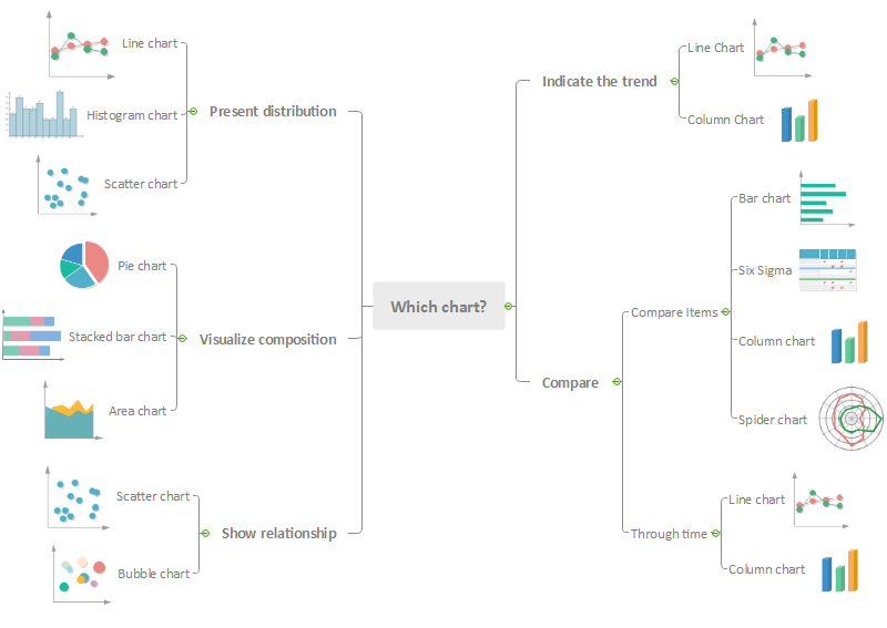
Presenting Distribution.
Distribution charts lay out how items are distributed to different parts. The best chart to use for this type of data are line charts, histogram chart and scatter charts which illustrating items correlation among others. -
Visualizing the compositions.
Three types of charts benefit for visualizing the composition of an issue. It is obvious that pie charts are designed to show the compositions as different parts of a pie can represent one composition and whole pie is the completion of an item. Area charts and stacked bar charts can also be visualized by different color areas for visualizing compositions. -
Showing the relationship.
Among all the data, it is of vital importance to find the relationships toward data. Spider charts and bubble charts are the perfect choices of analyzing the relationship as they contain relationship of one data variable to the whole group or other variables. -
Indicating the trend.
When you need a chart for indicating the trend of a series data in a fixed period, there are two basic charts proper for you – Column Chart and Line Chart. Both two charts show the changing trend with differences of data. You can also combine them into one chart named Pareto chart which is better for knowing relevant trends. -
Comparing.
Most charts are created aiming to data comparison. Comparing function helps you visualize mass data as data always appear with a large quantity. Divided into two parts, different items could be compared by bar chart, column chart, six sigma chart and spider chart while one fixed item can be compared through different time like line chart and column chart.
When to Use Different Charts
Occasions of Using Column Chart
- The data reflects the rank of values to focus on extreme values.
- Items on the chart have short category labels.
- A trendline is needed on the chart.
- The chart data contains negative values.
Occasions of Using Line Chart
- Experiment statistics.
- Data changes over time.
Occasions of Using Area Chart
- Analyze a part-to-whole relationship.
- Know the magnitude of the change.
- Compare a few categories.
Occasions of Using Bar Chart
- Values of each category need to be viewed intuitively.
- Items on the chart have over 5 categories.
- A comparison of data is needed on the chart.
- A part of the whole category relationship is needed.
Occasions of Using Pie Chart
- Show relative proportion.
- Measure changes over time.
Occasions of Using Spider Chart
- Several items should be compared with more than 5 metrics of features or characteristics.
- The overall situation of different items.
In conclusion, charts are very powerful tools to visualize the data. For a convenient selection, you can pick up the right chart according to different usages like for comparison, trend, relationship, composition, and distribution. Learn more chart solutions to make better charts with Edraw Chart Maker software.
Further Reading:
Line Graphs or Scatter Charts, Which to Choose?
Line Chart and Area Chart, Which to Choose?
Bar Chart and Pie Chart, which to Choose?

